Show some recent work
Show some recent work
- Started
- Last post
- 8,641 Responses
- robotron3k0
I don't have any recent work I just go to meetings and manage art directors. I ask you, is this any way to live?
- theredmasque0
- Nice. Really like the vertical texture of the blue. Is that individual strokes done 1 at a time?********
- Yes, individual strokes. Thanks. Glad you like! :)theredmasque
- Hey Orbit. Looked at your portfolio. GREAT WORK!!theredmasque
- Nice. Really like the vertical texture of the blue. Is that individual strokes done 1 at a time?
- janne760
- Llyod? is that you?********
- (sorry Janne... just reminded me of Llyod’s 3d car he was doing earlier in the year)********
- just as shitty at least...
:D :D :D :DPonyBoy - Llyod, LOLutopian
- if you would only fix your lightning it would look so much better allreadyRavdyk
- hahahaerikjonsson
- Yeah, that lighting is really let down the design of the car, DAM!********
- oops sorry about the lightjanne76
- Llyod? is that you?
- Fanco0
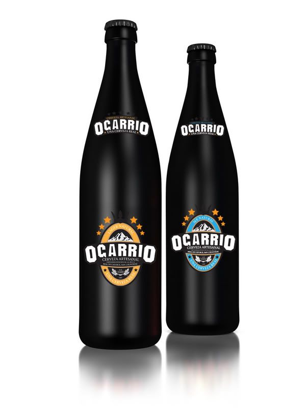
first time playing around with super8mm ever :
&
- hektor9110
- me likes!version3
- thanks....hektor911
- you should submit these to thedieline and lovelypackage dot com. :-)akrokdesign
- will do thanks!hektor911
- is it just me, or are the G and A a little weak in the logo?Amicus
- yeah... they are.. the reason for that is that they wanted to duplicate the font that was used on the entrance tunnel to a mexican townhektor911
- hasta que dejas ver algo! ;)sea_sea
- UKV0
- +1hektor911
- flipped the wrong way for the lightning to workerikjonsson
- dyspl0
- woh - that's really nice.********
- this is sick. good job!monreau
- this is awesome, good job.sofakingbanned
- nice +++yar
- u gotz the skillz to pay the billz !!!WeLoveNoise
- Nice! Much more readable than the earlier versions!neverblink
- thank you guys :)
yes a bit more readable, I didn't changed the shape (too lazy) but the lighting on some letters.dyspl - Good stuff dyspl.ADRENONLINE
- I like it except for the turd in the corner.slappy
- Love it. especially for the turd in the corner.CyBrain
- +1 nice!!CLRBLND
- +1 very nice.akrokdesign
- woh - that's really nice.
- yar0
I just wrapped up a project illustrating a trip across country in 68 drawings. http://www.driveintothesun.com
- ********0
- need to get proper bg and lighting though********
- Image size doesn't really show any detail. I think it worked just fine as a digital showing. Waste of ink unless it to hang at home.********
- Nice Digz. Like it a lot.Horp
- wanna have it?********
- need to get proper bg and lighting though


