Show some recent work
Show some recent work
- Started
- Last post
- 8,641 Responses
- UKV0
- version30
- it's pretty obvious where you been with your orange bike. heh.akrokdesign
- meffid0
- you want to join KDU or watched too much computer arts tutorial?typist
- what the fuck is KDU?meffid
- Kunt Design Unit********
- trust the KDU
http://www.gradientm…typist - http://www.gradientm…typist
- finally, the fucking KDU
http://www.thekdu.co…
enjoytypist - by the way, you need more trianglestypist
- I am founding member of Kunt Design Unit, Thanks Tom.meffid
- typist - pics or fuck off, you gorman troll. Triangle my balls.meffid
- meffid, what kinda pic you want ?typist
- Nice one mr williams.todd_proctor
- What a bunch of fucking vapid douchebaggery in this comment thread.********
- meffid0
All of them at http://leonwilliams.tv/10000DAYS…
- TheFatBaron0
Not super new... but new-ish.
http://www.danielboyle.net/blog/…- nice********
- nicely done, especially about the Brian Herbert + Kevin Anderson comment =)zarkonite
- i like thistheredmasque
- nice
- grunttt0
I don't think I posted this... I finally have a site up with my collage work.
- ********0
- theredmasque0
- how many of these do you banng out week? Are you on speed, nice work.utopian
- haha. anywhere from 1-3 depending.theredmasque
- there were actually three other artworks made in between this one and the last one I posted up on this thread, but I didn't post them.theredmasque
- tile0
- hi-res: http://www.flickr.co…tile
- De tijd? or what newspaper? nice********
- Yeptile
- link's privateversion3
- How 'bout this one? http://farm3.static.…tile
- only for you v3, only for you********
- beautiful!dyspl
- love that white wall bumped materialerikjonsson
- tile0
- simple but I like!********
- It's pretty simple indeed, but the AD was quiet strict and I only had 2 days to finish it ...tile
- very nice!
*don't forget to let enough space on the edge for margins (happens to me very often with 3d renders...)dyspl - I cropped them for portfolio-sake ;)tile
- reminds me i really need to find some new materials. love iterikjonsson
- simple but I like!
- FixMiller0
- I don't get the pyramids.non
- pyramids = 3d triangles?
dyspl - movement vs stillness. fluid vs rigid. that's why i've chosen pyramids.FixMiller
- floating ones, nonetheless.doesnotexist
- New World Order********
- yeah... french aliens form kung powFixMiller
- Do you have a pyramid-less version?non
- http://www.imgspark.…FixMiller
- Meeklo0
- nice typography as usual, meeklosander
- the whole series of these is class.invisiblechamber
- Lol.********
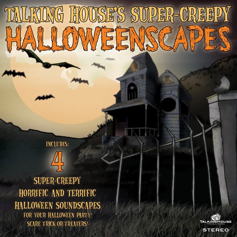
- p-mac0
- the typography doesn't look so super-creepy to me.Amicus
- The audio really is super-creepy, so the art is lighter retro monster comic stylep-mac
- : \brains
- I think the house should be in "focus" and the gate should be blurred.sander
- Upon further review, I agree, this is half-baked. Shouldn't have posted, but it IS recent work. Ha!p-mac
- ianjamescox0
re-designed my site!
<a href="http://www.ianjamescox.com"><img src="http://farm3.static.flickr.com/2778/4026383781_8f2c5fae05_o.png"></a>
- ianjamescox0
- the navigation reminds of logopond a little.Amicus
- ha, it looks nothing like it?ianjamescox
- i like it!theredmasque


