Show some recent work
Show some recent work
- Started
- Last post
- 8,641 Responses
- theredmasque0
- pretty cooldopepope
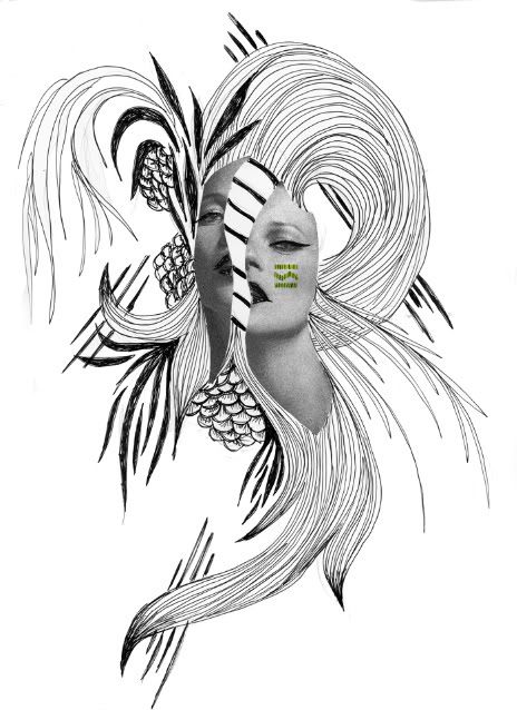
- Thanks. Working on her sister Egyptian goddess Sekhmet now (she's the lion-headed one)theredmasque
- mynameisdave0
- i'm a fan of that last onesfeske
- the last one is quite nicejanne76
- your life is on autopilot?! that = no fun! Nice work / Good hustle...ideaist
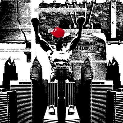
- Like the 3rd execution quite a lot. Are these posters?UKV
- The last one reminds me of this: http://www.etsy.com/…
crnatrava - r u masonic ???WeLoveNoise
- last one winzdopepope
- thanks!mynameisdave
- No, I'm not masonic. :P
And yeah, Mark's work is amazing. I'm not sure if I put this out before or after his, but either way, I'm not worried about a rip debate. They're two totally different styles.
These are for an online magazine I'm putting together with a few Designer/Photographe... friends. We're putting together a pilot issue and then hopefully will open up submissions to the public for Vol. 2 and on.
Thanks again.mynameisdave
- mynameisdave0
- The second one is nice, but generic. I think you could have played up the bulge into the type.********
- gros!
btw. try to use another font for a change.. seriously.janne76 - I haven't used Hel Ultralight in a piece except for these two pieces in about two years...mynameisdave
- The second one is nice, but generic. I think you could have played up the bulge into the type.
- identity0
^ i think your heart is in the right place....
- ********0
- version30
free wordpress theme for anyone to download. link is there
http://dev.rabbitwerks.com/
don't know how long i'll keep it up. threw it together over the weekend based on http://pixeltwins.com/current/_i… from last year. comments were removed. i saw it as a smart 1 page folio but you can also link to individual projects.your comments are welcome. thanks
- yar0
- ********0
- tile0
- I remember the old one, it was nice.
the light look a bit fake on the new one.dyspl - You seem pretty active, I wish Icould dedicate so much time on 3D :(dyspl
- Mean.detritus
- The lightning i s pretty basic on this one. I'm gonna shoot some backplates and hdris this weekend to put it together ...tile
- the old one is about a trillion times more fascinating imho.janne76
- hence the work in progress :)tile
- oh sorry, I meant the lightS on the car :)
You make me want to try modeling a car too.dyspl - http://www.disneypic…version3
- I remember the old one, it was nice.
- identity0
- I like it- I would make the logo+wordmark lockup a little tighter. looks like 4/5 sep. elements now.doesnotexist
- Well, the concept is there. The logo mark isn't doing it for me though. I can't take anything away from it.********
- I agree - I too think it could be much tighter.MondoMorphic
- haha "flushing it out"bigtrick
- love it, maybe because your mark is so abstract the type contruct can be simplified slightly but i really like it at the momentjimzyk
- ..moment..
*constructjimzyk - beautiful logo!mynameisdave


