Show some recent work
- Started
- Last post
- 8,629 Responses
- Stian0
For the Norwegian "Grammys"

- coolJG_LB
- These dudes are cuber euro!ideaist
- rock onakrokdesign
- nicebigtrickagain
- Kiggen0
working for 4 books for AB Inbev

- Nice! Although that first page is a lot of text for so little leading.neverblink
- looks okay printed, i had to be creative with the mass amount of text i got...i had to go for a verty 'thight' baseline...Kiggen
- Nice!Stian
- text all still in progress, thanks to a crap copywriter...Kiggen
- Audria0
something im playing with.. but not really feeling.
- ********0
New project process. Some comps I'm working on to show to the client—logo finalized, working on showing some of the system at this point. Doing a basket sheet next, then hot drink cup wrapper, and vinyl storefront graphics.


- playful. nice.akrokdesign
- like it.. cool name tootoe_knee
- nice logo ! please post the rest once done :)
*not fan of the opacity fade on the tea cup tho.dyspl - fantastic... I agree about the fade... let it bleedAmicus
- Alright, removing the layer mask on the tea cup. I'll post the rest when completed.********
- :)Amicus
- fresh!
and donuts look nearly as the delicious logo tooMeeklo - very nice mate********
- I like it, but the character has a close family resemblance to the pringles guyvoiceof
- I disagree. They both have a mustache, and that's really the only thing in common -- http://weblogs.balti…********
- mynameisdave0
second round:

- 1a is the best of these.... it's the most concept driven. Bloody hard name to work with mate.
:)Amicus - Thanks. And yes, I developed 1a the most. The PM wants a red and blue option. Honestly, I feel like the others are just filler.mynameisdave
- 1 is the better one, yep. but don't leave foundation all alone. either bring it up or bring something down. word!akrokdesign
- the icon of one is supposed to allude to the shape of the magnified viruses w/ a "C" in the middle for "Chicago."mynameisdave
- fyi. i am talking about the tag-line. which isn't one. just the name. :-)akrokdesign
- thanks akron. I appreciate the feedback.mynameisdave
- ya... 1a is nice. bit reminiscent of the agilent logo: www.agilent.com - but i like that logo too
bigtrickagain
- 1a is the best of these.... it's the most concept driven. Bloody hard name to work with mate.
- aanderton0
http://www.aanderton.co.uk/v3/
It's not done, but you get the idea..- horizontal scroll on track pad is kind of broken.wordssssss
- nice so far! are you going to put in some sort of js so you can click to scroll to the next project?bigtrickagain
- yeah that's what I'm planning on doing, just a little arrow or something to click.aanderton
- and yeah words, aparently things like track pads, and the new mac mouse dont like the way the JS works.aanderton
- invisiblechamber0
- you mean alfa romeo? :Dbigtrickagain
- si si. alfa und juliet. &)invisiblechamber
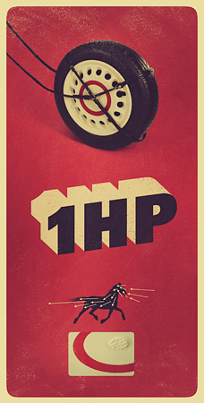
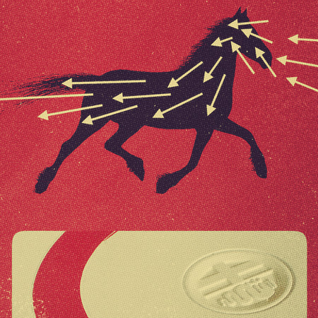
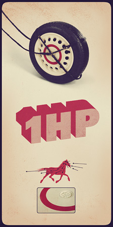
- nice, like the red one (1)neverblink
- Nice work. Horse does a power fart, though...jagara
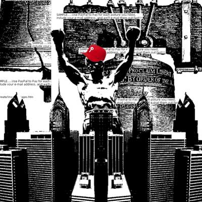
- MSTRPLN0
brainding/design comp for Yes. in the mix

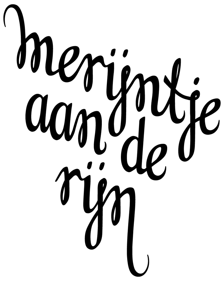
- toe_knee0
new identity. It's my name in Irish

- nice!dyspl
- neat.akrokdesign
- what font is this? niceinstil_design
- really nice. love it.mynameisdave
- thanks guys. Font is Stagtoe_knee
- ross0
branding for a cafe
- bliznutty0
We just launched U.S. Cellular's ToneRoom Deluxe last night. We worked really hard on this project and are very excited!
- e-pill0
inspired from Gundam Mechas..
ZAKU VERSUS EARTH...[for audio track to activate, you must watch in 480p]
:)
- SigDesign0
updated my demo reel... not very PRO but whatever!!
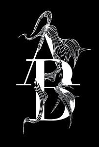
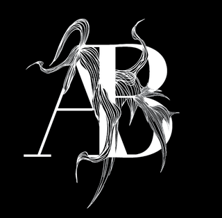
- bulletfactory0


personal identity package - WIP- i love that font for 't.white'e-pill
- yeah nice worktoe_knee
- thanks!! I've been really digging baskerville lately.bulletfactory
- is that what the font is?e-pill
- yes, I customized baskerville semi bold italic.bulletfactory
- letter layout is greatcamer
- thanks!bulletfactory
- flyingnowhere0
Been working on some iPhone wallpapers. Posting them here, http://flyingnowhere.com/
- very nice!!e-pill
- drive to austin and 1920s is DOPE!!e-pill
- Thanks!flyingnowhere
- flourishes and guns is nice too!bulletfactory
- Benefit is spelled wrong in the left column. just thought i'd let you know.MISTERKIJI