Show some recent work
- Started
- Last post
- 8,629 Responses
- mynameisdave0

--------------------------------...
- Achieve looks a little try hard. Love the font in Chicago, but I can't think of the name of it.Amicus
- thanks, might work a bit more on "achieve." And the font used in "chicago logo" is titillium.mynameisdave
- thanks dave. btw, the gradients on achieve are making it look weakerAmicus
- Thanks. Good eye, It's still in development. I'll get rid of the gradients or maybe work on them more for round 2.mynameisdave
- gradients in logos are very 99 designs thing.akrokdesign
- Good to hear. This will be fixed. :)mynameisdave
- pavlov0
Recently worked on a new Dead Kennedys TDTF shirt...
www.pavlovvisuals.com/clients/de…...
- pavlov0
link didn't work for some reason...

- thumbs up!mynameisdave
- i like this song.e-pill
- nice!neverblink
- Would look better in PINK********
- e-pill0
my follow to my vid above..
then with this one..
soon hopefully ill learn camera tricks and zoom and stuff and panning so i can make these lil videos so much more dynamic..
:)
- marindsgn0

- i like********
- like itdyspl
- What font is Fun?adren
- very cool,
what is the font`?flint - yes great lookMachuse
- STRATUM
http://processtypefo…marindsgn - You have some fantastic work on your site, marindsgnshapeaspect
- nice...utopian
- woof! this stuff is nice.akrokdesign
- thank you guysmarindsgn
- i dig this, hardcore style.********
- i like
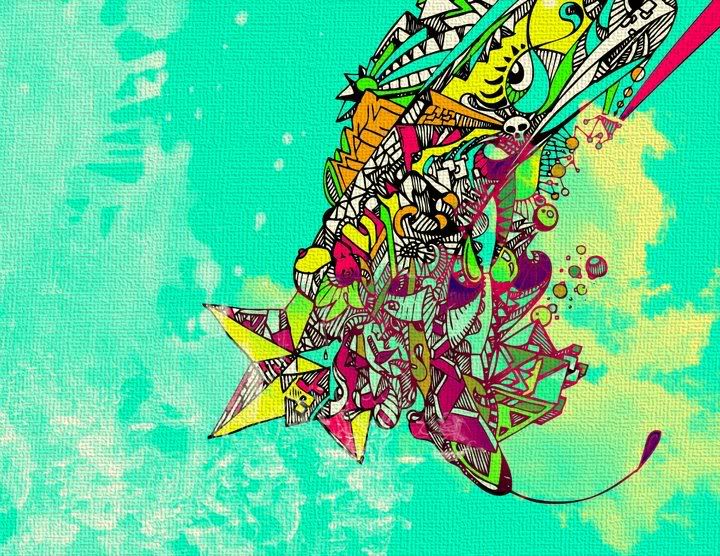
- aanderton0
Got bored at work so I figured I'd try something random for general pratice. Never designed anything like this before :S

- practice***aanderton
- nice. it 'pops' :Ptoe_knee
- background sucks********
- It's pretty much plain white??aanderton
- nice ... cool ideaMachuse
- yeah, nice.akrokdesign
- very nicesofakingbanned
- not to be a marketing douchebag, but the coke bottle is so iconic, i feel like the design is missing that.dirtydesign
- mynameisdave0
Name changed:

Think it's done. Apparently they're having a Chicago agency do spec work for the project as well. The web designer and PM are pushing my work as they'd rather work with me over the chosen agency, so at least that's good to hear.
- Very nice.crnatrava
- you probably has nothing to do with the name but they sound like they will killlllllllll yaH!akrokdesign
- lol. Found out I'm meeting with them on Tuesday. We'll go from there, if I live.mynameisdave
- good luck, dave.akrokdesign
- Thanks! Meeting went well, except they want the skyline incorporated into the logo instead of the icon I came up with. :(mynameisdave
- theredmasque0

- Got a bunch of work at the Three Ravens Gallery in Ardmore, PA for the next six months or so.theredmasque
- ********0
- light being (Carl Sagan)
I'm having a show of 15 photos @ Radisson Warwick Hotel in Philly for six months!******** - cool job on the show! like the texture on this pic <theredmasque
- light being (Carl Sagan)
- e-pill0
i just finished making this mix up.. from adobe illustrator for a all spinning logos.. then brought into modo from luxology and turned into 3D objects.. animated each mini clip separately at different frame rates as im just learning this whole timeline thing and 3D and animation i never did b4 so check it out.. also audio is made by a friend of mine.. if you like that i can give you his details.. he is a professional.. so here it is random 3D renders of the day[s]..
[this was my first editing of anything with audio and visual, i laughed at it during the middle and the end and stuff, i hope you do too..]
- opps.. took it down by accident..
ill make a better one..e-pill - Have you re-made yet?slappy
- yes, here it is:
http://www.youtube.c…e-pill - thanks for the support!!
:)e-pill
- opps.. took it down by accident..
- Ambushstudio0
Fanzine for this art project we collaborate with, we also did T's and some art direction in the premises.
more here: http://www.proyectosultravioleta…


- on the premises sorry...Ambushstudio
- nice!ntimm
- Thanks man, did you see the site? we did that too...Ambushstudio
- Cabein0
New Print
An illustration of another realm, depicting inevitable destruction and degradation, but somehow beautiful and entrancing at the same time.
The Reaper itself is neither male nor female, but only reveals itself under a hooded garment with a glimmer of light shimmering through it's right eye.
The light from the burning torch falls on the driver, a greed infected fallen maharaja who is a subject of a dark destiny, causing total destruction wherever he goes for eternity.72cm x 94cm
Digital hi-quality print, stretched canvas on a 5cm thick wooden frame
Stamped, signed and numbered.


- this is really really really intensely awesome!! i love it!! great details!e-pill
- cheers more pics > http://www.cabein.co…Cabein
- I really love your work.theredmasque
- nicejuhls
- mynameisdave0
Wrapping this up an album cover and the initial design direction:
Final variations:


And I had to change the icon to the Chi skyline on this one:

I was happier the alternative icon, but this is the direction that they want to go. I guess I can live with it. :/- Chicago Logo turned out crap. your original was a million times better. clients are cunts and should die.********
- haha. Yeah, I have to play with it a bit. I'm a little upset that I have to ditch the icon and go with their rather generic idea.mynameisdave
- Chicago Logo turned out crap. your original was a million times better. clients are cunts and should die.
- Kiggen0
work for a Russian Diamond Miner

Work for Cultural events in Antwerp

Published

- theredmasque0

"Augury Ex Avibus"
12.6 x 16.7 inches, Mixed Media on paper.Original up for sale on my Etsy shop. This was partially inspired by the artist / designer William Morris, whose work I admire.
- nerrdboy0
- footer needs some love- looks as if it was vomited on the screen. everything else = gooddoesnotexist
- I like, was the issue of the navigation being at the bottom and out a standard viewable area brought up?rayborn3000
- no offense to you but that game looks like the antithesis of fun.MISTERKIJI