Show some recent work
- Started
- Last post
- 8,640 Responses
- jerkyjake4
From most recent project: How an Electric Guitar Works
https://general-animagraffs.netd…
Here's the full thang:
https://animagraffs.com/how-an-e…
- antimotion2
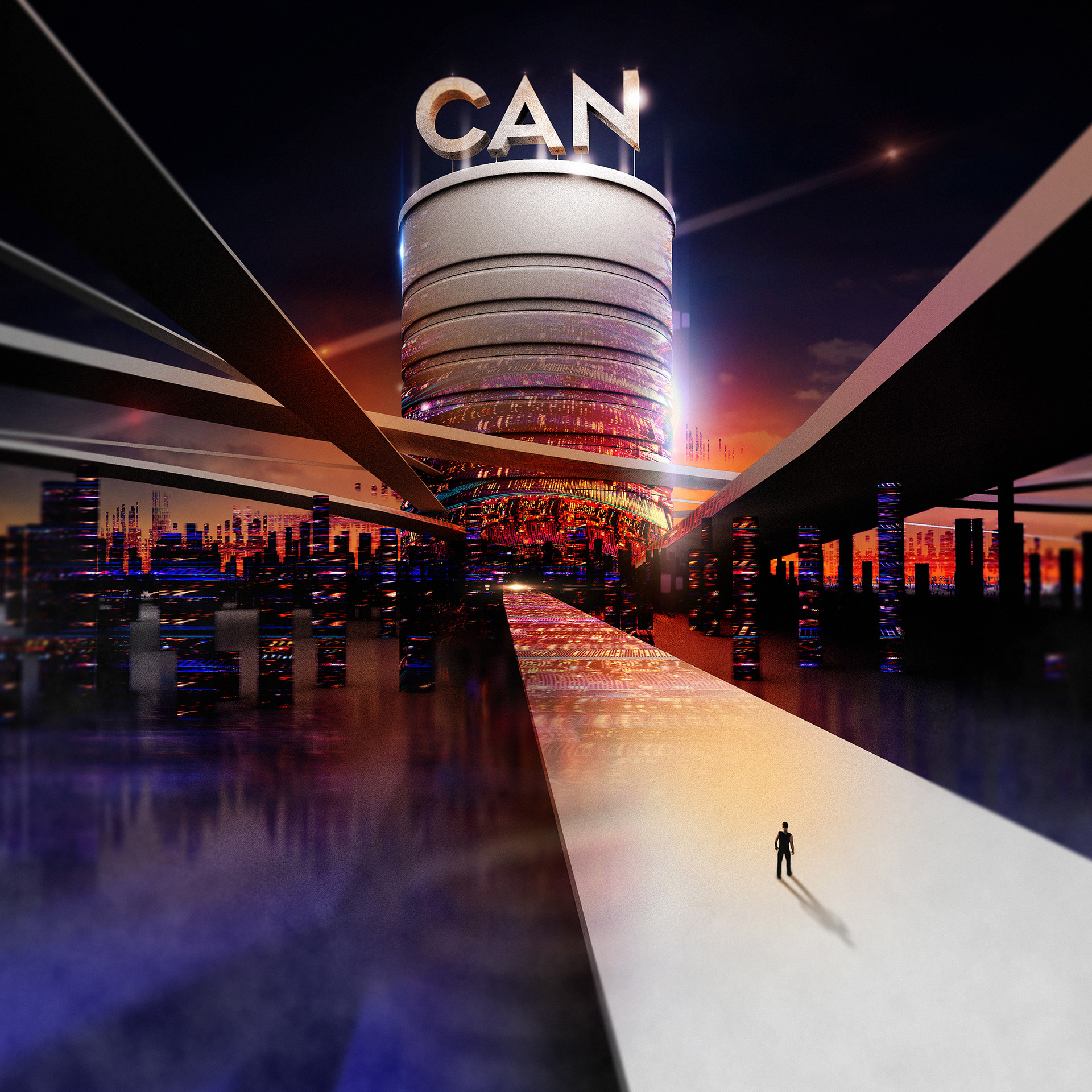
I was honored to donate artwork to the DONATE A CAN initiative created by Juniper Jones and City Harvest.
From Juniper Jones: "The can, so simple in its construction, a beautiful symbol for the promise contained within: food. At Donate the Can we’ve co-opted that symbolism, turning art of our favorite cylinder into actual donations for people in need.
We partner with artists and creative collaborators from all walks of life to render cans as they see fit, creating eye-catching, provocative imagery with the power to engage, motivate, and drive people to the DTC cause."
Find out more about the project and how you can help here: www.donatethecan.com
- pinkfloyd3
- Really nice to see the ills animated!antimotion
- Good stuff!PhanLo
- Thank you!pinkfloyd
- misterhow12
- 2Hayzilla
- 3Salarrue
- 1hans_glib
- 3HijoDMaite
- 3drgs
- 1monospaced
- Can'd decide 1 or 2 - leaning towards 1 - great mixantimotion
- 1Gordy22
- 3GuyFawkes
- 2pinkfloyd
- 3shapesalad
- 3WhiteFace
- Nice work, 2 is my fav :)mrAtor
- 3Gnash
- 3 pleaserobthelad
- Usually would go for 1, but 3 seems more fitting.PhanLo
- CMYK No2microkorg
- pango says "Nomba Won"pinkfloyd
- 1 for Xmas, 2 for the rest of the year.garbage
- Sick work, btw.garbage
- 3renderedred
- it's a tie between 1, 2 & 3. All are rad AF!fooler
- 3e-wo
- 2imbecile
- 3DRIFTMONKEY
- 3prophetone
- 1 - 4 votes
2 - 5 votes
3 - 11 votesimbecile - 3sted
- I like all 3 :)Ramanisky2
- 3, kindly.notype
- 3. Though 2 got that late 80s skate vibe which is A+inteliboy
- 3SimonFFM
- I like the simplicity of 1's colour palette, but I also like the richness of 3's.Continuity
- 1 or 3 here. I can't stand CMYK colour schemes — makes me think of shitty printing companies.detritus
- I feel like I'm taking a pysch test during these color questions.CyBrainX
- 1Jaline
- Miguex6
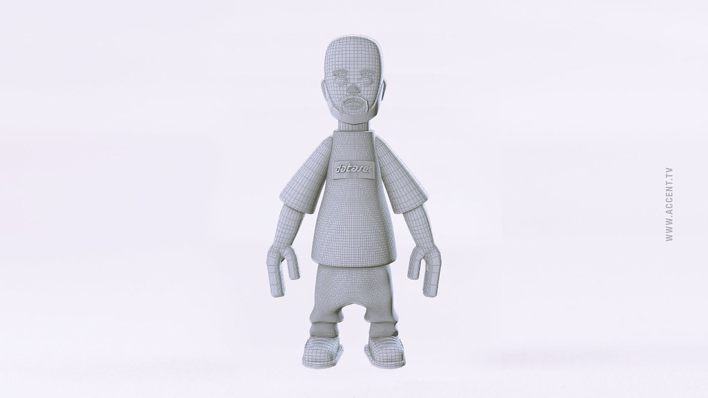
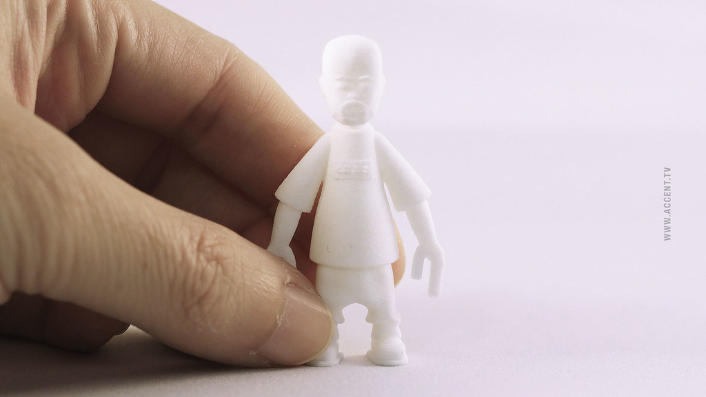
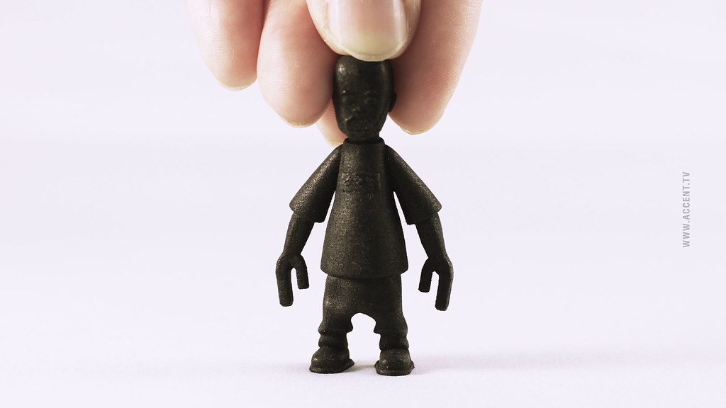
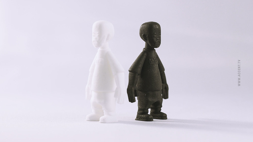
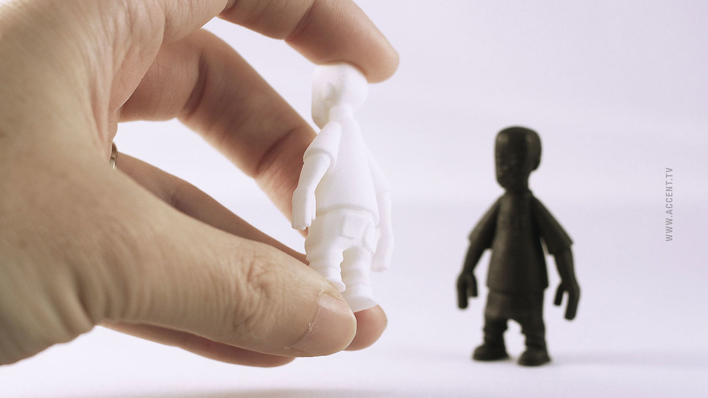
- Looking to make these in color, small run, possible resin or plastic, if anyone has experience. 3D Printing is nice but want a different lookMiguex
- Looks cool. maybe do some blanks, and have different invited artists paint them up, to increase the appeal/value.dopepope
- you could have those tumbled or vibro polished to further smooth their finish. applying a clear to seal the surface will create a smooth surface to paint on.imbecile
- they look greatimbecile
- thanks guys!
maybe I can try painting them myself?
is there a way I can transfer a logo to something like this? Painting it would be hard w so much detail...Miguex - I guess I can use something like this
http://customrubontr…Miguex - ^ Make a logo stencil?
Good enough for Banksy ;-)Hayzilla - @hayzilla at this size I would need to laser cut it, some of these transfers are pretty complex, I'm not sure it would workMiguex
- rubber transfers. girls use them all the time to do their nails. it's how hot wheels cars are painted.imbecile
- have your images etched into a piece of metal and you'll be good to go. https://www.youtube.…imbecile
- interesting, (rubber transfers) that sounds like production for those would be at least 500 thoughMiguex
- The metal thing could work, would look into it, thanks!Miguex
- You could do them yourself if you can get the metal etched easily enough.imbecile
- 1Jaline
- whoops wrong post hahaJaline
- de4k8
Latest in a series of prints based around the Peak District in Derbyshire, England.
http://www.totallyokay.shop/
- face_melter18
One of my images was used by Fabege (one of Sweden's larger property devlopers) for the front cover of their annual report. Didn't know about it until just now.
It still has posters for Unsane and Black Flag's Nervous Breakdown ep in the window, the DeLorean from Back To The Future, and a Henry Moore sculpture in the foreground. They clipped out the Deafheaven poster on the right.
- (it's their building, btw. they didn't just choose it at random)face_melter
- that's awesome :)Gnash
- has anyone ever noticed?Gnash
- hehehehe, veygüt!detritus
- lol @ the DeLorean...OBBTKN
- No-one has noticed or said anything. This client is fastidious and will act out if something is wrong - they have a dedicated PR / design team to check things.face_melter
- Err ... was the image nicked by the company?Continuity
- One day you will go too far, face!Gnash
- hahaha, that is incredible.kingsteven
- @cont. Nah, we designed that building and did a few images as part of the job. They own the image rights.face_melter
- @gnash. Yeah, I don't do it for every image and never maliciously - always as part of the content. I like to use odd things rather than bog-standard images.face_melter
- keep on, keeping' on :)Gnash
- Hehe, nicemaquito
- Next time, maybe a well-placed silhouette of a chap having a wank in one of the windows will pass the sniff test.Gucci
- Render? That middle car is tiny.Hayoth
- nice!SimonFFM
- AceMrT
- feel17
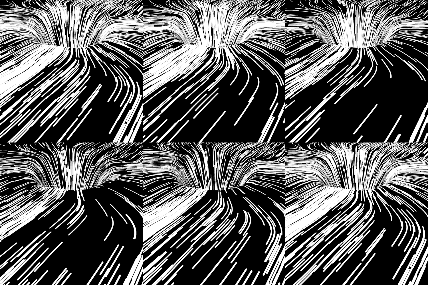
my second attempt in making an animated version of this http://brendantheblob.tumblr.com…
- < http://fmahalem.tumb…feel
- Goodness gracious!detritus
- awesome dude!********
- Crazy!yuekit
- Great work as always, Feel.
How did you get that to loop?CyBrainX - dope dude!Miguex
- used a simple particle loop, where you comp the end of the simulation with the beggining https://www.youtube.…feel
- KillerRamanisky2
- great!renderedred
- Excellent. You know it’s good when it would be upvoted on at least 3 threads...MrT
- Sweet bg to throw some characters on********
- Those characters would be in trouble. Like the guy dating my girlfriend's sister.CyBrainX
- Are you after her sister?********
- No, the sister is an identical twin except she's an evil vortex of pain for those weak enough to succumb to her black hole misery.CyBrainX
- Ah. The evil one.********
- mutanthands6
- Some fun stuff for t'gram- https://www.instagra…mutanthands
- dino burger?
wait!!! it's a turtle!!!********
- pinkfloyd5
- me gusto.detritus
- This looks like a sketch for the character DopePope did, 5 posts up ^CyBrainX
- Same movie character.monospaced
- pinkfloyd2
- Kinda hot. Looks like my ex-fiance********
- here's the tits in hd https://imgur.com/a/…pinkfloyd
- Meh********
- Kinda hot. Looks like my ex-fiance
- BGNmcr0
Slight update to our site at www.bgn.agency (few bugs being ironed out this weekend before a full launch early next week), but more importantly, our first showreel with the work we've completed in our first year as an agency:
- love the work. not crazy about the soundtrack.Gnash
- the work is quite thoughtful and the music seems a bit discordant to that. perhaps just a taste thing. lovely stuffGnash
- Love the site, love your work. You need to drop the Lancashire Farms work at the start on the reel. Not a great first impression and doesn't fit your style.fate
- Like others, I think the soundtrack is a little lame. The editing is KILLER and I understand why the track was picked...fate
- ...that track allows for those edits. But there are other, better tracks out there that will let you do the same sorts of edits.fate
- atomholc4
I finally got around to updating my website ... 9+ or so years.
It's brand new so let me know if you see any edits or glitches. It's also the 2nd website I've made using Webflow and still figuring things out.I always feel like being a "great" designer is always an elusive thing I am chasing because of how good some of you are. I hope you enjoy ...
- need to proof read it
udda:"We’ve worked from small-scrappy"
worked for
med republic: "Over fives years ago"
five
"his families medical"
family'shans_glib - nfl host: "to coordinate and manager their"
managehans_glib - ohhh.. thanks... on it. My GF usually proofs reads but she is travelingatomholc
- Thanks Hans, got it fixed already.atomholc
- i spotted others on a quick flick thru so check it all thoroughly would be my advicehans_glib
- I like the illustrated bits a lot. The one thing I found that was off was the "Art Is Everything" piece being squashed beyond the left edge of the browser.CyBrainX
- I shoulda known hans' eyes would be drawn to The Udder.detritus
- to be blunt - if I was looking for someone to do my site, your entire front page and its chaotic insistence that 'art is everthing' mantra is a bit off-putting.detritus
- Your portfolio of work is very good, and skirts both creative and blunt professional... although the reliance on so much movement is a bit trying.detritus
- Also, and really not trying to be a dick - if your site has four means of navigation (inc. top nav list and scrollbar) something's not brilliant.detritus
- Good work, and cool creative, though - i just think the merging might be dissuasive to similarly-miserable cunts as I :)detritus
- I could've made my website 'normal' .. but that's not my style and I like to take risks. Even if I don't always pull it off.atomholc
- I get your feedback Detritus... i would have never made this site for a client. Why would I make a chaotic experience to represent myself ... not really sureatomholc
- Thanks for taking the time to look :)atomholc
- i love this, navigation arrows are fucking my retina but yeah, fuck yeah :D don't care about what these old dickheads sayin' lol. (it's fucking awesome)sted
- I enjoyed scrolling through it on a phone. Only found two ways to nav and had no problems there. only issue is I don’t know what you did on each project.monospaced
- You just link to other company home pages ... does that mean you designed everything on each? Just the site or also branding? All pages?monospaced
- Maybe a little paragraph on each and some images of what you did, in case the company sites change some day. I dunno.monospaced
- @mono, good advice on the copy, will update ... I can be overly ambiguousatomholc
- Its fun and flashy but a bit inefficient and confusing.********
- Thanks docpoz, I get your feedback. I was just having fun and went with it being messy, slight confusing has always been in my style for whatever reasonatomholc
- not necessarily something that always works ... but I know how to separate my personal style from professional work most of the time :)atomholc
- Thanks again guys ... when I am not being pulled away for client work I am going to continue to evolve it.atomholc
- Best of luck to you. It aint bad.********
- A mi me gusta! It might turn some people off but I think it shows tons of personality and it's very refreshing in that sense. Typography could be stronger.canoe
- I noticed a few images won't load the first time on mobile until refresh, incase some you think some of the design is messier then it should be. Trying to fix..atomholc
- need to proof read it
- face_melter3
- That's it, call the folks - you've made it.
Nowhere else to go.detritus
- That's it, call the folks - you've made it.
- mutanthands6
- Jeez, I've seen a lot of your work and love it but this one is so solid.
https://www.instagra…CyBrainX - Thanks a lot, appreciated. Breaking out the old classic there :)mutanthands
- Yea lovely stuff man********
- Jeez, I've seen a lot of your work and love it but this one is so solid.
- Longcopylover4
- A shortfilm we created for Grand Basel, the show for automotive masterpieces in the high-end sector, curated by leading experts in the field.Longcopylover
- Really nice work - that dude can say anything and it will sound badass smooth!antimotion
- wtf, so cool!SimonFFM
- Wow, Lancia Sibilo ?? So weird to see one being actually driven, well done!spl33nidoru
- Is anyone of you going to Grand Basel? I just asked my father if he wants to go with me...SimonFFM
- Thanks for the kind words.
Elba was really nice. Not just a "star", but really professional.Longcopylover - The Sibilo is so weird but so cool. There is a Ferrari Dino engine in it and that makes it sound like petrolhead-heaven.Longcopylover
- Simon, I sure will be there. It would be nice to see you there.Longcopylover
- Thanks for the additional info. I'm tempted to drop by if I'm able to then.spl33nidoru
- Nice! I've worked with Elba, honestly the nicest and most talented person I have ever met. Came out, nailed it in a way that drops everyones mouth & walks offmugwart
- good stuff long!mugwart
- He really is. We had to record the voice-over in a hotel room in the night after the shoot. He just nailed it and made some versions for safety. Very pro.Longcopylover
