Logo of the Day
Logo of the Day
- Started
- Last post
- 821 Responses
- i_monk1
- the typeface isn't doing it any favours but that logo is great._niko
- those mockups are horrible. only good thing about this is the symbolmilfhunter
- It's not mockups of the day is iti_monk
- symbol = clever intern willing to take the riskgrafician
- @i_monk A logo is more than a symbol..milfhunter
- A logo is not the mockups it appears on.i_monk
- A Symbol is made to be placed on objects to communicate.milfhunter
- The R-arrow is a nice mark. Not to be a cunt but, the arrow is indicating circumference not radius.microkorg
- The arrow literally indicates a cycle.i_monk
- Dickbutt.lnu
- grafician-9

- instagram is not transforming into Threads. those are 2 different appsmilfhunter
- threads is part of instagramgrafician
- https://media.tenor.…hydro74
- You can change the colour (and texture) of your X icon. it isn't fixed to black.microkorg
- Krassy4
- Ca?Krassy
- Ga?utopian
- https://imgur.com/a/…MrT
- meta tying itself in knots trying to remain relevanthans_glib
- Not available for EU folks?crazyprick
- Balloon Knotrobthelad
- 6a or a6?nbq
- my Uber driver's "fastest route"Krassy
- heck of a buttholeGucci
- Cagmaquito
- CA = Cat's assholenylon
- https://i.dailymail.…Krassy
- CacaOBBTKN
- Kinda dig it, can actually see people I follow vs that tic tok wanna be random shit. fucking hate instagramhydro74
- The overhang is outta whack w/lower-right—looks like it would roll over. So I gave it a try... https://www.threads.…ptrdo
- If you delete your Threads account it also deletes your Instagram account for some reason.Nutter
- .net lolslappy
- i likemilfhunter
- _niko1
What say ye, Qunts?

- I don't see the connection to kickball.i_monk
- 4 LALIGA?oey_oey
- Y LALIGA?oey_oey
- Satander?oey_oey
- Fine, it's no Premier League tho. Plus that LL icon - players skidding on knees after scoring - is that more a Spanish league thing than in the others?MrT
- distancing themselves from the rainbow motiffaxion
- the font is nice but the I don't like the symbol on the left. What's supposed to be? LL? Y? U?NBQ00
- The U from Unreal engine but it supposed to be a double LL?milfhunter
- The LL represents a player sliding on knees after scoring.MrT
- the new one is a better markmonospaced
- https://ih0.redbubbl…Krassy
- The old one looks a lot like Picassa.CyBrainX
- 4 LALI6AKrassy
- I LLike itstoplying
- www.laliga.com - What a mess of information!!!ideaist
- Y la liga?Miesfan
- maquito2
Oh ffs! Really?!

- Suggestive...i_monk
- Surely they've been hacked?
₩∪⟂Nairn - ok, so which bullshit movie dystopia timeline have we slipped into this time?Nairn
- https://twitter.com/…
https://twitter.com/…imbecile - Sadly... some agency got a lot of money for this redesign.hydro74
- So it beginsskinny_puppy
- its about that timeautoflavour
- Metal Goth band?OBBTKN
- is this one of them magic eye things that if you squint hard enough you see a swastika?dee-dubs
- lolmilfhunter
- wokeneverscared
- They got infiltrated by Russian Propaganda Artists.uan
- Actually being it the Opinion Section...on second thought, I think it's clever af.uan
- it's on all their accountsimbecile
- not only Opinion got red...not so clever after all
https://i.imgur.com/…uan
- milfhunter1
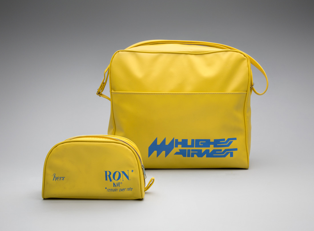
Hughes Airwest by Mario Zamparelli
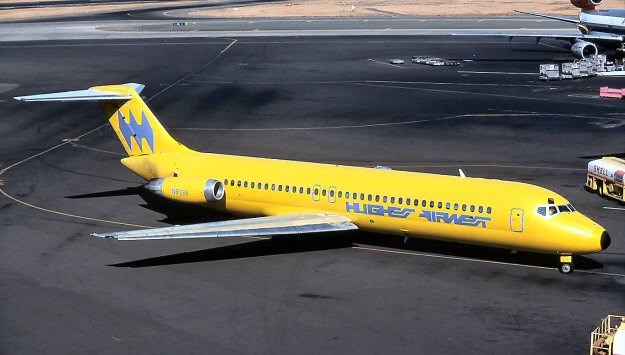
- wow, that's....shitscruffics
- You are shitmilfhunter
- what scruffics saidoey_oey
- what milfhunter saidoey_oey
- what oey_oey saidIanbolton
- what Ianbolton saidutopian
- I can’t unsee the Batman logo on the tail wing.Green_Pork
- I kind of dig it. It’s like when AI is trying to make letters but they come out all gibberish. A brand before its time.monNom
- what they saiddee-dubs
- The Hughest, the biggliest, the airwest.
— RonNairn - what utopian saidKrassy
- Slight Wipeout vibe(s).ideaist
- I think this was great back in the day and it looks kind of cool now. Or everyone's just biting the style from that era now._niko
- Feels over designed — a bit of cleanup and it would work better. But good luck with that word mark at small sizes/pixels.evilpeacock
- there were no smaller sizes/pixels in the late 60's they didn't even have to worry about yo fax! lol_niko
- there is not a way in which this is NOT shitscruffics
- what Krassy saidsted
- WIPEOUTcrazyprick
- If batman did a hostile takeover of QFC.garbage
- Late 60's small sizes = heavy dot gain killing fine details.evilpeacock
- What yurimon saidmaquito
- Na, i likes it, 4 realzmaquito
- If you said to me that it was made in 2001, I would have believed itdrgs
- What I don't get here is the bat symbol on the back of the plane is not the same logo as on the larger yellow bag and the smaller yellow bag is the same colorsCyBrainX
- ...but completely different type and logo.CyBrainX
- That is ass that makes the shit, nice swedish colors thoughAQUTE
- that looks bananapango
- Highest Air Wet?sab
- AirwolfCalderone2000
- This is neither WipeOut or particularly good.MrT
- _niko1
More like logo rip of the day
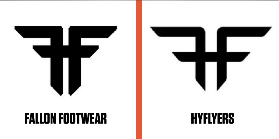
Argentine street wear on the left, Phil Mckelson’s golf apparel on the right
- Fallon is suing them for using their 20 year old mark._niko
- Nazi feelnbq
- HYFlyers is owned by LIV...try'n to get that Saudi money_niko
- It's actually Fallen Footwear and it's an America Footwear company started by Jamie Thomas but yes it's a total rip.dbloc
- I stand corrected, maybe the parent company is Argentine https://www.espn.com…_niko
- and this makes it 1000x worse, one thing if it's an obscure Argentinian apparel co and another if its an iconic American skate brand_niko
- also apologies for coming off as such a fucking poser lol I was basing it off that shitty ESPN article that didn't even name Fallen Footwear, had to dig (poorly_niko
- Boneless!canoe
- fooler1
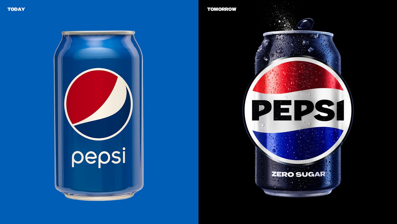
- I hated the last redesign. I can't believe it was 15 years ago. I remember tearing it apart here back then.fooler
- The new one for me says "unapologetic enjoyment" so clearly.shapesalad
- I can't unsee a fat red shirt and white gut hanging over blue pants on the old one.
I've always like Coke better anyways.fooler - Welcome backgrafician
- So immediately
Forgettablemonospaced - This is definitely an improvement, despite it looking like the logo of an Italian automobile manufacturer.MondoMorphic
- https://www.undercon…milfhunter
- anything is an improvement after the last atrocityKrassy
- The first batch of Coca Cola was brewed today in Atlanta in 1850-somethingstoplying
- LET'S FUCKING GOOOOcrazyprick
- Sooo much better!scarabin
- waaaaait a minute... how come I live in a country where they still say pepsi maxArchitectofFate
- faxion1

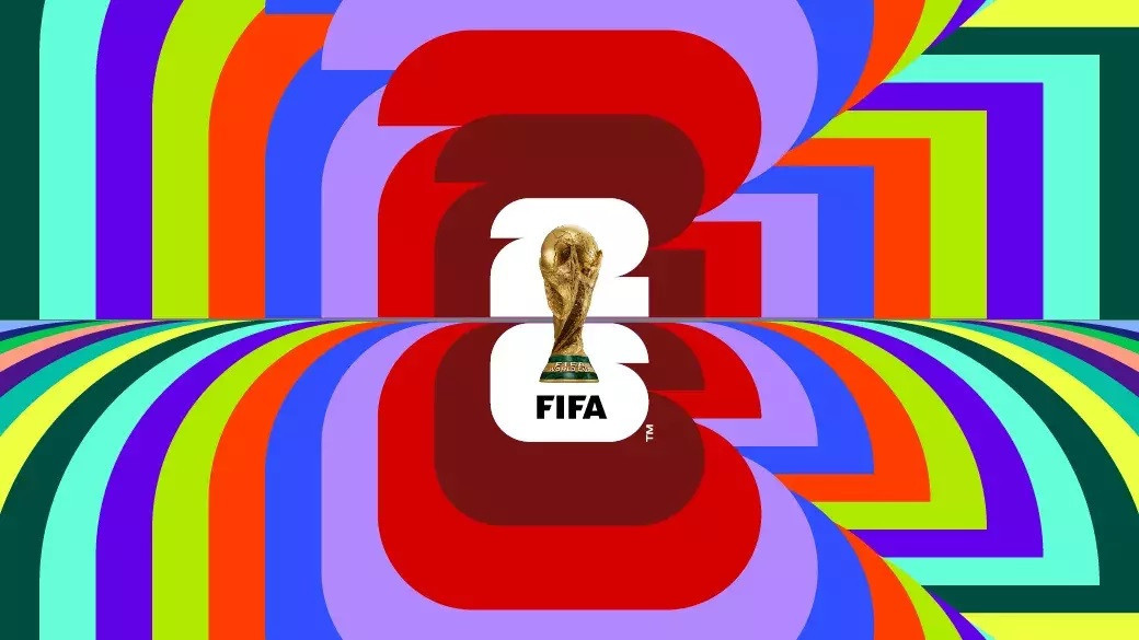
- Oh.
No.
Just, no.Continuity - The 1960s BBC called, they want their idents back.Continuity
- What the fuck is this? A billion dollar corrupt as fuck org. And this is the best they can afford?_niko
- Horrific, right? It's not going to make watching the WC on TV very much fun.Continuity
- Oh.
- uan1
- They got it right in 1975.comicsans
- Yawndbloc
- That egyptienne font really gives me a limp zucchini. What a senseless combination.stewart
- lego space called, they want their logo backtrooperbill
- It already feels dated.utopian
- love the vid, logo doesnt feel magical trusted or innovativeHayoth
- that said, the original logo was an ass sandwich with a side of shitsaladautoflavour
- logo looks outdated.milfhunter
- A bit meh really. When your story starts with the original SW trilogy and arrives at The Dial of Destiny, your brand needs a boost alright.MrT
- clipartimbecile
- IBMmonospaced
- _niko2
just came across this today, it's been around since 2018 but I never noticed it before, quite like it.

- the tour could use some love maybe but I dig the atp_niko
- Looks like a 90's ISPfadein11
- You like the gradient and shape in the racket?bainbridge
- I've seen it solid somewhere but couldn't find it to post which for sure is better, but the shape in the racket is fine, lines up with the "p"_niko
- and a huge improvement of hat they had before https://www.atptour.…_niko
- 1990's version was dopescruffics
- I like this, there's enough energy it almost don't need no gradients.MrT
- I likeKrassy
- grafician-3

- Supermarket own brand?faxion
- I worked on the previous rebrand back in 2005 I think.monospaced
- Fanta rebranded several times in the meanwhile, but okaygrafician
- The logo I helped designed in 2005 wasn’t altered until now. Okay.monospaced
- In fact the artwork is e developed wasn’t changed hardly at all since then until now. What the shit are you talking about?monospaced
- _niko0
just came across this today, it's been around since 2018 but I never noticed it before, quite like it.
- grafician-7
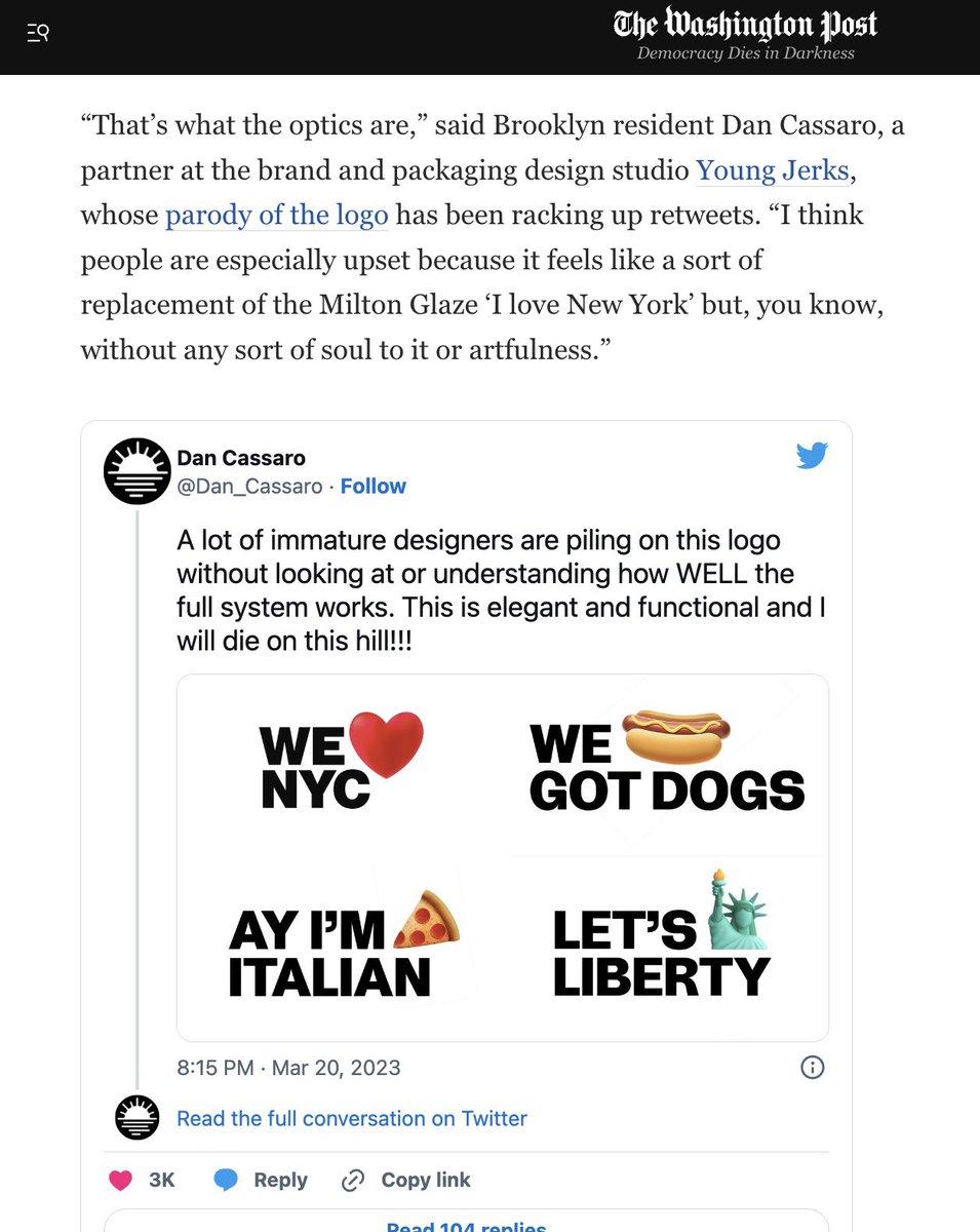
- the full system doesn't even work -» Ay' Im pizza slice italian?hotroddy
- we hotdog got dogs?hotroddy
- https://www.youtube.…MrT
- This must be a joke. The other three are all progressively worse. The Italian one looks pretty stereotypical too. None of them are even coherent sentences.CyBrainX
- I guess this is the next step for a society that embraces emojis.CyBrainX
- it is a joke guysuan
- https://pbs.twimg.co…aliastime