Logo of the Day
Logo of the Day
- Started
- Last post
- 821 Responses
- Gardener0

- https://www.youtube.…Gardener
- cue Benny Hill_niko
- I always saw this in front of danger mouse as a kidscarabin
- sted4
- sure, why not_niko
- I likeGnash
- Ew. I guess this is for the 'real' Nokia, not the phone brand, mind.Nairn
- iPhone Kiler 2.0utopian
- I like it.i_monk
- Smooth. I like it.CyBrainX
- missing bitssab
- Cutting edgemisterhow
- I'm nokeenMrT
- I wonder if the young kids who never heard of NOKIA would recognizeAQUTE
- Made with Flash™OBBTKN
- i dont hate it.milfhunter
- NO CIAgarbage
- KIAdbloc
- I can dig itscarabin
- sarahfailin-3
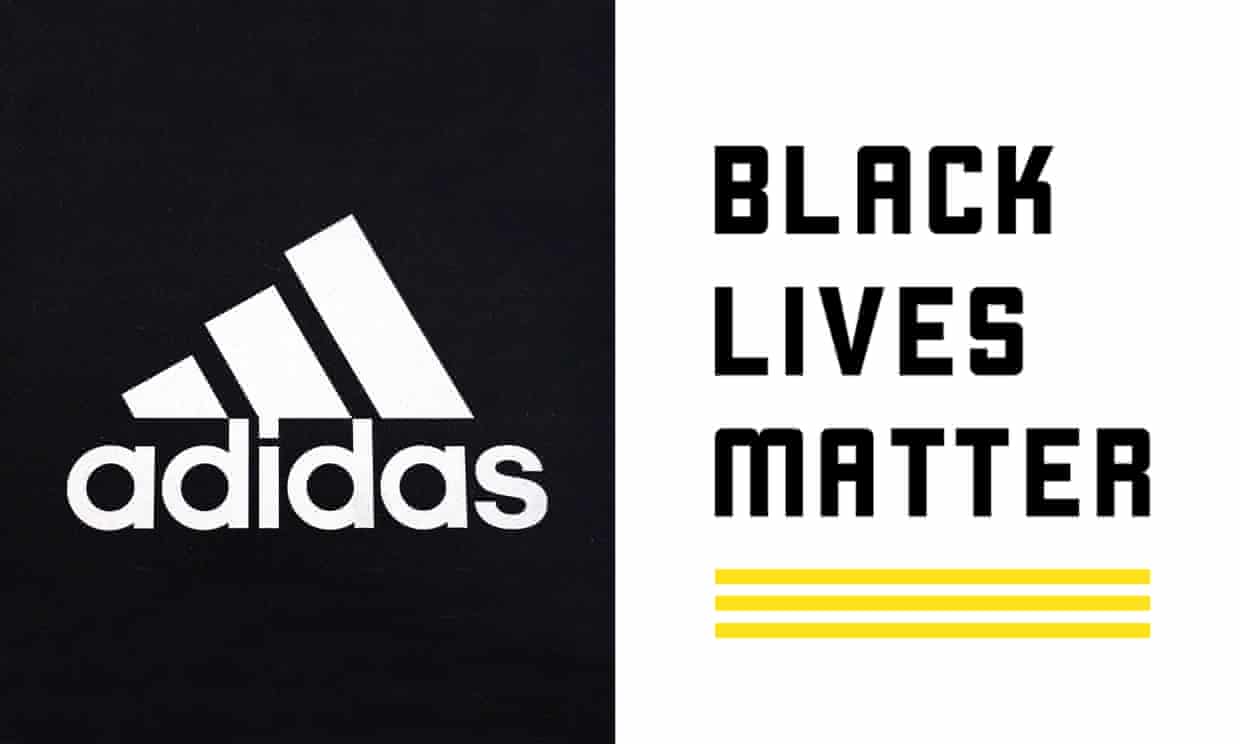
Adidas (apparently run only by white people) finally drops lawsuit against Black Lives Matter for using a logo that has *gasp* three stripes. Only adidas can use 3 stripes y'all, watch out.- Stupid lawsuit. I'm guessing the 3 stripes are 1 for each word.dbloc
- BLM is just giving adidas free publicity. Why would they use such an overtly adidas design?_niko
- This is trademark law. Defend it or lose it, even if nobody would reasonably make a connection.i_monk
- I would imagine it's more about their clothes. they have a pointGnash
- BLM is a business, tooGnash
- how are these the same? they are very not the same.sarahfailin
- Yeah, BLMGNF applied for a US trademark for a yellow three-stripe design that could be used on branded merch like cothes, bags etc.crazyprick
- They are also getting back with Kanye 'cuz they can't sell shoes without him
Chumpsgrafician - three stripes across a tennis shirt or hat would be interpreted as adidas.hotroddy
- *couldhotroddy
- grafician: source?crazyprick
- Just Do Itutopian
- 3 white stripes on black fabric are def Adidasdrgs
- "Adidas lawsuit is an example of systemic oppression and appropriation of a cultural symbol used in the blaxploitation of the urban community" - BLMhotroddy
- BLM is one big scam anyway.milfhunter
- you old white people understand nothing.
the stripes are *yellow* -- they can't copyright 3 stripes in any fashion.sarahfailin - Adidas use those 3 stripes everywhere. It's clearly their brand, no different than the Swoosh.formed
- sted1
- Ha! if your art board doesn't look like this, you're doing it wrong. versions on versions until you get something you like.dbloc
- half of them aren't even ravensscruffics
- more then half of the sketches have 1 raven while the name is 2 ravens...milfhunter
- whatthefunk7
- No one asked for this and everyone hates it.CyBrainX
- it was made on windows just look at the anti-aliasingsted
- David Carson should also work on getting his website secure. It's more broken than this new logo.dbloc
- #wetoodbloc
- you're right, holy shit, what a nightmare w/ the horizontal doom scroll
http://www.davidcars…whatthefunk - Not just nightmarish horizontal doom-scrool, but reams and reams and reams of tiny copy with leading tighter than a nun's cunt on Ash Wednesday.Continuity
- Also, I hate that We heart NYC logo. Fucking hell.Continuity
- Apparently not meant to replace OG logo, meant to be separate campaign post Covid... https://www.nytimes.…whatthefunk
- what the fuckcrazyprick
- Shit logo and David Carson was just a fad.MrT
- WE ❤️ QBN®utopian
- kill it with fireoey_oey
- Can't be any worse?
https://imgur.com/Za…theonlyengineerhere - agreed with him but hate every bit of his work as well.milfhunter
- Flipping through Transworld, David Carson made my day as a young skateboarder.canoe
- @MrT - at least he had fad, that's more than I can say for me. You?canoe
- I'm not famous but I don't see what that has to do with what I think of David Carson's work, which is not that much.MrT
- grafician-6
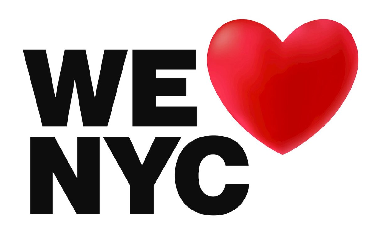
- we nyc + emoji. ok...shapesalad
- https://i.imgur.com/…utopian
- almost reads as 'wince'.
well played.monNom - you know 12 people designed this and 11 of them were from marketing and strategy._niko
- naaamilfhunter
- getting rinsed on Twitterfaxion
- rightlyhans_glib
- shapesalad-7

- from https://www.design-s…shapesalad
- Yikesscarabin
- I cam across them as while watching Bloomberg live stream on YouTube - a YT advert came on, of them.. design-sells.com... so I clicked throughshapesalad
- expecting some top design studio... no... some dude with zero skill and website and some advertising budget. props for trying.shapesalad
- ewMrT
- NBQ000
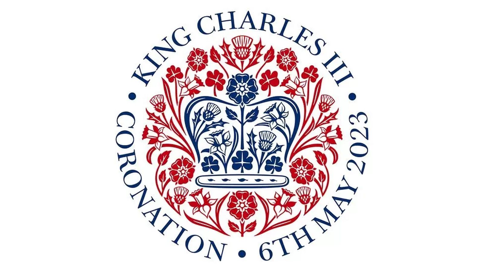
Apple's Former Design Chief Jony Ive Designs Emblem for Coronation of King Charles III (pretty sure not Ive himself but some designer in his new company LoveFrom.)
- its OKmilfhunter
- A distinct lack of heraldic animals.zardoz
- Clip Art Vibes.utopian
- Future commemorative plate.i_monk
- all the things Camilla chews onMrT
- Camilla's got the covid again. Imagine if she died.zardoz
- Low hanging fruit.
Is that a baguette in the middle?grafician - It's a tampon.i_monk
- Works well in single colour/black onlymonNom
- Like a royal Shepard Faireystoplying
- I hope none of you actually think that is a well designed logo.utopian
- I hope none of us think an emblem or coat of arms is a logo.i_monk
- grafician0
Everybody in fashion is reverting?
- it's so lame how they really not go their own way. Constant copy loopmilfhunter
- grafician4
- I like it, nice motion treatment too. Better than the old one from those SomeOne chancers.MrT
- Indeed, one of the better ones so far this yeargrafician
- Me likee. Good that UK does the design contract whilst having absolutely fuck all to do with the actual business. Yaay.Nairn
- So... many... videos...
'tis lovely, though!
#Approvedideaist - The posters are using the same typeface as the logo which used to be a branding faux pas.canoe
- meh.utopian
- that type is blah. the whole thing looks like a freight forwardign company to me. but wtf do i know?hans_glib
- I know what you mean about the type hans. Maybe it'll grow on me, otherwise i do love the icon and it's movement.Ianbolton
- ideaist3
- cool. I thought it was a logo creator from napkin sketches using AI_niko
- ^ It MIGHT be.
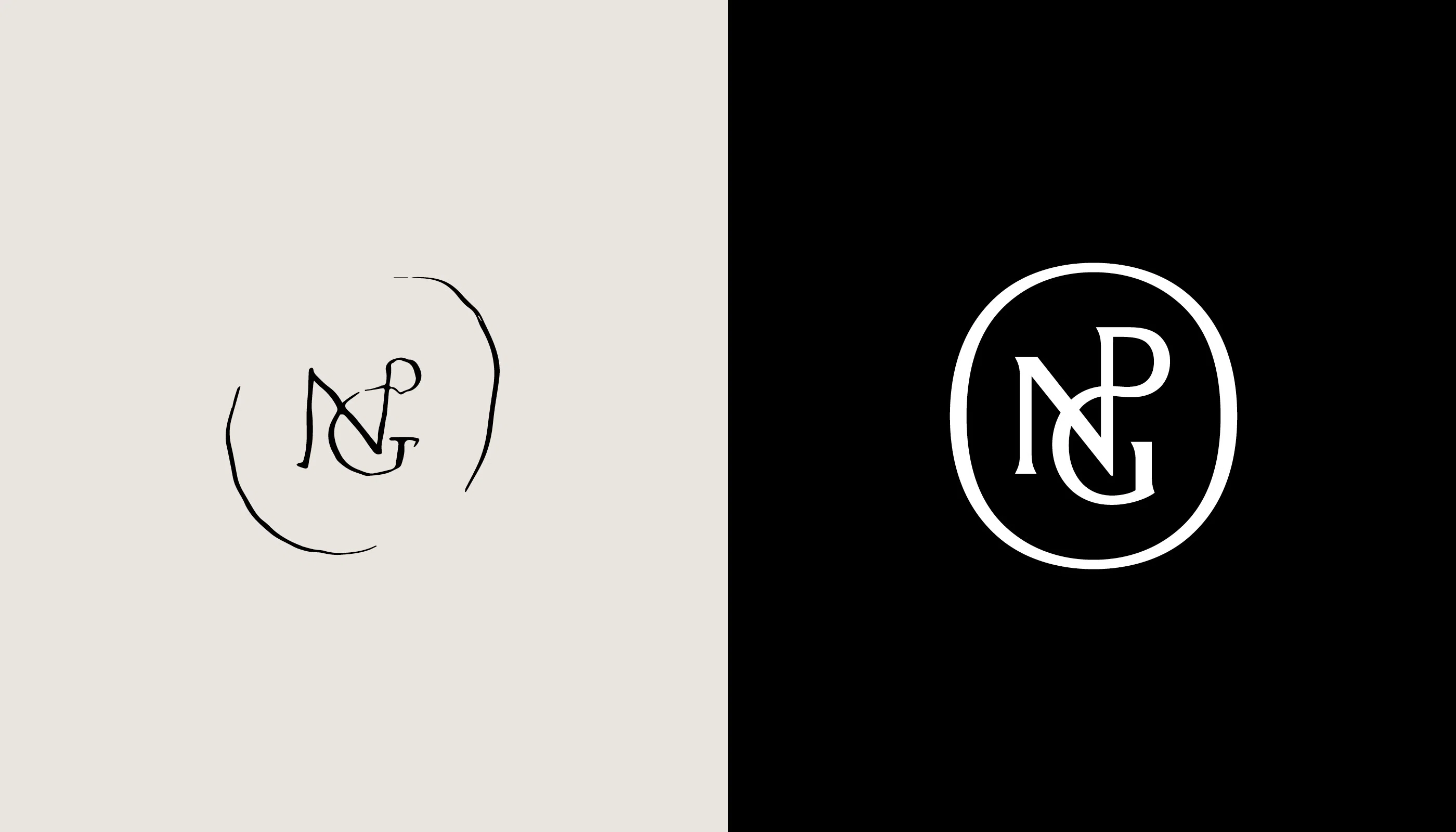
Lolz.ideaist - i get it and I want to like it but something about it just doesn't work. the way P transitions into G (G to P??) isn't smooth and the stem on P is oddly thin.scruffics
- New Power Generation Ƭ̵̬̊SlashPeckham
- grafician2

- That’ll never embroider! Glad to see fashion brands moving away from the monotony of black serif wordmarks_niko
- yeah that's what I thought also
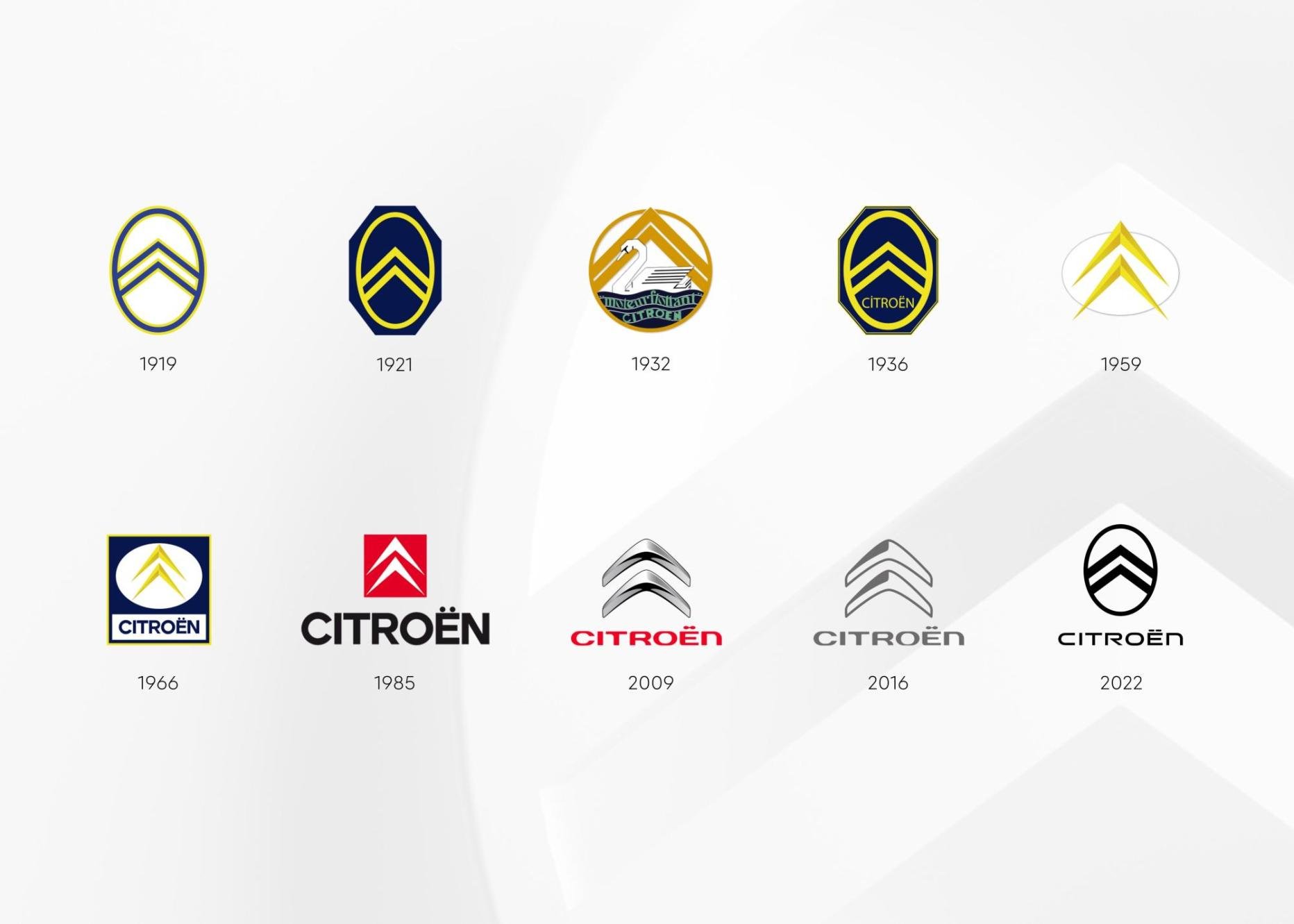
the knight it's a mess!grafician - they used an old version from 1901, basically just retraced the knightgrafician
- That's prorsum!sab
- don't like the knight or their AU$750 Ts.MrT
- drgs-1
OUP rebrand


- removal of lower left serif on the R is unecessarily archhans_glib
- ditto loss of top serif on F crossbarhans_glib
- flol ignore me that was the before...
facepalm.gifhans_glib - ^ haha, i was just thinking which one is the new one too. The one below looks almost cliche graphic design!Ianbolton
- cliche logo is the new one, of coursedrgs
- And just like that, 500yrs of history obliterated .Hayzilla
- sted0

- D ee PNBQ00
- It bothers me that the dots are not skewedrobthelad
- and that I want pizza now. Otherwise I like this little mark.robthelad
- yeah that looks a bit weirdsted
- Where’s the golden section grid?Gnash
- Lol @ "Letter d". That's some tenuous shit right there.scruffics
- arrow pointing downdbloc
- @scruffics, I was thinking the same. Tilted chevron, more like.Continuity
- Tilted Dsted
- that's a laptop or Lego piecesKrassy
- terriblemilfhunter
- But they still sell fatty manhole covers made by dingbats.MrT
- Just a concept, move along
https://www.msn.com/…grafician - Is this guy on twitter "re-designing" famous logos on request for clout, pretty boring stuff
https://twitter.com/…grafician - gfo ppl qbn police is here.
@grafician if you have nothing to contribute, you are just instructing people without any foundation at 3am, go to sleep.sted - sorry, did I embarass you in from of your friends by actually contributing the source of this post? Awwwwwgrafician
- aye so the reason why skip on the source for these post are exactly these bitchy judgemental notes.sted
- Passscarabin
- Unless the dots were also in perspectivescarabin
- Also, dominos‘ legal department said they haven’t had the word „pizza“ in their brand name for like 9 yearstoemaas
- sarahfailin2

- its a pinormilfhunter
- It looks like two butts...or butts made into the infinity symbol, like an infinite amount of ass.MondoMorphic
- sted-1


- not for me. too gamertechNairn
- Needs more FibonacciNBQ00
- Pepsifaxion
- drivlhans_glib
- lol it took them 10x longer to come up with that bullshit grid than it did for them to download the typeface from DaFont.com_niko
- and then there's the reasoning. They left out " the 'I' shape represents our erect cock as we spew verbal masturbation to try to sell this hack job."_niko
- hahahaNairn
- lolutopian
- If ESPN and Pepsi had a child...utopian
- ahahaha @_niko rotfl :D
that verbal masturbation you're referring to was in the brief :) that "bullshit grid" is part of the visual system, and it isn't bad.sted - yesterday I had the opportunity to learn a little more about this project, and one of the expectations was that it should open for young people.sted
- it was done by a kid from Romania who has far more talent and enthusiasm like most people got the opportunity to show their stuff and get feedback at the event.sted
- @utopian ah nice with the Pepsi, I didn't even think :D my first note to the kid was that it looks like ESPN brand :)sted
- Hey sted no disrespect meant to hard working designers especially if they’re kids, I assumed this was done by pentagram Europe or something :)_niko
- lol no worries:) he got far worse comments :D somebody even questioned that he made this by himself. now that was really low and disrespectful...sted
- The rationale is irrelevant when the stroke contrast is that wonky.i_monk
- lol no.milfhunter
- scarabin0
- UK is fucked threadimbecile
- wow. Designer Jewelleryshapesalad
- He spent his life learning jewelry design instead of fonts. Bet he makes more than usnb
- Haha. When it works, it works. Although I don't think comic sans really works here.Ianbolton
- You'd be hard pressed to find a good use of Comic Sans. It would have to be a parody.CyBrainX