Logo of the Day
- Started 17 years ago
- Last post 5 days ago
- 874 Responses
- Gardener-1
- sofas0
Macaques Form Preferences for Brand Logos Through Sex and Advertising [research study]
A further advance in understanding the value of butt recognition:
“Rhesus Macaques Form Preferences for Brand Logos Through Sex and Social Status Based Advertising,” M. Yavuz Acikalin, Karli K. Watson, Gavan J. Fitzsimons, and Michael L. Platt, PloS ONE, vol. 13, no. 2, 2018, e0193055. (Thanks to David Austin for bringing this to our attention.) The authors, at Stanford University, Stanford, the University of Colorado Boulder, Duke University, and the University of Pennsylvania, report:
“we asked whether rhesus macaques (Macaca mulatta) show choice behavior that is similar to humans in response to sex and social status in advertising. Our results show that monkeys form preferences for brand logos repeatedly paired with images of macaque genitals and high status monkeys.”
- imbecile0
- nailed it of the day********
- does it really need the by?nudes
- When the logo idea came before the busines idea.robthelad
- sad / sadutopian
- shite / stickhans_glib
- sha-des / by / des-ign Doesn't at all read shades by design. Plus what is "shades" by "design" ? totally meaningless.shapesalad
- they likely make 'shades' (blinds/curtains) by 'design' (custom).Gnash
- I get what their trying to do, but it doesn't read very well. Its trying to be too clever. Not really a fan.desmo
- Man I struggled to read that! LOL. Time to go home.Hayzilla
- I think it's greatdbloc
- i struggled to get it. didn't even read "shades" I read "sha-des" and was like whutsarahfailin
- nailed it of the day
- Gnash1
- http://rebrand.c21.c…Gnash
- yeah, pretty loose in the NTUmonospaced
- ^ T H I SKrassy
- Yep********
- They've kerned the T from the ends of the crossbar rather than balancing it visually. Basic********
- CEN T URY 21capn_ron
- this is nice.
http://rebrand.c21.c…dbloc - ^ ya, some of the application is quite niceGnash
- Aka how to make a brand completely generic. Congrats...youre a boring uniform of generic modernization.********
- Cunt21, interesting..futurefood
- lol 1979Maaku
- pinkfloyd0
- All of these, except google has a logomark as well. There's no need for unique type when they will almost never be see without their mark.voiceof
- Google's name and colors are established. They don't need unique type.voiceof
- Isn’t it slightly the opposite of the above? Separating the icon/mark is more suited to modern applications, so it is a trend. Ugh.MrT
- All an improvement apart from pinterest********
- Logos do seem to be becoming more uniform.Hayzilla
- easier for branding agencyumbee54
- Gnash0
Speaking of "text" logotypes (wordmarks)
Here's an interesting case:
https://www.underconsideration.c…Company (Joy) uses a font to create a logo. turns out the font license does not include that usage -- needs an extended agreement, and more money, in order to use font in a logo
I don't remember the last time I looked at the fine print to check that usage. I'm feeling a little anxious now...
- haha, yes. I'm going to slip back in to the comfy cloud of denial and pretend I didn't see that.********
- haha, yes. I'm going to slip back in to the comfy cloud of denial and pretend I didn't see that.
- fooler0
- surely you jest_niko
- nope, it's real. this looks like the logo of a bad accounting firm_niko
- lolpinkfloyd
- oh shiiiiiiiiiitttt. I know a couple of the guys over there. Wonder if they had anything to do with it.kona
- wix!futurefood
- Foot locker stock plummets!!
No, jk, it's finesarahfailin
- dbloc0
- haven't seen it in the field yetGnash
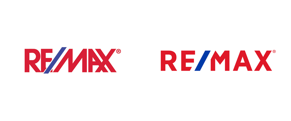
- that looks betterpinkfloyd
- i like the new one better in this instance.capn_ron
- looks better but still sux :Dsted
- There was a video of the making of the new logo which is pretty much 5 minutes of the creative agency blowing each other._niko
- slight improvement.utopian
- And that probably cost them 10s of thousands....Maaku
- The old one is a bit uneven but I think I prefer it. New one is boring.PhanLo
- I really hate this basic font as logo trend. There's no personality or individuality there.i_monk
- Gnash0
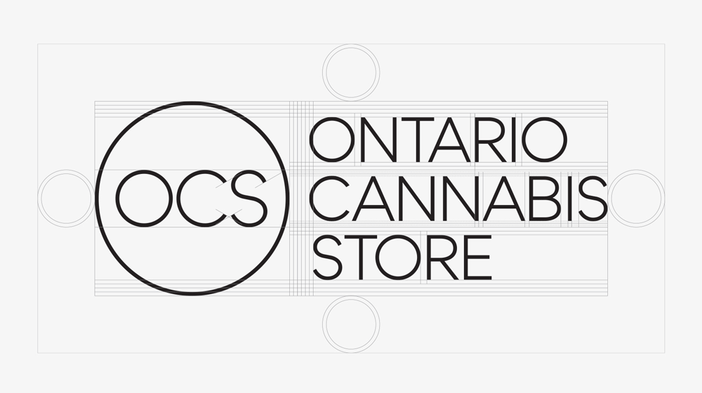
Ontario has legalized pot sales but the gov't will control all retail locations -- no independent stores will be allowed to sell the stuff. They do the same with booze, all sold through the LCBO (gov't retail)
This is the branding they developed. $650K
tag line; "Ontario Cannabis Store: Because we committed to selling this stuff and I guess we have to follow through"
- cannot tell if this is a joke or notMattjanz3n
- 650K, wow. did that include the font license for logos? imagine if not lol.fadein11
- the tagline is a joke, the rest is realGnash
- zaq0
- imbecile1
- Neta, but perhaps a little too clever for its own good?detritus
- na, they have branded brains for generations by nowuan
- Funny how self congratulatory they are for how little fucking work they've done, but meh... it's alright...********
- Cossette (the same agency) worked on a similar campaign (tight cropping on logo) for Bell Canada 10 years ago.i_monk
- ^ i remember that oneGnash
- So clear and clever they still need to write the directions. This way you fat fuckers!MrT
- Too smart for the clientele; ad fluffery.ideaist
- Gnash5
- somebody added this to a contest on 99designs?sted
- it must be in jest.Gnash
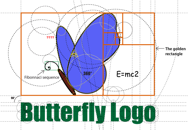
- lol, golden rectangle ... and is that Impact?monospaced
- lolKrassy
- Lolnotype
- brillantatomholc
- yep Impact :Dsted
- I bet that completely pointless E=mc2 is Comic Sans.CyBrainX
- ooh we have here a lot more: helvetica rounded, arial, comic sans, verdana, impact. I would love to know who made this :)sted
- Pentagram design?utopian


