Logo of the Day
Logo of the Day
- Started 17 years ago
- Last post 4 days ago
- 874 Responses
- Projectile2
- ground control to major fail: Just click itProjectile
- They need more blokes, perhaps?detritus
- Went to school with the guy that designed the first one, cool talented dude.Maaku
- "Only use the Pinterest badge (please don’t use our wordmark!)" from their website... Hint: it looks like shit.Maaku
- LOL ...Pentagram?utopian
- The dumbing down of logosdbloc
- Target?Krassy
- Helvetica?monospaced
- Works for me. The symbol is all they need stylised...********
- It's online, the name is just written in system fonts anyway. Symbols are the future, especially once tech enters the brain. Scary********
- Good point.monospaced
- But why make it generic and terrible? I get the symbol, but just delete the text...I can see why no one wants credit for the 'redesign'!formed
- DRIFTMONKEY-1
- Designed by Donald********
- Oh it was Melania.********
- Whiteboard marker?R_Kercz
- Love that I can only hear that phrase in her accent.Gnash
- I think it's awesome :) she's taking the piss out of herselfGnash
- +1 Gnash. There is no other way to read it.monNom
- "designed" 5 min before her presentation. Just had Baron write it in marker real quick.chukkaphob
- "Hello"aslip
- It aint bad. The color is too political.********
- https://twitter.com/…whatthefunk
- Designed by Donald
- ilahuber-9
There are many logos which should be appreciable but most of them are need to hard work. Being a professional designer and experience in <a href="https://www.logoventure.com/">design a company logo</a> I will welcome to the people who want my assistance because Logo is the primary hub of your business and clients first focus on business logo then go to the rest of the things.
- https://www.youtube.…Wolfboy
- I disagreerobthelad
- Fouty Lives!
Fouty 4 Prez!
Fouty Rocks!utopian
- imbecile3
- Cool animation, but what is it? "c"?formed
- cunt?chukkaphob
- Ⓒ pango?Krassy
- https://dribbble.com…imbecile
- He's got some slick animationsformed
- tightHayzilla
- sarahfailin1
- God dammit, do you think her face is what I want to see when I’m staring at girls asses? Huh? Do you? Well congrats cause that’s what’s gonna fuckin happen lol_niko
- I really can't believe a company with that name and logo makes mens gear.fooler
- https://www.youtube.…sarahfailin
- imbecile2
- Their branding and ID has always been pretty on point. Maybe they have an eye for it themselves or just hire the right experts and get out of the way.MondoMorphic
- I love Firefox, but I wish Mozilla would stop feeling the need to 'evolve' their brand every 6 months or so...detritus
- ********0
- ********0
- (by Pentagram)********
- yeah, that's just unpleasant.Fax_Benson
- not to say lazyhans_glib
- ive seen this design trend to muchmilfhunter
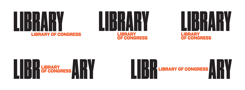
- library library of congress - so good they named it twice?trooperbill
- you guys love to shit on pentagram. but this is rather average...inteliboy
- and yet again I scratch my head and wonder how they became such design Gods.formed
- https://uploads.disq…mort_
- selling concepts, applications and longevityumbee
- They pander to the ego of the MD/CEO..."Have you seen our new identity? Pentagram did it".Morning_star
- The original one is classic. Why even fuck with it? Plus the Pentagram ones look like some amature randomly found some free fonts and stock photos.fooler
- Looks pretty boringTaschen
- I knew this was Pentagram just by looking at it.monospaced
- you have magic eyes?Taschen
- i'm starting to assume every boring logotype for a big brand is pentagramTaschen
- http://i64.tinypic.c…monospaced
- links not workingTaschen
- works finemonospaced
- This is ulgy.
Awful font choice.
Fail.
Nope.Bennn - there's nothing on there mono********
- this is such garbagecolin_s
- Like the idea - the application sucks donkey balls. This is the absolute worst example of motion design. Lazy type. Lazy everything. It'l be changed in 2 yrs..RumperChunk
- Are they just churning out the same design? https://www.pentagra…Hayzilla
- so weird ... when I click I get the tiny url image I made :)monospaced
- Who uses tinypic anyway.
imgur.com !******** - There was a very similar execution recently for British museum or something like that?Hayzilla
- even if you go for a type based identity, at least don't use a boring generic font.renderedred
- imgur wasn't working for me, I think the firm firewall is blocking uploads to itmonospaced
- We have a thread just for this
http://www.qbn.com/t…i_monk - https://pli.io/kuq8n…monospaced
- There are so many reasons why that original one was great and smart, and why this new one sucks.nocomply
- at the very least it will teach the philistines the there is an "R" in the wordGnash
- LI VIOLON BRARY LIBRARY OF CONGRESSBennn
- LIBRA Dorothea Lange RY LIBRARY OF CONGRESSBennn
- LIBR FLOWERS RARY LIBRARY OF CONGRESSBennn
- LIBR LIBRARY OF CONGRESS ARYBennn
- Thanks Bennnnmonospaced
- I'm starting hate it less the more I look at it.Taschen
- the |'s in the B R A R are annoying and forming a face.shapesalad
- I like it, it wont last more than ten years probably but its nice for now.wordssssss
- This is shite. Pentagram UK were deserved legends in the early days. Once they expanded in the early '90s the design diarrhoea kicked in. IMHO.MrT
- it's drearingly uninspired and contemporary********
- the one with the violin, kerning is horribleTaschen
- Its very bad. College students would do better.Bennn
- /\ College students are doing better.ben_
- Wait... are those flowers?DRIFTMONKEY
- I wonder how they sold this through. They must be masters of spin. Could have had a decent rationale behind it.inteliboy
- Fucking hell, this really is revolting.Continuity
- BOND. JAMES BOND.Krassy
- Design by cocaine. Or yoga.PhanLo
- ans must have cost like 300-400,000$ or moreBennn
- Oh, yeah, they've got the sales down!! The big difference in big buck brand development is selling it.formed
- this is an act of treasonimbecile
- LO L̶̪̿͒̀͐̏O̶̦̱̬̱̔͛̿̉͊̉... ̸̧̧̡̨̻̱̼̮͎͖̥̞̀͝I̵͎̞̳... VE IT!chukkaphob
- ^ whoa!Krassy
- (by Pentagram)
- shapesalad54
- Is that Impact?NBQ00
- at least it's not redundantformed
- Impact and Arial ~ the finest font's known to man.shapesalad
- qbn gods should let us "design" the upper left QBN every month or so. this would be a winner for sure :)renderedred
- This is magnificent.Continuity
- haha. nice oneGnash
- approvedsted
- hahah great!yuekit
- perfect! bravo! hahahKrassy
- Are those dogs the first entry to Pic of the Day?CyBrainX
- First surviving entryyuekit
- I fuckin love you guys. ty shapesalad for making my dayArchitectofFate
- this is amazingBennn
- QB bunch of dogs disguised for halloween N QBN FOR A BETTER TOMORROWBennn
- hahaha! wow!********
- lol, shape... I spit coffee on this one :)PonyBoy
- What was the first pic in the pic of the day?fooler
- A.M.A.Z.I.N.Gtrooperbill
- yes from pic of the day, before I signed up to qbn, I was forever seeing that image.shapesalad
- Top shelf.dablammit
- HAHA!bezoar
- it stays.utopian
- fucking yespedromendez
- how much?umbee
- This should be a T-shirt.monospaced
- 52likes, can it be beaten?shapesalad
- Continuity-3
- hahahaha!********
- It did cross my mind to use a set photo. It's such a beautiful logo concept, adaptable and liquid.shapesalad
- Especially for QBN. We could have a year's worth of weekly logos if we tried.Continuity
- hahahaha!
- fooler1
- brain tree neuron activity but others may see dingleberry balls? maybe a dancing coked up nose?imbecile
- A dancing mushroom with armsPhanLo
- I see an ass shitting out a water spout Or POV doggy style with Pinocchio’s nose.fooler
- a sperm tree.stewart
- Apple Tree?mekk
- http://www.krembo99.…sted
- 2 live crew sued for royalties********
- OSFA0
Holy shit! This thread was started 10 years ago???
- misterhow0
- I think you need it when you drop the g_niko
- I think it needs the apostropheHayzilla
- They just had to keep some pink in the logo. And too bad their donuts and food blow ass.utopian
- is there a reason for everything to turn into logotypes? what's the reasoning for it?pinkfloyd
- https://youtu.be/F-z…Hayzilla
- Personally don't need any of it. Terrible product.ben_
- Sterling fought to remove the "Donuts" from the brand about 12 years ago. I wonder who has the account for the redesign now?
This is an improvement.MrAbominable - I like it. It also gives them room to keep moving upstream to take Starbucks on. Hell, I might buy their stock because of this!formed
- futurefood-4
- the fuck?********
- I quite like the first one, just the Audio bit is annoying.PhanLo
- both horrible!chukkaphob
- ^********
- ^^I agree. They are a couple streets down from my work. If they were looking to redesign, they could have asked!futurefood
- whyyy? the old one is so recognizable, new one looks like a 1996 brown/orange striped rave polo shirt logoprophetone
- shoulda just fixed the old one.chris_himself_2
- the new one hurts my eyes, both suck thoformed
- the fuck?


