Company logos
Company logos
- Started
- Last post
- 52 Responses
- Jaline
What huge companies do you believe have horrible logos?
- harv0

They are in for a rebrandind I believe!
- GetRefresh0
amazon books
- kalkal0

- Classic but I still hate itkalkal
- I agree... Google's logo sucks!GetRefresh
- nice drop shadowgevitron
- was going to post thisjoeth
- same here, its the bevel and emboss that really gets me.Kiko
- Yes its ugly, but i don;t think it is bad... i mean, hasn't really stopped the company from growing.Midge
- To say its bad,means that logos don;t matter, thus we are all wasting our time. So, I am saying its good.Midge
- drop shadow
3d gradient -watever it is
all the primary colors + green..
hmmm... not bad :pNadooy
- harv0
All multi billion $ companys! makes you think!
- yep, and their website designs suck tooGetRefresh
- not every
http://www.ge.com
moamoa - maybe because they just code like crazy!!hektor911
- CODE CAN BE BEAUTIFUL TOO!
gjbrown1983 - Not all at all http://www.smashin.c…nolovelost
- Jaline0
Thanks.
- waterhouse0
I think the newest Xerox logo is absolute crap:

A much favored their previous one. It was effective in conveying Xerox's relevance in a changing world:

- joeth0
- I like the simplicity, but hate the "smile."joeth
- There's something very 70s about those logos, which I actually think is bang on for right now, whether they're...mikotondria3
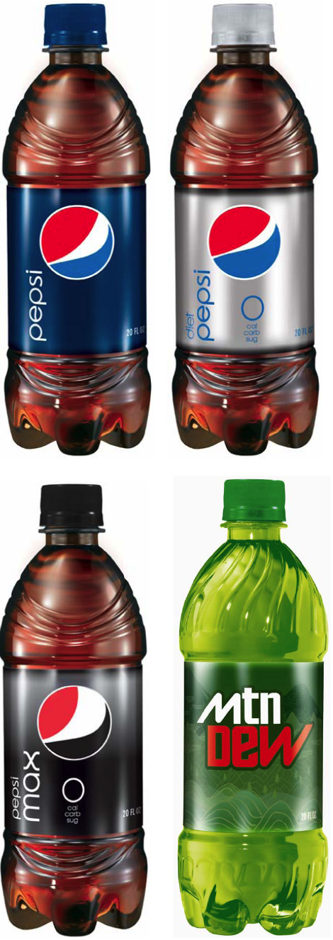
- pepsi looks like the Obama campaign logo... mtn dew is plain horrible!GetRefresh
- asthetically accomplished or not, the mtn dew one particularly looks to be from 1974. In space, etc.mikotondria3
- i really like the new mountain dew logo. totally works for me.chuparosa
- I love the new mountain dew logo. i think it totally speaks to the age range of its target market.GrandChamp
- The new Pepsi logo looks like it's belching.boobs
- I didn't know the logo had variations. I don't like that. I don't believe it works.bebelabree
- i hate this so much.showpony
- utopian0

- Come on.waterhouse
- thats a great one
Kiko - yeh fuckd up there
didnt paul rand do this ?WeLoveNoise - not by Rand, Ford didn't use Rands design from 1966XC01
- This is an excellent logo. I believe this version was redrawn by Vignelli some years ago.gramme
- What's wrong with it then?doctor
- the shitty bevelsmodern
- utopian0

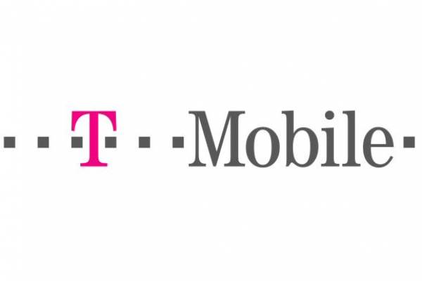
- ATT set a new trend, i'll give them thatGetRefresh
- this one is growing on me, I liked the old one better thoughMeeklo
- I liked the old one better too.kgvs72
- I loath this one... it looks so poorly drawn... How does it work in BW on a fax?Amicus
- yeah, i wanted to kill myself daily when i worked with that thing.refunktion
- ukit0
They are pretty much all hideous. I can't think of one that I like.
- joeth0

- gotta disagree, this is an iconic logo that works for a car that has been around for almost 100 years. Yes its simple but obviously works if they still use it
bukka - I've always hated that color. I'd like it a lot better in silver.joeth
- This works so well on the car, but gold does look shiteAmicus
- It was better when it was still blue and said Chevrolet in the middleboobs
- Simple marks reign supreme.lifterBARON
- Bad shiny effect but the logo is fine.doctor
- gotta disagree, this is an iconic logo that works for a car that has been around for almost 100 years. Yes its simple but obviously works if they still use it
- utopian0
- I am reminded of Catherine Zeta-Jones every time I see this. I guess their campaign kind of worked.Jaline
- Those were actually pretty good ads.joeth
- Did you see the Johnson Banks article about this really interesting
http://www.johnsonba…scribbler - It was Catherine Zeta Jones.kgvs72
- I know...Jaline
- Great read, thanks for the link.non
- The link was very useful, thanks.Jaline
- Meeklo0

- Let's see..
horrible kerning ✓
type stretching ✓
over colorful ✓Meeklo - But you can practically recognize it from outer space.waterhouse
- only because its a popular brand, not a good one.Akiraprise
- Due for a redesign as well.kgvs72
- It is ugly when you look closely, but it still works. Unfortunetlynon
- over colorful?anxiousarms
- I think the colour-scheme is OK, but I want to see some more options. Should be clean and modern.Jaline
- Let's see..
- designerror0
a kitten dies every time this is looked at

- oh yes - this was rather unfortunate.
More on this here:
http://original-link…O_L - WOW...GrandChamp
- YES! This is a proper candidate for worst shit ever.doctor
- oh yes - this was rather unfortunate.
- _me_0
a small piece of bile rises whenever i see this...

- Fucken hate this logo and their products for that matterXC01
- The face is good though. Should stick with that.Jaline
- +1kgvs72
- Delete the slogan or move it under a reworked LG and this would work. The face is classic - never seen a bigger smile :DAmicus
- I like the face but life's good looks like an after thought. BLAHGrandChamp


