Company logos
Company logos
- Started
- Last post
- 52 Responses
- Jaline0
Anyone think the NHL logo looks bad?

- thelukeandrews0
- scotch is ok i guess... and maybe canon.. but the rest.. ewwthelukeandrews
- O_L0
- Not so bad... maybe some minor tweaks to the angles within the word and a slightly thinned down W?Amicus
- It's bad for having to see it every time I go into townkalkal
- http://original-link…AVAVA
- isakosmo0

i used to do emails and web work for them, and their partner agency that do their print and main web stuff did some proper revolting work.
- Jaline0
Thanks.
- Nadooy0
- 31 flavors! come on!!!dirtydesign
- you do understand the significance of the 31 right?7point34
- -1kgvs72
- I LOVE THIS REBRAND!
-1GrandChamp - Have to agree, I actually like this one for its cleverness, regardless of how tacky it might seem.dMullins
- waterhouse0
I think the newest Xerox logo is absolute crap:

A much favored their previous one. It was effective in conveying Xerox's relevance in a changing world:

- Nadooy0
idiots! idiots! idiots!
- ESPtype0

- There was a major uproar when this came out. I think it was executed well.kgvs72
- It was sad to see the original go, but the fresh look makes sense for today's consumers.joeth
- i actually like this better than the originalGrandChamp
- I that is a bit of a stretch.lifterBARON
- The old one was awesome, but this isn't that bad either.doctor
- every time i see that shitty gradient printed (and banding) on the side of a truck, i cry i little...showpony
- ESPtype0
Web 2.0 killed the logo
- joeth0
- I like the simplicity, but hate the "smile."joeth
- There's something very 70s about those logos, which I actually think is bang on for right now, whether they're...mikotondria3
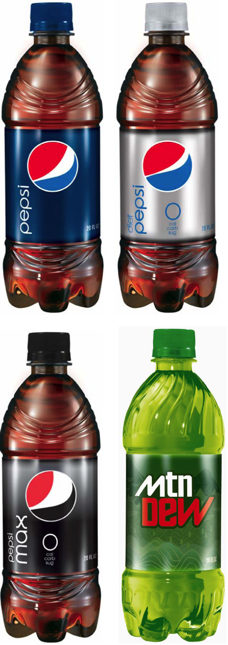
- pepsi looks like the Obama campaign logo... mtn dew is plain horrible!GetRefresh
- asthetically accomplished or not, the mtn dew one particularly looks to be from 1974. In space, etc.mikotondria3
- i really like the new mountain dew logo. totally works for me.chuparosa
- I love the new mountain dew logo. i think it totally speaks to the age range of its target market.GrandChamp
- The new Pepsi logo looks like it's belching.boobs
- I didn't know the logo had variations. I don't like that. I don't believe it works.bebelabree
- i hate this so much.showpony
- utopian0

- Come on.waterhouse
- thats a great one
Kiko - yeh fuckd up there
didnt paul rand do this ?WeLoveNoise - not by Rand, Ford didn't use Rands design from 1966XC01
- This is an excellent logo. I believe this version was redrawn by Vignelli some years ago.gramme
- What's wrong with it then?doctor
- the shitty bevelsmodern
- utopian0

- ATT set a new trend, i'll give them thatGetRefresh
- this one is growing on me, I liked the old one better thoughMeeklo
- I liked the old one better too.kgvs72
- I loath this one... it looks so poorly drawn... How does it work in BW on a fax?Amicus
- yeah, i wanted to kill myself daily when i worked with that thing.refunktion
- ukit0
They are pretty much all hideous. I can't think of one that I like.