Pic of the day - DESIGN
Pic of the day - DESIGN
- Started 16 years ago
- Last post 12 days ago
- 1,467 Responses
- Krassy17
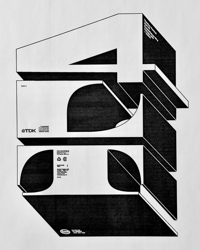
- This will go down in design historyProjectile
- The drip and that hard cut for the X. And the E. None of this should work, but it fucking sings.garbage
- @projectile it already has.milfhunter
- 2068. They keep awarding these so far out into the futuremisterhow
- https://media.gannet…CyBrainX
- I’ve always loved this.CyBrainX
- @garbage is correct; it's just so much fun and perfectly imperfect.ideaist
- Murder OlympicsYakuZoku
- londons is better – change my mindArchitectofFate
- The London logo looks like candyrock turned sentient and is giving you a very 90s gay "hello".garbage
- Not that there's anything wrong with that, but there's plenty wrong with that logo.garbage
- mort_3
- No hierarchy = chaosgrafician
- That's the idea.mort_
- This so reminds me of some early aughts dude, but I forget the name. He had some "UNLEARN" or "UNTHINK" thing.garbage
- That does sound familiar. Can't think of the name though.mort_
- It wasn't "wefail" was it?mort_
- It’s more textural than anything, and as a whole there is a composition. But yeah, doesn’t convey any info.monospaced
- @mort I had an "AH HA!" moment. It looks like early Dave Kinsey, before he got into color.garbage
- Not familiar, will look him up. This style reminds me of the late 90s early 2000s web before UX when eyecandy and ambiguity reigned. Surfstation era.mort_
- More art than design. It is a record cover so fair game for anarchic self absorbed style whorishness maybe.mort_
- I think he had some pieces in Juxtapoz and old graffiti zines. His b&w stuff looked like a squarepusher cover.garbage
- His color work is insane.garbage
- I have an envelope full of Dave Kinsey stickers he sent me back in early 2000s. Some adorn my current phone case.microkorg
- Haha, small world. I had the "RETHINK" sticker on my biker carrier windshield.garbage
- https://www.rarestic…garbage
- Very impressive that you still have some around.garbage
- imbecile12


