on top? or on the bottom?
- Started
- Last post
- 64 Responses
- ukit0
Cut the guy some slack. You make it sound like he just killed a baby kitten or something.
- imnotadesigner0
hey hey horts, taker easy buddy.
1. the comment back to niko was what I get all the time from us creative bunch on qbn, which is always the same and not that creative. One I get almost everytime I post.
2. Did I you think I would post something on here knowing it was totally similar to what I saw online and NOT think anyone would notice?? Im just as resourceful as any of you are.
3. The client was sitting right next to me when I grabbed the font and said they wanted it to look like whats up on fontfabric and since Im doing it for a huge $50, I couldnt care less to argue with them.
5. And I predict this isnt the first time you're gonna see this treatment done in the same way. So if you wanna start hating on me. Then hate. What can I say.
- JourNYC0
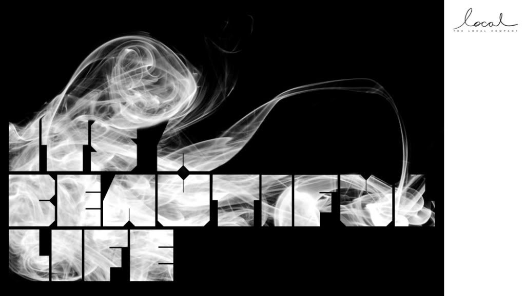
Top right smaller. Here is my creative direction for the day. Please publish this work with me as creative director. Give where credit is due.

- i concur. needs to be brought in a hair on each side.lambsy
- Don't take credit for the Batesole. It'll make you look bad.monospaced
- Yeah, like this positioning.fodcj
- chris_himself0
ON TOP, then
- JourNYC0
Sorry I should explained the creative direction.
The large typographical element is positioned in the right place but it lacks balance. The logo in the middle of smoke shows whimsy but the logo got lost with the flow of emotional being that is the smoke. The logo on the right bottom gave some balance but it also fought more with the typography. The reason why the logo is smaller is because smaller scale gives more room to be identified and looked over. While making a logo bigger can be said as making an impact, with this treatment, making it smaller gave more presence. On top of that, it gave solid balance to over all layout of the piece. The heavy set yet emotional typographical and emotional elements came strong and powerful yet fluidly beautiful. The logo, on it self on the corner gave that equally powerful message but not utilizing in size, hence the beauty of this layout.
- Say this the client and you are golden. And say that your CD gave you this direction.JourNYC
- And when you submit this to win the black pencil, dont forgot to put my name down.JourNYC
- I much prefer the bottom, it's def better balanced there IMOBrainiac
- Hey why dont you write a counter piece to my position. I only see people say bottom with out reason.JourNYC
- i wish i could bookmark this post. :)janne76
- NONEIS0
Neither, it's far too phalic.
- ok_not_ok0
Tell the client...we need to think outside the box...then show this.
- tOki0
ah geez
- NoFavorite0
This is the best thread ever!
- duckofrubber0
OH SHIT!
- Brian_Piper0
You really arenotadesigner. Rippin' is rippin'. So RIP to originality here I guess. Great creative direction of logo placement...
- imnotadesigner0
Are you guys fucking kidding me... Seriously, like did I just became the qbn shitting pot of the day. Ok fuckers, if it make you feel better to have me say, I ripped off this design and tried to pass it off as my own then I was going to submit it to awards magazines & shit. And clearly next time a client says I want it like that. Ill say sorry, no can do because the guys at qbn will rip on me.
If the job paid more than 50 bucks, trust me. Id come up with something alot different. Its my fault for post this shit anyway, I should have known better.
- You didn't even TRY to change it or make it different. Hence, a fucking rip.monospaced
- That's "a lot", two words, btw.YAYPaul
- Sorry couldn't help myself ^^YAYPaul
- jaylarson0
bottom. all things aside, the smoke brings the eye down to the space between the u and the l. making it easy on the eyes having local on the underneath that.
- acescence0
internet outrage!
- neue75_bold0
I make more blatant rips on a daily basis, suppose the only difference is that I don't post them here..
tbh, the "original" image, typeface and all, are awful.. so my only advice is, if you're gonna rip something, rip something better...
- ckentish0
there must be a recession - noone does any work
- there's nothing left to do, all the work is done..neue75_bold
- anyone that codes is working, that explains why i'm busyversion3
- jimzyk0
BOTTOM>

