design a typeface 2009
- Started
- Last post
- 629 Responses
- hans_glib0
sssserifs...or not
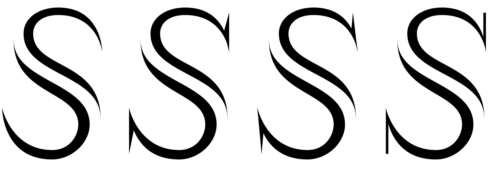
- the 4th one for meneue75_bold
- < this oneneue75_bold
- 1st, but make it less 8neverblink
- Fourth one looks too off-balance. The first one even more so, for me at least. I think the 4th is on the right path.dMullins
- no i don't like 1 at all. i'm not wild about the straight serifs of 4 - too brutal?hans_glib
- 2 or 3 for me - keep it nice and sharp. 3 seems the better balanced but it looks too celtic tattoo...hans_glib
- #4 can you make that slab thicker? and maybe shorter?7point34
- I love 1 and 4.TomBac
- Its out of balance a bit, top half nees to be brought back a bitset
- a bitset
- i guess that's me put in my place then...hans_glib
- 3 has the best balance
Sandman_1982 - #2 and 4 are leaning too fari_monk
- 1 and 5 are my faves.. fuck it, drop 5, take one..serious_cat
- or do whatever neue sez.. then it is perfectly fine.serious_cat
- see not a bad suggestion
4 is my favWeLoveNoise - 2, 3, 4 look like they are going to topple over to the right at any second.juhls
- maybe it's more exciting that wayjuhls
- I wasn't going to mention the balance issue, don't see this as a crit thread, but I don't like the barbs on 2+3neue75_bold
- imo: they all fall to the right & the serifs are too far out from the vertical line created by the beziersversion3
- that's true, neue. nevermind my comments.juhls
- serious_cat0
hey jimbo should we use the email addy in your profile then or what?
- fuck it, mailed..serious_cat
- serious cat is serious!jimzyk
- digdre0

- TEEEEEdigdre
- <falling downMau
- i think it's great, Terence.serious_cat
- A great capital E.serious_cat
- you must be serious, cat.digdre
- Knuckleberry0
Sent... Complete.
- digdre0

- TEAAAdigdre
- i like that. keep it!
honestly do, hahaha!serious_cat - make the tea label bigger and more realistic and we got a winnerserious_cat
- what if you swirled the label and string around more to make the T crossbar?Greedo
- could be a weiner!Greedo
- could be a weenerdigdre
- fucking love this. You thinking outside the box like that got me going proper on my 3...neferiu
- sublocked0
can i do another one? that was fun. maybe i'll do a full font. :)
here's my concept with the finished (again)


- are you into dungeons and dragons?serious_cat
- yes and death metal.sublocked
- awesome!serious_cat
- serious_cat0
renascent?
- Debut_and_Fin0
Æ =

- Debut_and_Fin0
Æ =
- what's that symbol even used for?sublocked
- havent the foggyest! lolDebut_and_Fin
- After Effectsserious_cat
- nordic languagesGreedo
- curriculum vitaedigdre
- Aesop's fablesAmicus
- nice onejuhls
- like it mateWeLoveNoise
- Gælord.detritus
- cheers gents :)Debut_and_Fin
- Hey now... it's a vowel in the Danish alphabet...NotByHand
- serious_cat0
to: people whining about small sizes:
that would limit us too much. go all the way in terms of contrast in form and balance. these one's should only be for poster use. imho.
- freitag0
we should make this a pro-font with lots of alternatives!
- neverblink0
Nice Justin..
Where are all the other characters? I think I've only seen 12 of the 26 in A-Z
- deadline is 18th I thinklukus_W
- not due yetjuhls
- Ah,.. so how's your J coming along Juhls?neverblink
- digdre0
who's actallu gonna make this into a real font?
- get on to hypefortypeDebut_and_Fin
- i will a .ttf if need be, but i'm sure jimbo has the chops, it was his idea afterallversion3
- FallowDeer0
seen some really nice samples that actually should get made into typefaces on their own
- like..Debut_and_Fin
- jimbojones' 'G' is definitely a candidatelukus_W
- Mau's 4 for oneFallowDeer
- i_monk0
There are a lot of characters left but jimbo doesn't want people doing more than one and nobody else is scrambling for them...
- juhls0
People are getting ahead of themselves. He just wants it under control before proceeding to the next step (ie. lowercase characters).
- any sneak peeks yet? i'm having fun exploring the ideas (as you can see)version3
- BAN HER.Jnr_Madison
- *scatters glitter
*says "poof!"
nothing happened...version3 - Almost have some done.juhls
- Jnr_Madison0
I want out.
- In and out, the old in and out.Jnr_Madison
- burger?freitag
- yes please.Jnr_Madison
- NotByHand0
If anyone drops out, let me know, Jimbo...


