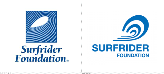
Surfrider digs a rail
- Started
- Last post
- 32 Responses
- dirtydesign0
the foundation alignment bothers me. should be evenly spaced under 'rider'? somethings off.
and the illustration just blows.
- dirtydesign0
- ok can we see this image one more time? or am i missing something?inkpink
- start of a new page pal. there for reference.dirtydesign
- not if you dog earinkpink
- well if you, either way it helps to have it again doesn't it? dog ear or new page :)Miguex
- go team go!inkpink
- mikotondria30
Nah, the old one was way off. Looks to me like a low-budget frozen foods wholesaler, or even a margarine label.
I think the new mark has a better rhythm to it, type choice is not revolutionary, but in the right ball-park. Wave curl could have a little more character, be less abstract, little more interesting, but it'll reproduce well under a wide range of settings. Moderately successful logotype, significant improvement on the previous. Not all bad.- I'm right there with you on the old one... hahaha @ margarineMiguex
- Pixter0


- Old one is coolerPixter
- that's my brothers photo!forcetwelve
- gramme0
As a surfer and Surfrider member, it's all bad. Yes, the old one needed an update, simpler forms, much better typography, etc. But the concept of looking at the world from within the tube was much better than this new cauliflower ear, which isn't even well drawn.
If they simplified the old mark, set it within a circle instead of a square, and used a friendlier sans than Helvetica, it would be spot-on.
- instrmntl0
the old one is terrible. the new one is so so, with shitty type.
- nthkl0
Tell Jim:
- IRS0

- eegrek0
I think they should have kept the feeling of being in the tube, not outside looking at a wave. And the wave is poorly drawn. About all they got right is the font, but then screwed that up with the thin to thick type thing.
- cannonball19780
is anyone reading this
surFRIDERS
- Countryman0
as a member of the surfrider foundation I feel like this logo is a total waste of my 20 dollar donation.
It would even look nicer if instead of a curl they were just straight like sets of a new swell rolling onto a tropical reef. Speaks to conservation, building energy etc. much nicer and would compliment to logotype as well.
- sneakybadger0
Meanwhile in france!!


