another bad logo redesign
- Started
- Last post
- 33 Responses
- robulation0
It's original, and more importantly, it's not a fucking faux 3D shiny crap logo like everything else these days.
- it's quite dull and fairly unoriginal and reads badly. other than this i think it's greathans_glib
- Miguex0
Let's start over:
I think they did a great job on this one, let's not bash on anything just because it has been updated.
- i don't think it repays the time and money spent on it.hans_glib
- that's subjective and debatable thoughMiguex
- if the owner likes it, and paid for it, then it's a win for all involved.bjladams
- time doesn't mean anything - take a look at the Citi logo - 30 secs. scribbled on a napkin.bulletfactory
- bjladams0
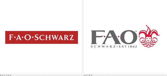
my first thought was "holy crap- looks like a logo for a toy shop"
now i understand that it is for a toy shop, bravo.
- bigtrick0
this isn't as egregious as the gap one. i would hesitate to call it "bad," but then again logo design is not my area of expertise
- ETM0
Neither logo screams toy company. Both text treatments look like something that would be in the financial sector. Not sure about the jester yet...
- dirtydesign0
i like the new one
- monospaced0

- haha this makes me laugh for some reason. i secretly like this movie...prophet
- Pic needs more PedobearGlitterati_Duane
- tasty0

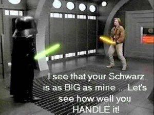
BIG- WTF his left foot is not lighting the keyboard up. Call Sherlock benfal!!
(jokes <3)Hombre_Lobo - jokes! <3
:PHombre_Lobo - hahahabigtrick
- in the movie it blinks on and off as he moves his foot. i know this scene very welljetSkii
- WTF his left foot is not lighting the keyboard up. Call Sherlock benfal!!
- PIZZA0
never even heard of them in the first place. who cares
- lol - they're the NYC equivalent of Hamleys in London - renowned toy shophans_glib
- Gotta admit, I didn't even know either!robulation
- oh fair enough that would be whyPIZZA
- to be fair the original logo sucks for a toy shopPIZZA
- robulation0
Doesn't bother me, I like the marque, even though it's not the most friendly, it makes me think it's a really established company.
Schwarz is really really small compared to the F.A.O. though and will become pretty much illegible if it was any smaller than the one above.
- hans_glib
via Brand New