CP+B ruins Arby's
- Started
- Last post
- 48 Responses
- dbloc0
horrible™
- colin_s0
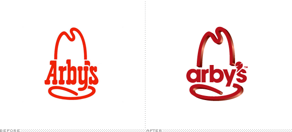
3-d in logos is something i'm not fond of to begin with but putting a flat typeface in the middle? what?
- omg0
the old western flavor is lost when you replace it's flavorful western styled font, with one that has no flavor, only to attempt a modern direction for a fast food business. I find unappetizing the disconnection of 3D and 2D elements in the new logo.
- omg0
the old western flavor is lost when you replace it's flavorful western styled font, with one that has no flavor, only to attempt a modern direction for a fast food business. I find unappetizing the disconnection of 3D and 2D elements in the new logo.
- ETM0
- CALLES0
it was already ruined
- monospaced0
Overall feels like two different ideas thrown together—the 3D version and the minimal sans-serif type version—with another version's randomly-modified apostrophe. What the hell does that add?
- identity0
I'd like to see how the new typemark plays out across the rest of the brand's executions - that being said - this looks like a decision made out of the CD's ego.
- i_monk
Someone make a joke about the new logo being as bad as the food. I'll wait.