Need feedback - illustration poster
- Started
- Last post
- 27 Responses
- monNom0
so basically your client wants this guy?
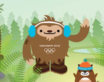
- Llyod0
Looks like a fetus.
- fredddddd0
If you enjoy drawing, you should like draing type too. Both parts are equally important for the poster.
- fredddddd0
If you did draw the illustration, you should be able to incorporate the type in better.
I don't understand why talented illustrators use fonts when they could easily draw more interesting type and incorporate it well.
- ukit20
Is bigfoot considered as representing Canada?
- benfal990
oh and thanks for all the feedbacks guys
QBN rocks!
- benfal990
yes, i did the illustration.
about the type, the client wants to change the concept so i will stop working on type for now. He says he now want a bigfoot wearing a hockey jersey... I may change the type!
- fredddddd0
Stop using crappy handwritten fonts.
Draw the type.
- fredddddd0
Did you draw it too?
- benfal990
Client wants the first font. I modified it a little bit.
Also, client told me he REALLY like the illustration, would like to use for somthing else, and now he want a bigfoot with a hockey jersey for the Cannes poster... :-)
- albums0
who did the illustration? would be best if the type was hand drawn in a similar style intertwining with the film rolls. maybe put the second line of text below the head if you're going to continue use type on top.
- detritus0
agree with albums' original point (*spit!*) - whenever you're using a fint in this context, you should always make the next steps to differentiate and uniquify the end result, otherwise it's just sloppy.
So, I now prefer your amended text - but the fact that it's a font is highly visible to me.
SImilar letterforms and bad linkages (u & a in 'court, for example).
In this context, fonts should be a base, not an end.
- oiishi0
also nice example http://pinterest.com/pin/2560015…
- oiishi0
get a brush and some ink and try drawing it, maybe explore having one line bigger than the other or in a different weight, but i think it would be more suceessful if it felt more natural and less like a font, just my opinion but if i was you i'd spend a whole day doing loads of versions and having some fun! good luck
- benfal990
second try

- much better!fresnobob
- hmmm japan ttf? swedes have it on their milk cartons ;D
ArchitectofFate
- oiishi0
also i find the most problematic of that font is the lower case t, i really feel this is the most confusing and also is where my attention is being held the most, the most distracting part, i think even if you could solve the lower case t would be a huge improvement

