ios7
- Started
- Last post
- 546 Responses
- CygnusZero40
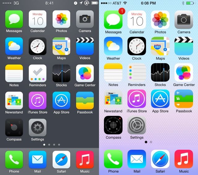
After 24hrs with it im indifferent to it. At the keynote they show the icons floating on top of wallpapers effect and it looked rly cool, and turns out they could barely get it working because I didnt even realize it was working for many hours.
Every other change outside of folders looks like useless aesthetic windows 8 changes to me. Nothing that needed to be done. Sounds like their art director got a hard on for flat design and this is what came out, but its a little rough around the edges.
I hate how everything fades and zooms now. When I turn my phone on it really should just turn on. Why does it have to fade on?
- I think there's setting for the level of "floating" effectmonospaced
- prophetone0
nitpicking but there are design assumptions throughout ios7. for instance, i have my music set up in playlists, like jungle, electronic etc.
what we have now are little cover art icons as representation of everything, how this blows as a U/X prob is the playlist icons are drawn from the first song in that playlist so I now have to stare at some specific song icon as some sort of all-encompassing representation of that playlist.
the icons are a good idea but perhaps not for the playlists level. great at the songs level tho.
- CygnusZero40
There is a setting for the floating effect? Lmao ive been messing with this thing for a day. Never saw it. It must be well hidden.
- Accessibility > Reduce motionmonospaced
- and I've never used itmonospaced
- Um, its WAY reduced by default. Turning on reduced motion slows it down even more. You cant notice it either way.CygnusZero4
- I'm not certain, but maybe you need the 5S with the M7 chip for more of it? Perhaps it's subtle on purposemonospaced
- mg330
WOW! Anyone do Invert Colors yet in Settings>General>Accessibility??

- hmmmmmmBabySnakes
- cool. but apps look like shit inverteddbloc
- gimmicks..GeorgesIV
- And all your photos toodopepope
- this has always been on the iphone.iCanHazQBN
- apps look like shit however you configure it, the icons look like cartoon tires.utopian
- mg330
Facebook app updated for flat design. But still annoyed that I can't use the app as one of my pages. I think you can only do that on a computer. I want to be able to switch to my page, and comment / interact with people as that page. Still doesn't seem possible on the app.
- jaylarson0
Anyone update on a 4?
- fuck thatdoesnotexist
- Yup. Seems to actually be faster for me (not sure how this is possible). Could be I just needed to restore my phone.duckseason
- I also don't use my phone to store music/videos etc. Not sure if that makes any difference.duckseason
- yup and the one thing I've noticed is the battery life seems to be miles better.Wolfboy
- I was going to upgrade due to my battery life being terrible but with it seeming to be way better I might wait another year.Wolfboy
- killing most of the shadows / gradients I think would help improve response time.. yes?PonyBoy
- ya my iP4 got faster too.pango
- iPhone 4 here. Faster, more battery. Less all round lag.meffid
- Yup. Certainly hasnt made it slower. Batterly life seems ok too.JerseyRaindog
- the 4 is not able to do the blurring so it only uses opaque white/black for notification center etcinv
- which looks like crap
inv
- ESKEMA0
Did they removed the integration of Facebook and Twitter from notification center or it's just me who can't find it?
- ESKEMA0
iOS 7 lockscreen breach.
http://m.iclarified.com/entry/in…
This guy is insane. How can he get to these sort of stuff??
- iCanHazQBN0
Wow. I just bypassed the locksrceen. Just followed the directions in the link above. It was so easy. Good job, Apple!
- utopian0
iOS 7 lockscreen breach.
I just accessed all of monospaced selfies...
Uploaded and posted to tumblr!
- utopian0
Is it possible to swap out and use your own icons in ios7 or does it have to be jailbroken? Has anyone done yet?
or
- one on the left are safe and boring imo.inteliboy
- I think inteliboy has either had his eyes gauged out or was dropped as a babyset
- Safe and boring? Should those icons go skydiving? They're a vast improvement.iCanHazQBN
- instrmntl0
Still not sure how I feel about the new iOS overall. For sure vast individual improvement on a lot of the native apps.
- instrmntl0
Also, what's up with the salmon call button? And the folders bg being the overall wallpaper color? I had to discard my fav wallpaper because the folder bgs turned pink. I had a white w red print bg.
- lnu0
- Inu?? Imposter!inv
- most of this stuff is from the beta, fixed in the final releasekingsteven
- OK cool
lnu
- inv0
Federighi says iOS 7’s new look is inextricably linked with technological advances.
“This is the first post-Retina (Display) UI (user interface), with amazing graphics processing thanks to tremendous GPU (graphics processing unit) power growth, so we had a different set of tools to bring to bear on the problem as compared to seven years ago (when the iPhone first launched),” he says. “Before, the shadowing effect we used was a great way to distract from the limitations of the display. But with a display that’s this precise, there’s nowhere to hide. So we wanted a clear typography.”
- Sort of makes sense?
- sounds like typical post rationalisation bs to mehans_glib
- hans_glib0
24 hours in and in terms of functionality (that I require at least) ios7 hasn't really added anything in exchange for this new UI. Except the flashlight - which could well be useful.
The mistake was to throw everything away and start from scratch rather than taking the old UI and refining it. This would have also made the revised look gel better with the apps that still use the old UI. For instance the old navigation buttons could have been updated visually, but otherwise left as they are:

So the change to the UI seems more to be about "we need to change" rather than "how can we make it better?" - there's no actual improvement in functionality or ease of use as a result of the new look. In some cases it's actually harder to use. Jonny Ive might be a good industrial designer, but he should leave the graphics to somebody who knows what they are doing.
The most depressing thing for me is that it shows that Apple have ceased to be a company that "think different" and now is staffed by people for whom it's just a job, and who have lost the passion for the brand. They have become like samsung, sony, microsoft et al, churning out product, shifting boxes.
- <<<<<<iCanHazQBN
- whatever they had done we'd be ripping it to shit. Are you saying the first version of the iphone was perfect? This is the first version of iOS7, get a grip.Ianbolton
- first version of iOS 7Ianbolton
- cool post, agree with a lot!
yeh by conforming to trends apple have lost the idea of being different and leading.Hombre_Lobo - Agreed. I was hoping for iPhone6 and something "new". Apple is looking sloooow and old these daysformed
- (of course, the rest of teh market is faster and trips all too often, landing solidly on their faces)formed
- utopian0
Apple Garbage®

- To be fair most of those were from the betaset
- also, i assume this only happened in the beta for a split second when you hit send by wich point it would be locked, in yer pocket.kingsteven
- your pocket.kingsteven
- nice try utrollianmonospaced
- thought it was weird too.ohhhhhsnap

