blog
- Started
- Last post
- 75,848 Responses
- Horp0
Record sleeve - I like. I like the follow through, the novel vinyl colour, the purely abstract nature of what are essentially 'constructivist' shapes. The contrast between the recangular forms and the fluid cascading shape they make on the cover. It has personality and it conveys a sense of something. Its okay with me.
Wooden end blocks page - I like it. It looks tactile and rich and suggests antiquity and vintage which to me is accentuated by the 'yellowed' paper.
Viva Poster - don't like it. Its cheap and computery and doesn't convey any elegance or consideration in its composition.
Luomo Convivial - I quite like it because it suggests animated information signage and it suggests layers of meaning. I like the colour palette and the evidence of process in the overprint areas.
Jumble of circles and squares - I don't like it. Its not communicating anything to me and I don't like the colour combinations.
Die Welt - I like this because I respect it as a piece of well tempered classic 20th century typographic layout. Refined and restrained.
Picture of Horpverine - I don't like it. Its wrong.
The Tschichold book - it conveys nothing to me and could easily be a phone book designed by somebody of no redeeming features.
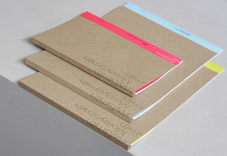
Ravensbourne booklet - I like it. It feels pure and intriguing in its use of broken messages and the interesting folded paper cover makes me want to explore it.
Future invite - Its okay, but I don't understand it. Visually it engages closer insepction which is not a bad thing, but it doesn't reveal any greater purpose so it feels a bit indulgent.
noamgriegst - it feels a bit too cramped to me and it jarrs and jumps a bit in that typeface.
SARD - Is refined, tactile, classic feeling, interesting in its processes, bold in its execution. I like it.
Having said all that though - I personally am unable to evaluate the design work just by looking at a picture of it, so I am grading the pictures you show, not the contents within. How can I tell if I like the record sleeve if I don't know what its trying to represent?
Those are my answers.
- hahaha********
- Horpverine is money.
You're just in denial.NotByHand
- hahaha
- ********0
Don't you find all this Tsichold, modernist, bauhaus ish stuff falls short of the work which it is inspired by / referencing?
Perhaps it's just me...- Its been cherry picked from history by fetishists and viewed in isolation.Horp
- they have become so encrusted with mythical reverence it's impossible to know********
- Fair enough, I suppose.********
- sea_sea0
has this been posted?
http://users.telenet.be/kixx/
- ********0

- Does it have some kind of meaning?Jaline
- Sudoku?NotByHand
- Depends what its for. I quite like and I don't like in equal measure.Horp
- 8
34
7******** - I can infer that it is based on some meaning or system, but I don't really care what it is********
- I like it********
- looks a tiny bit sloppy, have the feeling that it precedes computers********
- _salisae_0
would be cool if adobe would apply the same location technology to screen shots that apple do to camera phone shots and embed a location within the web in the file.
- its location_salisae_
- In terms of metadata you mean? That'd be cool. And kinda scary.********
- Actually, you could probably write a script for your server to do this automatically********
- oh yeah? would be handy._salisae_
- Yeah, it's totally possible. We did a site a while ago that automatically added certain metadata fields to images in a directory. Can be done.********
- specific directory. It can be done.********
- ********0

- I think it is fit for its purpose so I approve this artwork.Horp
- I get the sense, that I'm overly critical of everything you show, so I'll stop commenting.NotByHand
- no, I like hearing it********
- I like the picture, how it's simple and on top of a black bg. Not really the the top-right area, but it could've worked for the 80s.Jaline
- i wonder what your take is on it, m_r._salisae_
- I love it--it uses the convention of the "never mind the bollocks" album cover from 1976 in an elegant way********
- I bought a Jamie Reid screen print the other day, another thing to add to the 'must frame' list. It'll never be framed.********
- kelpie0
woo woo, famke's totally wasting the place. god I want her.
- It's quite the roller coaster with you and her, eh?NotByHand
- Is Famke 'Jean'?Horp
- yupkelpie
- I made love to her Kelpie. She was in one of her rages and I loved her back to earth with my power.Horp
- Are all of you watching the same thing? <font size="-1">Famke is mine, by the way.</font>Jaline
- you are dead to mekelpie
- both of youkelpie
- creative-0
This iPhone contraption isn't half bad you know
- ********0
- I like this a lot. Reminds me of the "Stella McCartney" stuff by MadeThought.NotByHand
- I like most the stuff you're addingkalkal
- It smacks too much of meaningless contemporary mores, even in the presentation of it in this image.Horp
- ( ie Horpverine does not approve)Horp
- *posting. I swear the process of thinking and typing is totally screwed up herekalkal
- I like it.Jaline
- Would you have been happier with a pizza in horpverine's hand?kalkal
- kelpie0
is it weird to anyone that I generally find a blank pad of white, plain paper to be a more attractive object than 99% of printed graphic design?
- chossy0
I know kelpie she is the hotness
Bubba ho tep is on sci fi in 40 minutes this is a fine film :)
- she's god-like.kelpie
- Still talking about Famke? Agreed.Jaline
- She wanked me off last November.Horp
- I really want to hear her actual accent. She always uses her American accent in interviews.Jaline
- Oh god I said something smutty and boyish and Jaline is here reading the notes.
= XHorp - "Used to eat almonds and dried cranberries every day while filming X-Men: The Last Stand (2006)." Okay...Jaline
- hi, spookyJaline
- ARGH.
Hai.Horp - It's OK, I understand.Jaline
- she's just-- there's just-- gad, I dunno. she just looks bad. I like bad.kelpie
- Here:
http://queueban.com/…Jaline
- kelpie0
bubba ho tep rules. don;t have sci fi though, so I'm going to have to drag my brain into work mode and knock out this rubbish I have been putting off
- kalkal0
Sunday night project: bag of wank
- ********0
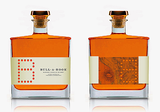
- I wish the B wasn't therekelpie
- Saw this before, didn't FFFFound it.Jaline
- ok--I'm stopping. beginning to feel like omgitsacamera********
- aside from feeling that the B is slightly too big, I think this is superb********
- I don't like the map or the inline etched typeface.Horp
- I also don't like the "B". But I do like the type for the rest of it.Jaline
- Jaline0
This may be a long shot, but does anyone know of a personal blog site that is all blue and designed well? It belongs to a developer. His site is XHTML and CSS compliant. That's all I remember. Not sure if I added him to delicious or not, but I am searching. I think I got his site from http://www.zeldman.com
- Nevermind, I found it. WHY DO I FIND EVERYTHING MYSELF AFTER ASKING AT QBN?!Jaline
- I had been searching for days before this.Jaline
- link? just curious to see the siteComplexfruit
- Not as good as I remembered it as being, but still some neat code:
http://stumble.kapow…Jaline - Also this guy:
http://thebignoob.co…Jaline
- kelpie0
even pre-op I would seriously consider it baby

- kelpie0
rand; I think the type is gorgeous, the bottle is gorgeous, and the label compliments it and the colour of the booze perfectly. I can't help but think that if they got rid of teh B, and moved the type in to the centre, I would love it even more. I'm an old school type fetishist though, in much the same way as a lot on here fetishise the modernist stuff
- kelpie0
oh right, I see how it is, I see how this works; I even fucking mention something designy and every one of you people fuck off and hide