Show some recent work
- Started
- Last post
- 8,657 Responses
- where_am_i9
Finished up a film for a new rum that is launching here. Went live today. Very happy with this one, was a labor of love.
- headphones pls :)where_am_i
- Exceptional.Hayzilla
- Love it.PhanLo
- Tastyfuturefood
- thank you kindlywhere_am_i
- wow! nice!lvl_13
- lovelyutopian
- do you freelance? what are your rates?utopian
- Working under this name as a small studio as constantly bringing in various specialists per job. I'll mail youwhere_am_i
- cant seem to get your mail, you can find our mail at bottom of machinesoflovinggrac...where_am_i
- Take a gold star and sit at the front of the class! Good workdee-dubs
- hehe thank youwhere_am_i
- I'll trust you didn't choose the musiccanoe
- no, sound design by sound studio ;)where_am_i
- CyBrainX1
New Year's thingy for Yahoo Finance. I posted the numbers I designed in this thread recently.
- dopepope17
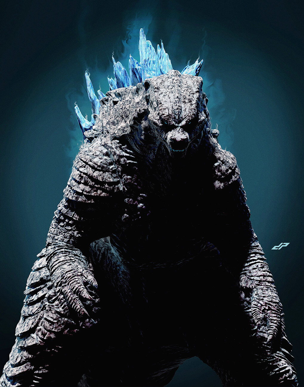
I got a shout out on Adam Savages Tested youtube channel. Worked on some crazy toys with Jim Groman.
- that blue one there is what I sculpted.dopepope
- 3:50; yes brother!!!ideaist
- awesome!moldero
- of course you did and you deserve it, you are an amazing artist pope!********
- So cool - you friends with the Mishka guys?ben_
- hell yass! love your work man!jaylarson
- Thanks! No, dunno Mishka.dopepope
- pretty amazing, dp!!PonyBoy
- That is super cool! Congrats!! :)Fabricio
- Ddddope! Fuckin slick!bezoar
- You should check them out, they’re pretty involved in the kaiju scene. They have a shop in Brooklyn, good guys.ben_
- CyBrainX6
I updated my font from the previous page. I never created a font before, so I'm working on the finer details of the FontSelf extension for Illustrator which looks fantastic so far. It's very easy to use. Start by selecting everything and it will recognize A-Z, a-z and numbers. Punctuation is manually done character by character. Select a grouped shape, type a glyph and add it to your font.
- Nice!monospaced
- That is super cool :)
Must have been a lot of work I imagine!Fabricio - Nice progress; it's a nice "completing the puzzle" feeling as you go, eh?
Fontself looks great, BUT I've had great luck with https://glyphsapp.co….
; )ideaist - It's like creating a language. You have to establish rules and maintain consistency. It's easier if you walk away and come back with fresh perspective.CyBrainX
- There’s a really great texture resulting from this. It doesn’t fatigue.monospaced
- @CyBrainX Do you have a font file we can test OR is this . a vanity project? I love AND loathe the spacing between characters.ideaist
- That's just my Illustrator file. Here's the font. I'm still working on spacing. It's too tight right now. http://talesfromtheh…CyBrainX
- skwiotsmith3
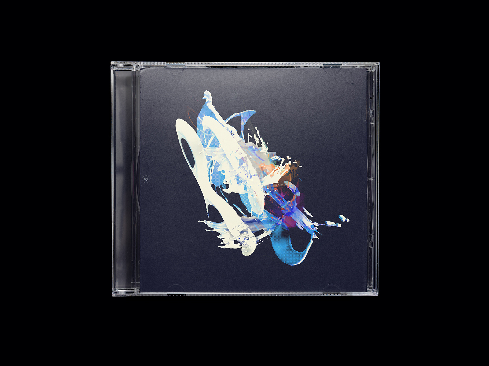
- Few more shots here: https://www.instagra…skwiotsmith
- Nice. What album? I like the screen effect in the details. A big print would be cool!MrT
- Honestly it’s not for any album, beyond just me trying to stay nimble with my artwork. I hope someone sees this & needs it for their album.skwiotsmith
- Also, all my work I do at 300dpi. This one is actually sized for a 13in square canvas. So prints are possible!skwiotsmith
- Fabricio18
Hello everyone!
After I finished Death Stranding, the PS4 game, I finally got inspired to do some personal artwork again (after quite some time).Since I love pixel art/retro stuff, I tried to re-imagine what Death Stranding would look like in a 16bit era, the cinematics at least. (inspired by Flashback/Another World cinematics). I also did the music theme of Death Stranding in chiptune style, using ableton and serum.
I hope to do, in the near future, some remake (or demake) of some very modern games, in this same style, as well as the music themes.
PS: Has any of you played Death Stranding?
- shit... double post, sorry.
Can someone delete this please? :)Fabricio - gives us the chance to upvote twice :D great workkingsteven
- Great work. I'm going to upvote twice.CyBrainX
- Cool!!Bennn
- https://youtu.be/ZAt…cannonball1978
- man this is dope!ernexbcn
- Thank you so much folks :)
I got happy about this, and the response as well :) Hideo Kojima retweeted on his both acounts, and my tweet went viralFabricio - I think there is something about nostalgia, that connects with us. In times where games are striving for so much perfection...Fabricio
- We remember with love those old games of our teenage years :) I wish I could buy a Super Nintendo and a Sega Genesis again.Fabricio
- Man this is amazing, you're incredibly talented! So true about the nostalgia vibe :)pedromendez
- Wow! I love the game—this is great!jaylarson
- @fabricio - I also think that pixellation allows the mind to better fill in the gaps, making an investment in imagination that makes the experience richerNairn
- insane!dopepope
- This is so good man, great stuff.ben_
- shit... double post, sorry.
- Fabricio3
Hello everyone!
After I finished Death Stranding, the PS4 game, I finally got inspired to do some personal artwork again (after quite some time).Since I love pixel art/retro stuff, I tried to re-imagine what Death Stranding would look like in a 16bit era, the cinematics at least. (inspired by Flashback/Another World cinematics). I also did the music theme of Death Stranding in chiptune style, using ableton and serum.
I hope to do, in the near future, some remake (or demake) of some very modern games, in this same style, as well as the music themes.
PS: Has any of you played Death Stranding?
- feel3
not so recent, but some work I did for Slack this year:
here are some behind the scenes:
https://www.felipemahalem.com/sl…
- stewart22
- Cool! And you come up with the cuts folds and template too? Sounds so fun. Are these multiple pieces each? Would love to see flat art.monospaced
- Too cool! Die cuts abound! How many mock-ups until you had final folds and cuts?misterhow
- They used to give similar (but not as nice) out for the TTC in Toronto, as a kid they were always fun to get and assemble. Very cool!ben_
- i member collecting and assembling models like this as a kid. super fun.renderedred
- holy fuck that brings back memories...
i had to do a shit ton of 3d paper stuff like this when I first started out...
nice work man!!!exador1 - super clean :)Maaku
- Neat - sweet curves! Did you cheat and use something like Pepakura?Nairn
- C Y B E R B U S ®utopian
- Haha... Assen.BK
- Oh, I love these! :)
I used to have some of this when I was a kid too. The characters standing just near is a nice touch!Fabricio - Thanks! The busses are made of simple box shapes, so no Pepakura. Just a mac and Adobe Illustrator.stewart
- G E K O L O N I S E E R Dmilfhunter
- Calderone200013
- The pattern you created from the type is great - nice detailGnash
- I like the colors. Not sure about that type thing though. I’ve seen it a lot recently and looks “untidy” imo.maquito
- niceutopian
- Looks wonderful! I really like the pattern!SimonFFM
- Really nice work, love the colour & type.pedromendez
- thanks guysCalderone2000
- SimonFFM21
- Congrats! To both that, and the fact that you still have a wedding ring :)Gnash
- I am only a photographer not a gigolo.SimonFFM
- Richard Gere was a gigolo AND a photographerfuturefood
- It's nice to see smiles over here :) Kudos man, success is ssweeeet +********
- +garbage
- (Parenthetical plant nerd comment: that spider plant has so many pups, please pot them.)garbage
- Nice!stoplying
- Simon thanks for capturing the art of feminine beauty, with integrity. When it's done tastefully and respectfully, it's enjoyable for us women to admire.********
- Melania Trump?utopian
- My home is full of spider plants. They like me or they’re damn easy to handle. I began putting them outside in my neighborhood.SimonFFM
- SweetNBQ00
- @simon Yes, they're pretty easy. I had one, and now I have far too many and am constantly giving them away.garbage
- Keep your pimp hand strong my brother.utopian
- Congrats Simon!!! You should create a QBN Spider plants grower thread...OBBTKN
- https://imgz.org/idZ…Nairn
- colin_s3
https://shifteight.bandcamp.com/…
new album for those into instrumental / ambient / avant garde / guitar loops
- neverscared3
- Always badass! Crazy style!!antimotion
- thanks.neverscared
- I likebezoar
- mtch13
- Really like the colour scheme and the clean animation :) Nice one!Fabricio
- this is nice.. .AE?dee-dubs
- Yeah AE! :) thx!!mtch
- I love that map scan one.
Great Stuff!Nairn - Love the colour paletteChimp
- That's in dutch! Mooi gedaan manCalderone2000
- goed werk!milfhunter
- antimotion8
Having fun testing out a biomechanical look with the new ARNOLD TOON-SHADER in C4d.
You can achieve some really interesting results depending on textures injected into the edge node. I used a mixture of JSPlacement and my own custom design for the linework.
The additional coloring and noise are tweaked in post.
The human model was provided by THE FRENCH MONKEY - he has some wonderful free assets if anyone is interested.
Here's his link: https://www.tfmstyle.com/freebie…
As always - thanks for checking out!
- Nice!monospaced
- As a Redshift user, I'm very jealous of Arnold's Toon Shader. This is such a great look.CyBrainX
- Really dig them!PhanLo
- Thanks ya'll!!! Really appreciate it!!antimotion
- This is so cool! Nice style :)
I have been playing with arnold too, and it is so powerful for toon shading!Fabricio
- dopepope16
- wowpinkfloyd
- King Kong?utopian
- Gets better and better. Nice stuff, popeGnash
- Kong is coming. : )dopepope
- photo realinteliboy
- Dopepope! I follow you on Artstation and only NOW I realise you are... you! haha!Fabricio
- I even setup an e-mail reminder to alert me whenever "dopepope" posts something new :) Love your Muto series!Fabricio
- badass pope!********
- @Fabrico ha thanks man. that's great.dopepope
- misterhow6
- I think you can lose the grid, and finesse the type so it follows the perspective better. Maybe a different font too.monospaced
- text could do with a little loveNairn
- Only one of them looks 'joyful'.i_monk
- Maybe more colorsdrgs
- or more contrast if you're sticking to one palettemonospaced
- +1 i_monk
the repeated sneaker detail irks, and is a bit one-dimensional. Also, how long are second from right's arms?Nairn - vary the strokes on the people a little more perhaps.fadein11
- Boom box could be more central in the comphoppa74
- I agree with mono loose the grid, that will help perspective a bit. The rest is crescent fresh!robotron3k
- +1 on loose the gridrenderedred
