Show some recent work
- Started
- Last post
- 8,639 Responses
- dpi13
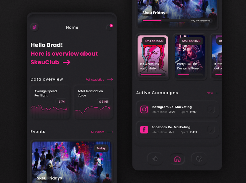
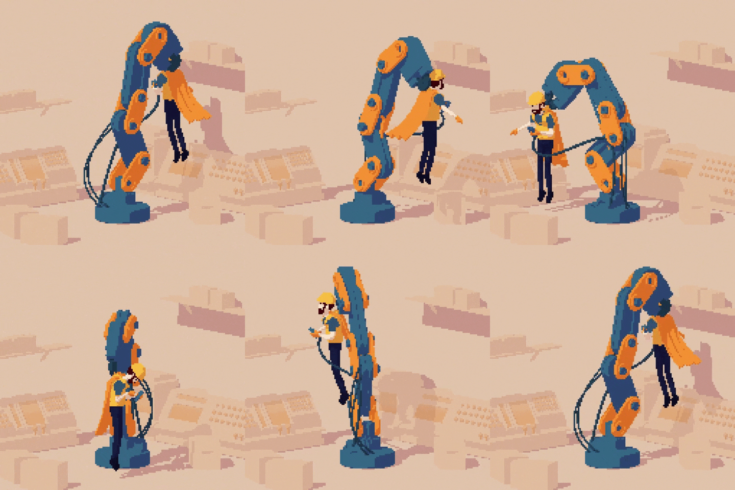
Just something I did over the weekend. Actually in QBN context I can say that it reminded me good old days when you needed at least 3 different layer style for your ui elements.
You can check small animation in Dribbble:
https://dribbble.com/shots/97977…- nice. I can feel those buttons at the bottom.
VelvetyProjectile - Flat Design Is Dead Parties on Skeu Fridays! Then Drive-In Saturday!CyBrainX
- Did you animate in Photoshop?ideaist
- Thank you!
Designed in Figma, Animated in AE. Probably same could be done with PS timelinedpi - How was Figma? Been working in it long? I'm toying between this or Sketch... I know these are all cutting edge tools right now.ideaist
- Nice buttons.DRIFTMONKEY
- Figma is great. As a freelancer I am always jumping between apps. Different clients, projects, needs. Every app has its own strength.dpi
- https://uxdesign.cc/…Nairn
- nice. I can feel those buttons at the bottom.
- SHIP32
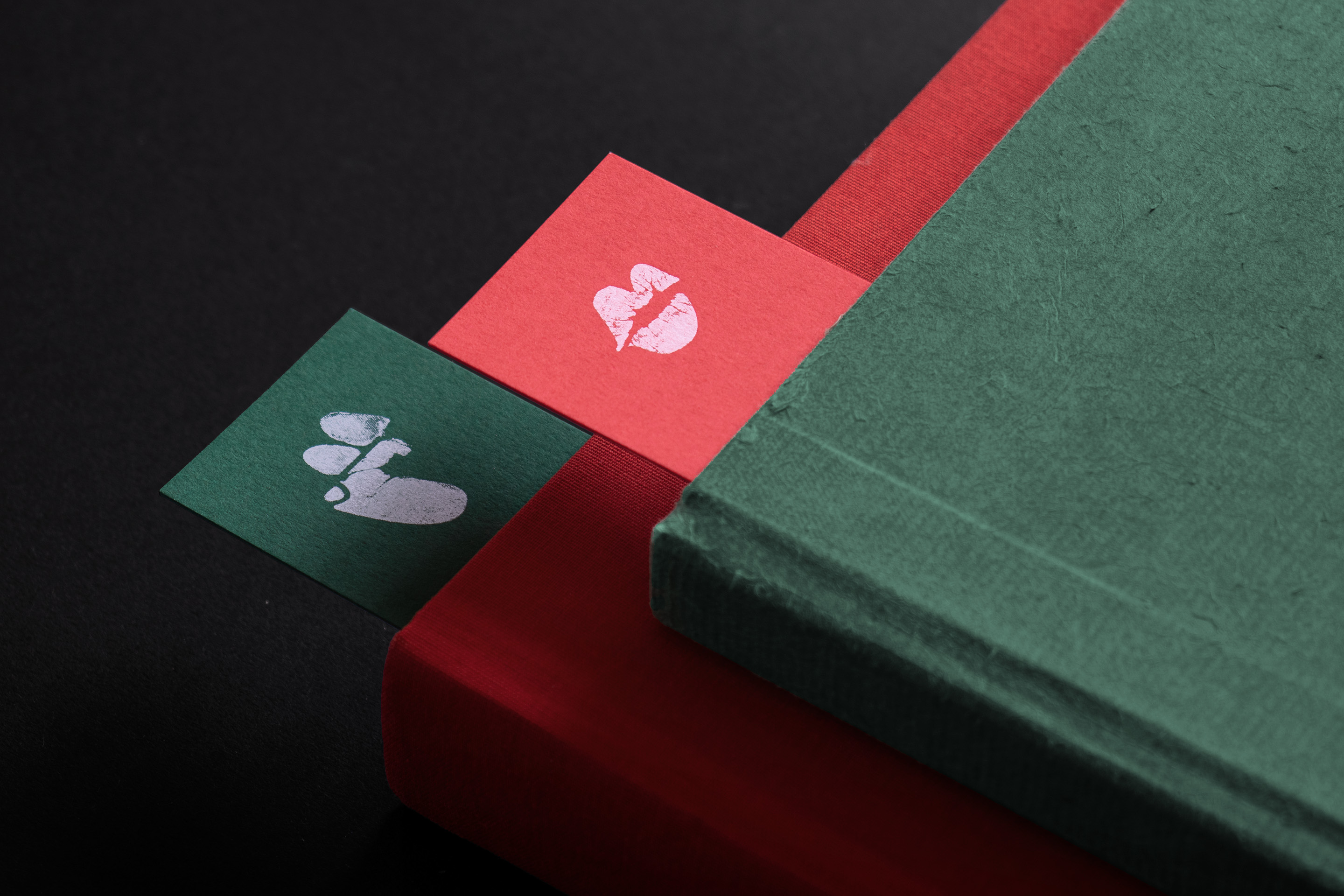
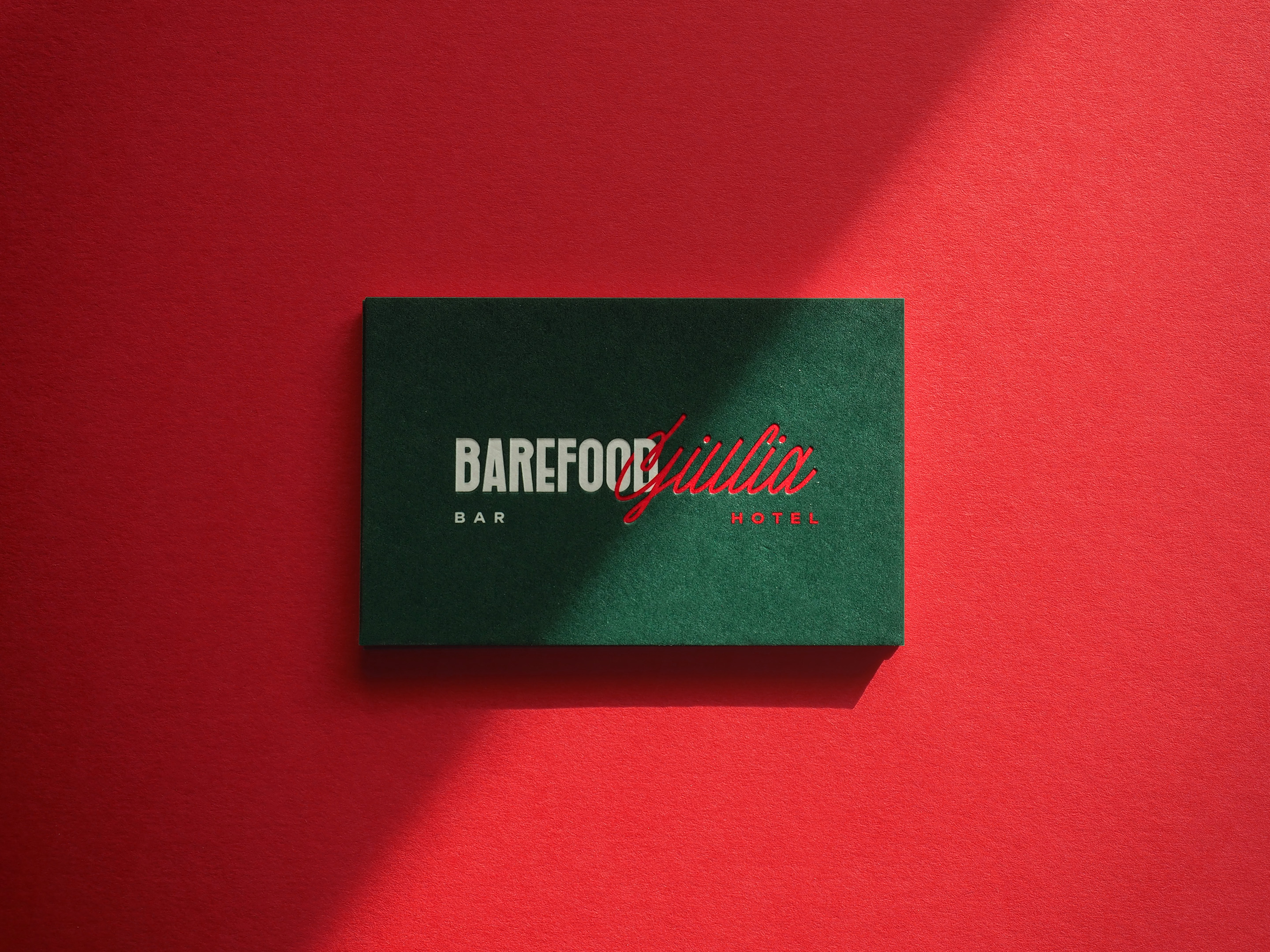
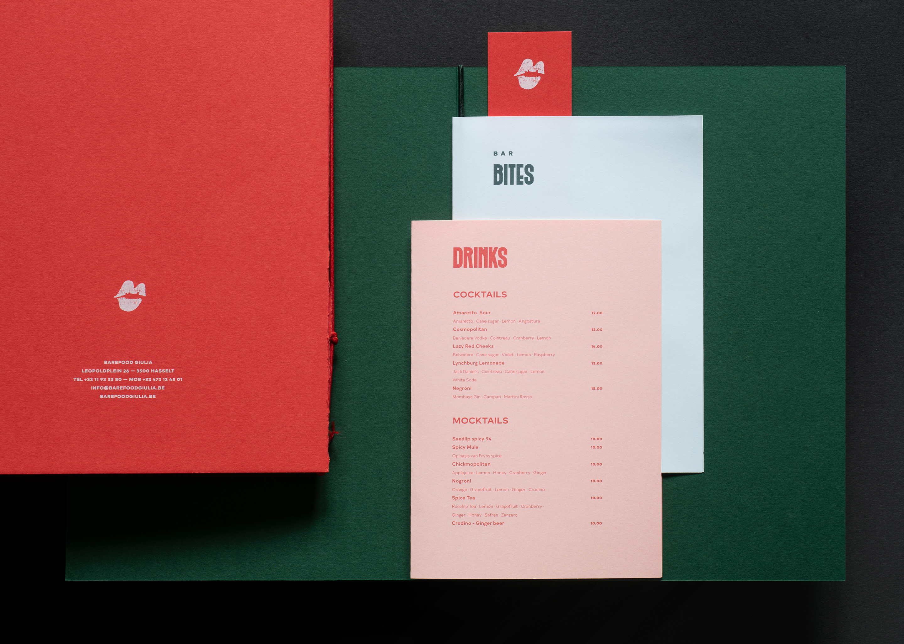
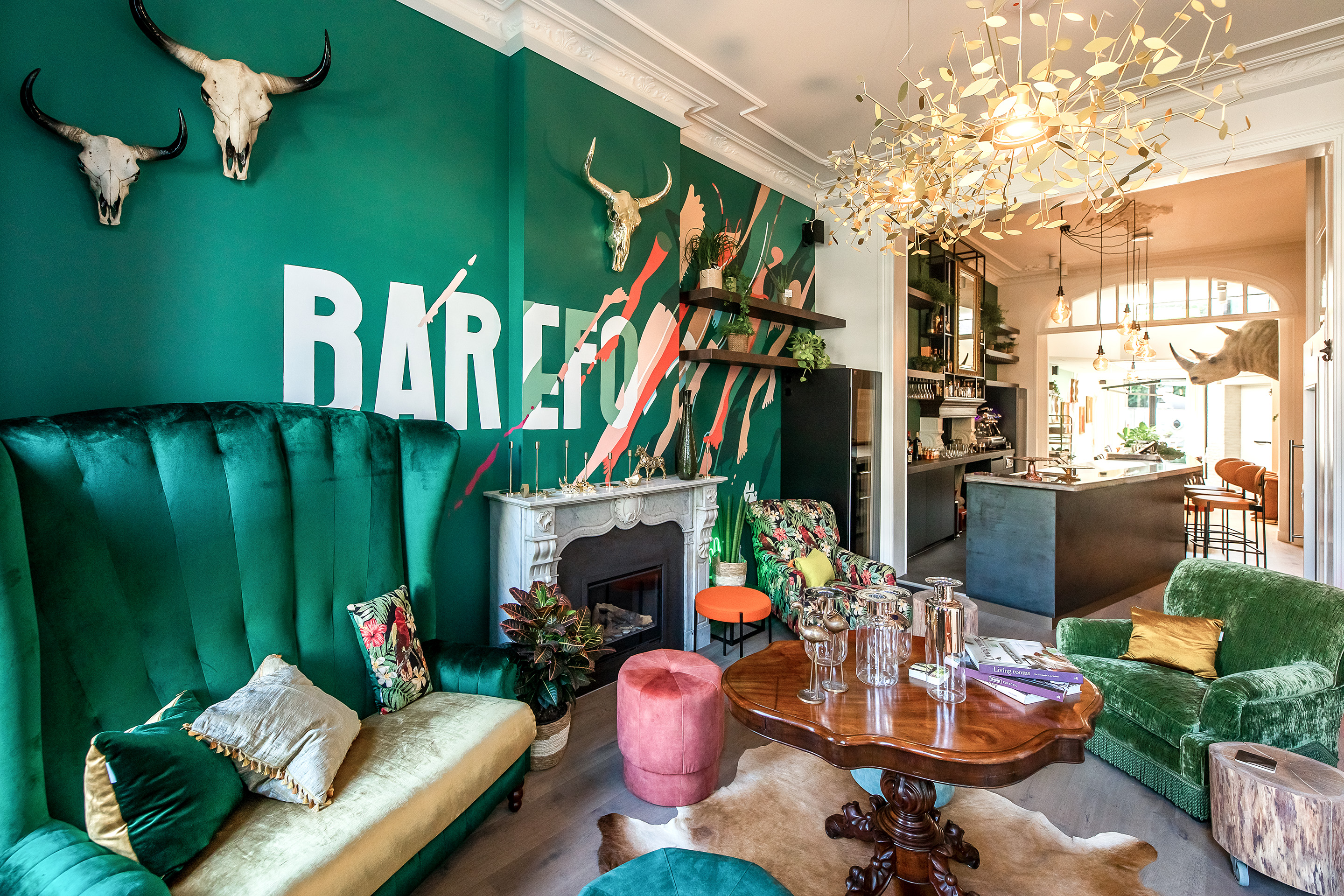
Branding, custom typefaces, stationery & print design, signage & wayfinding, interior graphics, handpainted murals, webdesign, and whatnot for a lovely bar & boutique hotel. Pretty intense but rewarding project — Full case: http://www.eskader.be/barefoodgi…
- Great details and texture(s) on the paper @SHIP.
#ItStaysideaist - Fucking hell @ the project page mate. That staircase, though!ideaist
- fuck you!
fuuuuuuuuuuuck.....
you!
just beautifulscruffics - DOOOOOOPPPPPE!dee-dubs
- +100 great work!renderedred
- Great work!canoe
- Very niceMrT
- Quite frankly, it stays********
- oh the staircase! really nice :D
i wanna hit that bar and deletested - Thanks guys! :DSHIP
- so damn good! well done SHIPcapn_ron
- Damn slick!bezoar
- Stunningmaquito
- Super nice!fisheye
- Oh my, this is dead sexy.
Design — and *great* design — is alive and more than well.Continuity - excellent.neverscared
- Really lovely work. The carpet is wild.Gucci
- your portfolio is fantastic.fadein11
- Great details and texture(s) on the paper @SHIP.
- neverscared1
- You're a fucking maniac.
+1Nairn - the fucking maniac, thanks.neverscared
- You're a fucking maniac.
- arne17
belongs to the above- niceutopian
- coolioGnash
- what the how?!scruffics
- Very fantastic.CyBrainX
- Really goooooood.PhanLo
- Darn, arne! That's dope!stoplying
- this is really nice, what's the process of doing these light streaks? looks very fresh!feel
- it almost looks like you are photographing the screen somehowfeel
- kind of got some results using Echo, very interesting effect!feel
- thanks for the feedback!arne
- @feel: right - it's sort of photography / after effects ping pong.arne
- Looks like long exposure photographs of fireworks.CyBrainX
- Nairn11
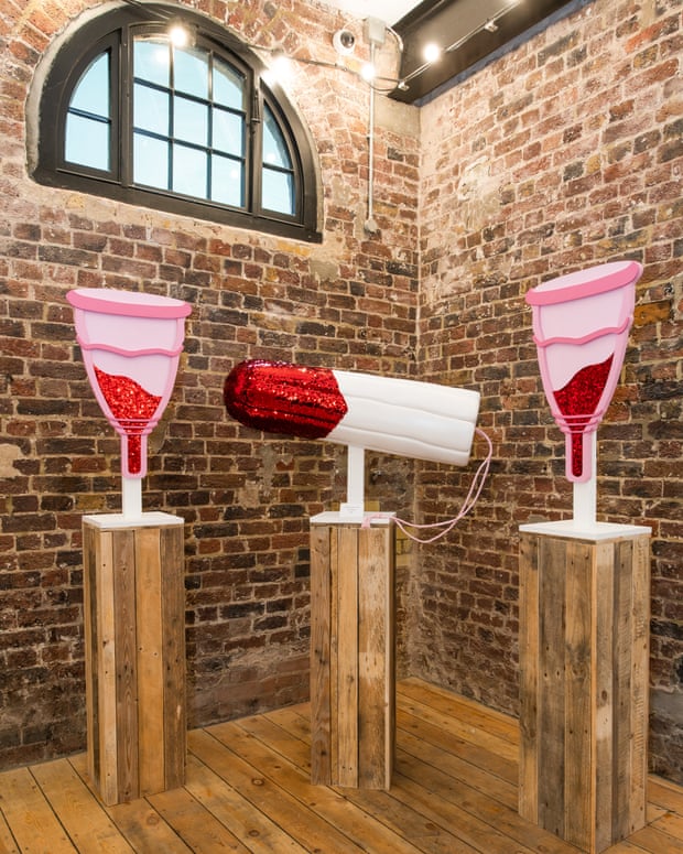
As often for my posts in this thread, this isn't 'my work' as such, just something I helped make for an artist - it's all her work, I just helped a bit on the technical side.
Anyway, I helped make some menstrual cup ('moon cup') designs for the World's first Vagina Museum...
- her personality shines through....renderedred
- cool ...monospaced
- I ended up reading the whole article. Nice work man.monospaced
- Good work!Fabricio
- dopepope31
- Dude !!!Ramanisky2
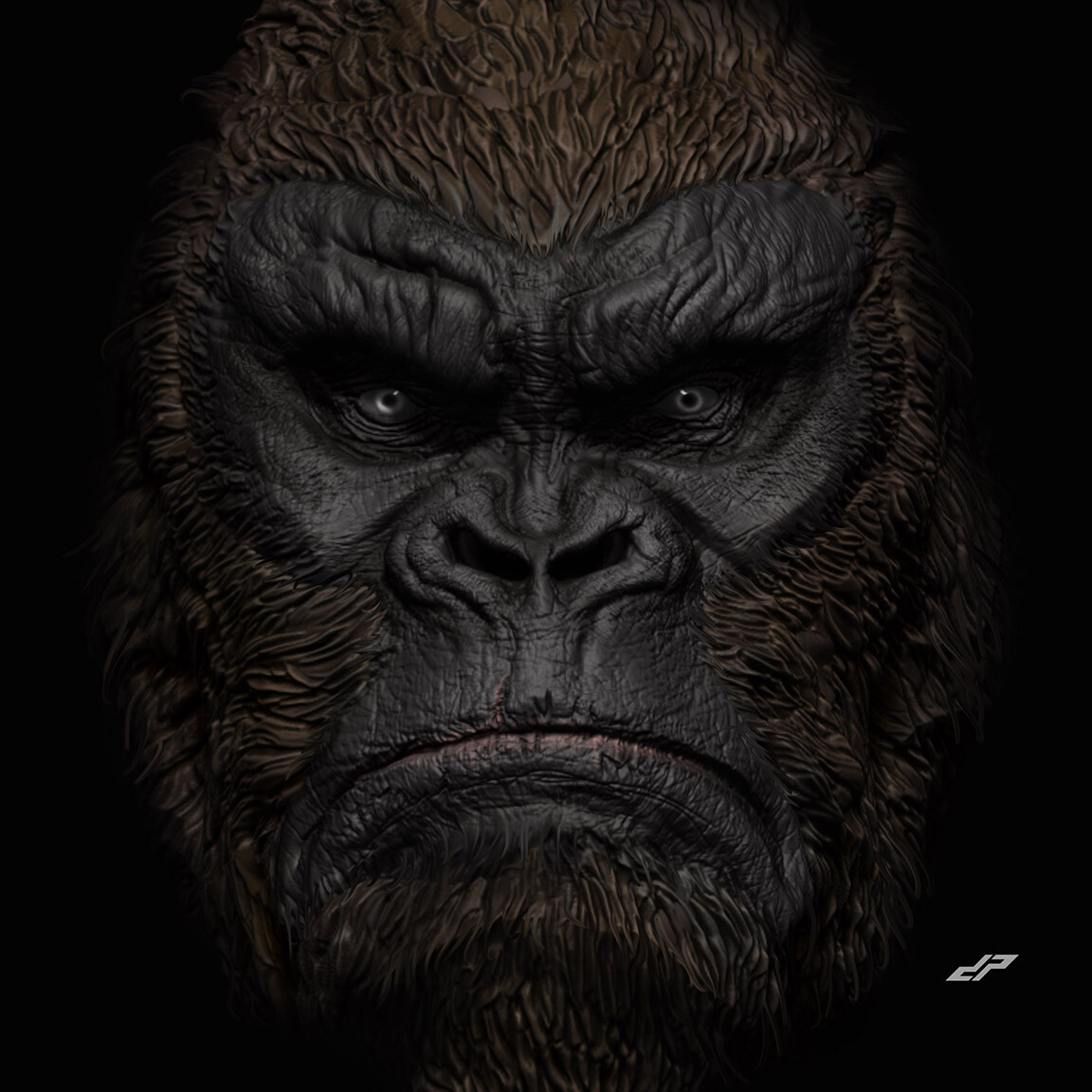
- This is great. How did you do it? Please tell us more.Longcopylover
- First you buy a ton of clay, then you kidnap a gorilla...Nairn
- whoa dude!renderedred
- Wow! Nice work man!Bennn
- That’s Bigfoot, not a gorillaGnash
- so fuck off talented.inteliboy
- Dope!fyoucher1
- This is why I love QBN; seeing talented mother fuckers become industry leading mother fuckers.
Niiiccceee @dopepope!ideaist - dope, pope!Krassy
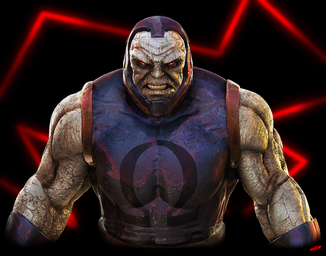
- Thanks everyone. Just digitally sculpted in ZBrush. Rendered in ZBrush too. nothing fancy.dopepope
- Amaze you!robotron3k
- so gooddbloc
- This gorilla is going places.garbage
- "nothing fancy." dope says... lolslinky
- wow, please DO NOT show us the fancy stuff - we're not ready nowapi
- loldopepope
- Awww he’s just a humble dope... popeRamanisky2
- I just meant it's a basic render. standard gray material. One light. polypaint. no texture maps, UVs or anything.dopepope
- That kind of makes it more impressive. Take your compliments, you meticulous and cool papal figure, you.garbage
- When I grow up, I wanna be like youuuu! :)
So awesome!!Fabricio
- Fabricio39
- I love the happy traffic cone.CyBrainX
- hehe, thanks sir :) !Fabricio
- very cool! How do you make these? 3D software?Bennn
- ^ Blender I believe.Hayzilla
- excellent stuff! i look forward to seeing more! go go GO!scruffics
- fantasticdopepope
- Thanks folks :)
Actually I returned to C4D for a bit...
I love Blender.. but I missed C4D's interface.. a lot!Fabricio - Found Set!utopian
- both are great!SimonFFM
- lol utopian - that's better than my attempt :)Nairn
- Hey Fabricio - i think you've explained across a couple of your posts how you do this - have you thought about putting links to those descriptions in your bio?Nairn
- I was both delighted and in a way a little saddened to read how you 'export as pixels'. It's such a clever method, but I'd assumed there was some "pixel render-Nairn
- -ing magic going on.
I mean, it's cooler the way you do it - I just had it in mind completely differently.Nairn - ❤PonyBoy
- The cape is such a nice touch. Great stuff as always.garbage
- Thank you so much guys and girls <3Fabricio
- Hey Nairn!
you want me to send you an explanation through e-mail? Yeah, it is quite a simple method.. but it is also staying truth to how images and games wereFabricio - ... processed back then. Smaller resolutions due to limitations, expanded into a tv screen.Fabricio
- great!prophetone
- I love the actual scene/story concepts in your work (in addition to the implementation)!Krassy
- amazing work man, you're a genius!pedromendez
- +1 krassy. @fab: I'm in no position to be doing this sort of thing, sadly - I was just thinking you could save time in future when people ask you! :)Nairn
- I mean id like to know! :)woowahesque
- pr23
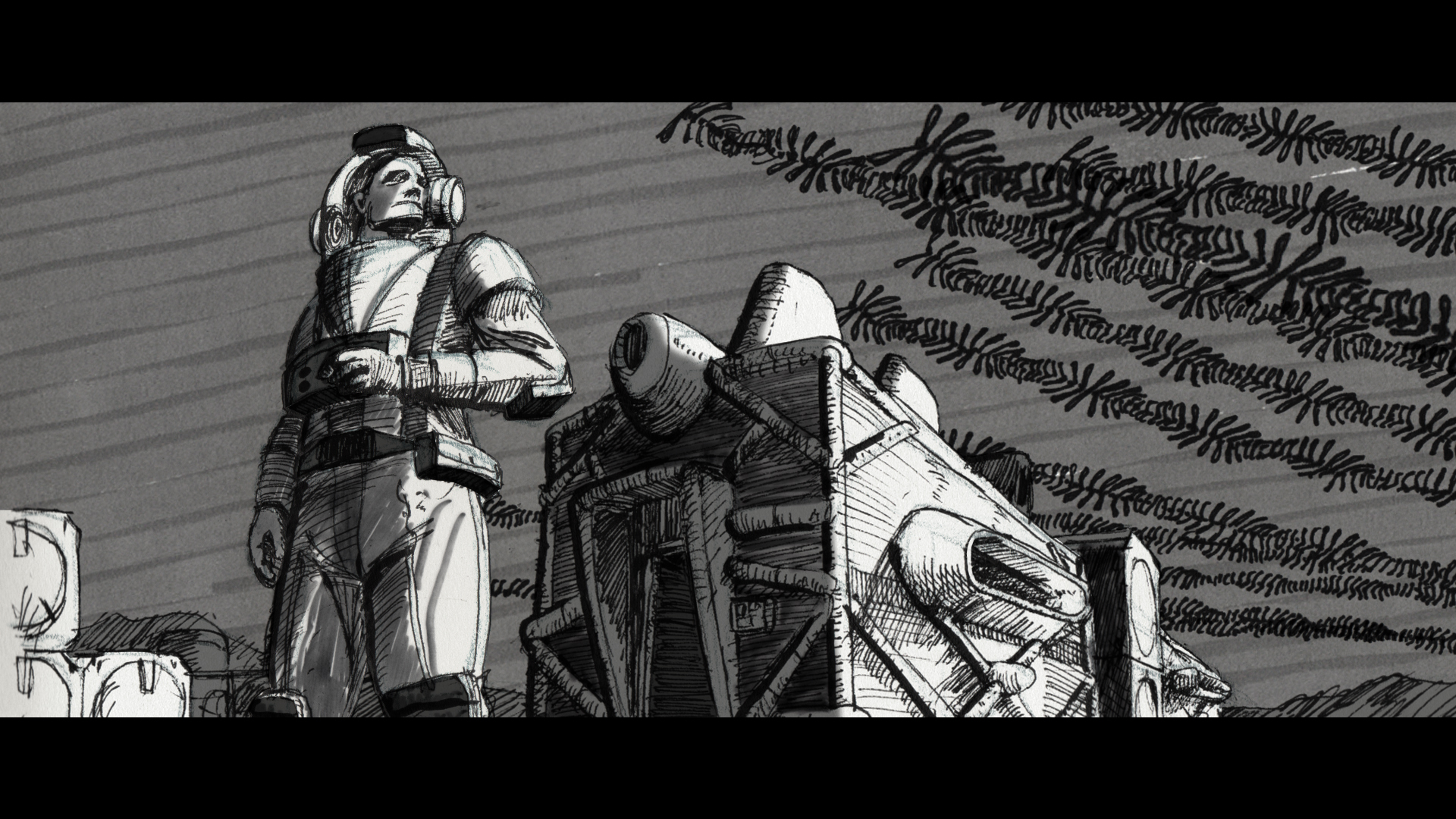
Another still grab from my book: http://thornsofimmortality.com
Even though the book is pretty much finished (missing some tweaks here and there), only now do i start picturing details of the world I wrote about. Painting pictures with words was never my intention, so I don't feel particularly guilty of hypocrisy (you know, writing about the stuff before it even shapes in your own head), but what I find fascinating is how images inspire clearer interpretations. For instance, only AFTER I started making drawings certain physical characteristics of the future world started materializing. The book takes place in two futures - that of around 150 years from now and further one, around 350 years later. The future set 500 years away is devoid of objects, with spaces mostly only defined by light. But the more immediate future is in a transition period towards that physical indefinably. It's made up of temporary inflatable objects, like the outpost in the image below.
- I still think you are incredibly talented as a visual storyteller, but that your writing is not at the same level. Please PLEASE work with a host of editors.monospaced
- And please publish with the illustrations as part of the book, not as just supplements. They really are your vision.monospaced
- Curious ... is your plot expecting the reader to accept that God is real for this to work?monospaced
- The "God" is used as a concept to give concreteness to the structures outside of ourselves. Without "It", the speculations wouldn't hold the same weight.pr2
- And thanks for the feedback! My "pretty much finished" indeed means it's ready for a serious editor.pr2
- Coolmonospaced
- SimonFFM23
- C Y B E R C U N Tutopian
- Congrats!zarkonite
- Nice, Simon!!!PonyBoy
- Tits!robotron3k
- If you succeed we succeed!grafician
- Congrats Simon! You must and should be very proud!Bennn
- Without the caption, this photo tells a very different story.monNom
- ^Lol! Congrats Simon!!sarahfailin
- Looks like your plants are growing very well Simon...OBBTKN
- j/k, congrats man!!OBBTKN
- !!!GuyFawkes
- Congrats!inv
- Thank you, guys. It was a wonderful production. And I am happy with the photos. And I made it on the QBN frontpage again. Yeah! LolSimonFFM
- How hard is it to be published by American Playboy?drgs
- Right on Simon!!lambsy
- Congrats!!!ApeRobot
- Playboy America is a quarterly mag while PB Germany appears monthly. The whole team changed last year. I am available for them, too, if they ask me.SimonFFM
- I know nothing about the business. I imagined Playboy America operates centrally somehow, from models to photographers (ie. not hiring freelancers)drgs
- lol monNomNairn
- Nice one.garbage
- And I am happy to have one over the Coronavirus on the front page! (At least for a moment, Corona lovers).SimonFFM
- Congrats!!formed
- What is more special, Simon? QBN or Playboy coverpage?Krassy
- QBNSimonFFM
- ♥Krassy
- YES! SIMON!!! Properly chuffed, mate!zarb0z
- antimotion9
- these look cooldopepope
- Thanks man!!antimotion
- Superb! cyberpunk afgrafician
- I've only had ProCreate a short time and didn't know you could animate at all. These look great. Did you draw those in ProCreate too?CyBrainX
- Hey cybrain, yes. I usually use symmetry to cut time in half. And for these I have a set of grain brushes, then animate top frames using fin image as BG.antimotion
- The timing on these is whack due to short amount of frames - I didn't mind the glitchiness, but note that more frames might be a bit smoother.antimotion
- Depends on how large your canvas is - this is 5Kx5K with 17 layer max. Smaller canvas will give you more frames.antimotion
- this is amazing, I'm loving it! I think the short loop contributes to the stylefeel
- and also, reminds me of silverhawks!feel
- boobs-5
- boobs-8
- nice boobs!grafician
- nice broutopian
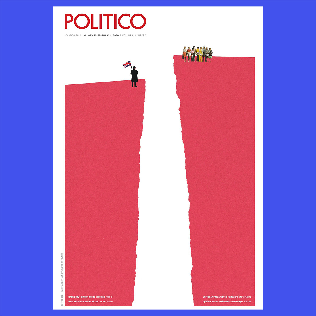
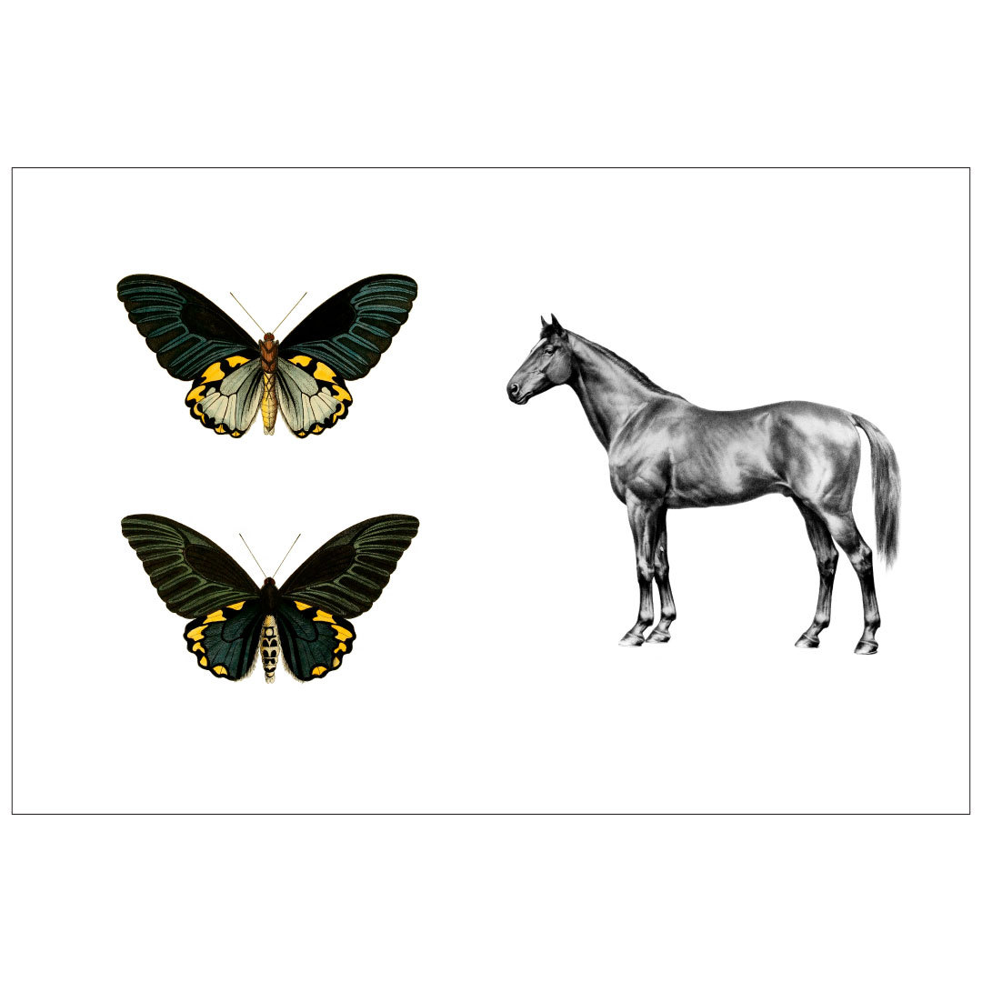
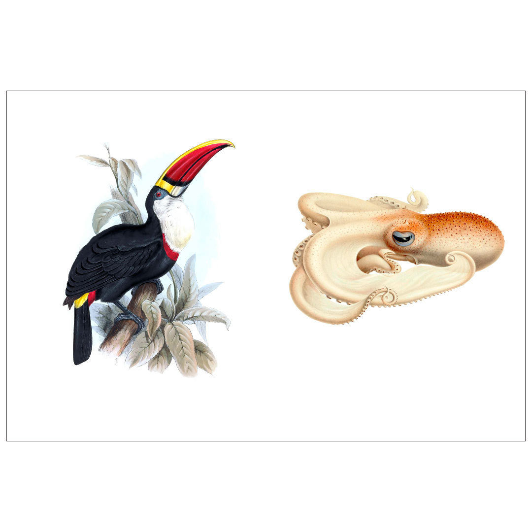
- Your work is "curating" illustrations?
At least give Edward Lear & Ewald Heinrich Rübsaamen some credit.deadsperm - From what I can see your pairing of illustrations & black outline around them adds no conceptual or aesthetic value to their work.
Do explain.deadsperm - This is even less your work than the shit I post in this thread..Nairn
- That 1px outline, tho!deadsperm
- ApeRobot7
Confinement Day 1- I’ve made the beat
Confinement Day 2- I’ve made the visual
No work, away from my son, keeping my self busy. Creative and productive.- me likey. wicked production, like that bass!renderedred
- Good stuff! Great to see something creative coming out of such odd times.
Dug my APK mini out today and messing too.PhanLo - nice. may get time to work on our album and finish my bastard script.fadein11
- All I’ve done is clean out the cupboardsGnash
- Lovely, it’s got a great John Carpenter vibe.Wolfboy
- cool Ape!Bennn
- Thanks guysApeRobot
- ApeRobot1
I’m digging in every footages I can find to make those visuals. Limitations are sometimes good actually.
