Show some recent work
- Started
- Last post
- 8,639 Responses
- antimotion6
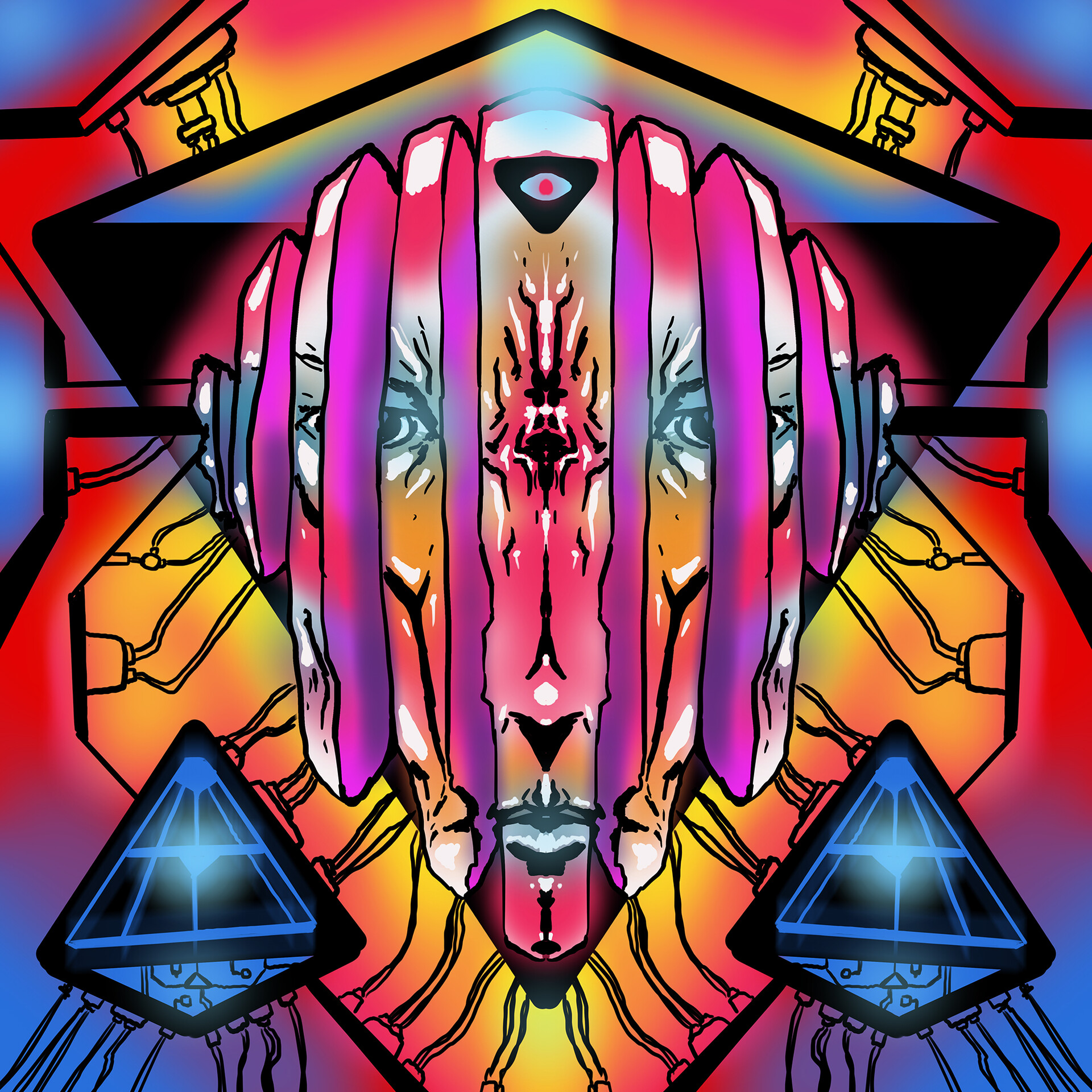
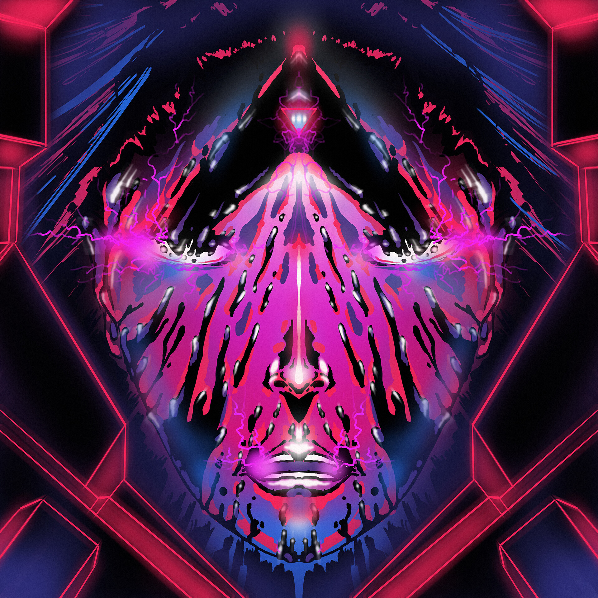
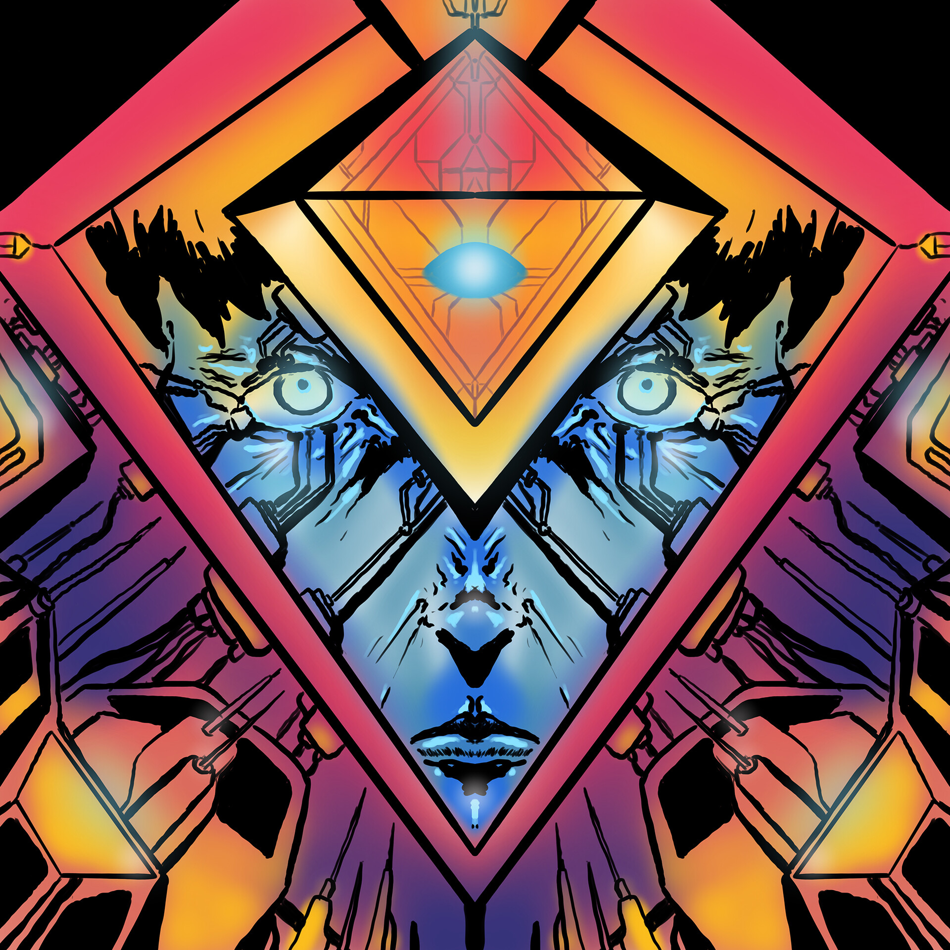
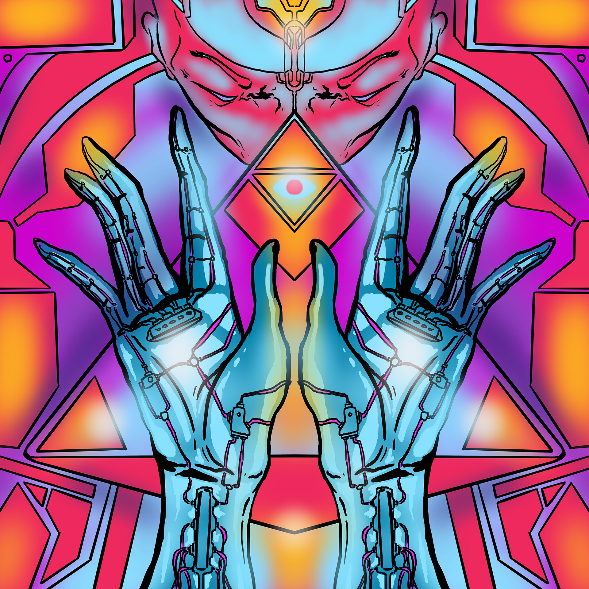
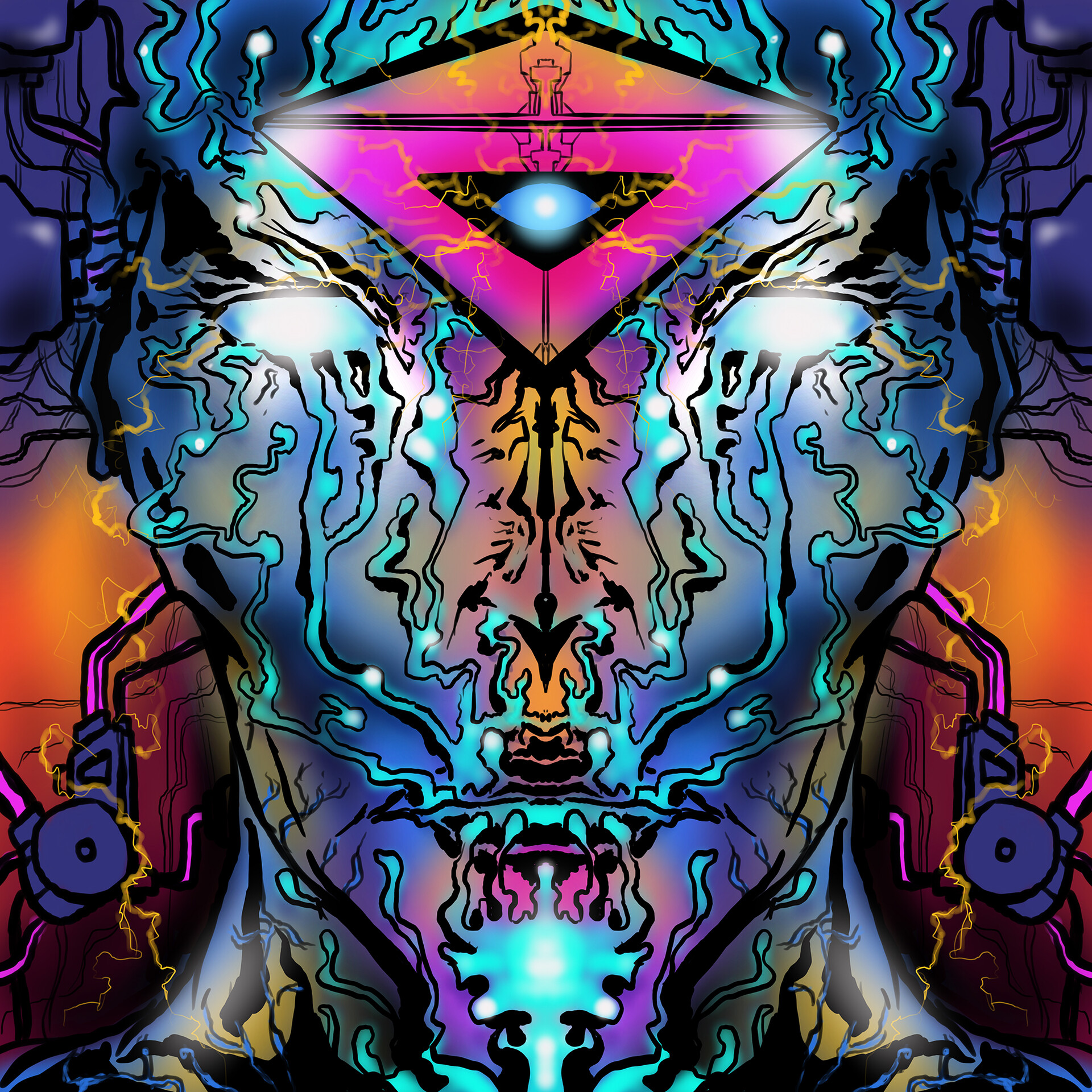
Trying out some prints on Artstation ; )
This new series is an interpretation of fond childhood memories flipping through the beautiful art depicted on the pages of OMNI MAGAZINE.
The images represent what the heart of a computer may look like or some kind of digitized omnipresent eye.
My attempt to retain an "OMNI MAGAZINE" ethos was to create montages with a geometric 3D look without actually using any 3D software. Only Procreate and Photoshop.
Like the illustrators back in the day -- eyeing the perspective, and being okay with slight imperfection due to the human touch rather than allowing the CPU to control the measurements down to the micron.
As always, thanks for checking out crew ; )
I really appreciate the support and hope you enjoy!If anyone is interested in the process, I'll try to get a video together soon - in the meantime, here's an explainer:
1. I draw the detailed Linework in Procreate and manipulate the full screen "frame" into a cube shape with perspective.
2. Export as a layered PSD and open in PS.
3. From there it's simply a matter of tweaking colors and composition. I'll add a little noise and tweak layer styles, etc.
Overall, some of the areas obtain a kind of airbrushed grain look and others have slight pixelization - I dig the mesh of the two and have been exploring these textures for a bit.
If anyone is interested, here's the link - there are a few "tall" versions available as well: https://www.artstation.com/laser…
- Looks cool. I'd suggest buying some test prints of those first. My experience with online print services is they print dark, and details get lost.dopepope
- I recall buying a poster once and being very disappointed at how dull it was overall, when the image online was so vibrant.dopepope
- Thanks man, I haven’t ordered yet, but really respect some of the artists who have prints available. Maybe a factor?antimotion
- Is there a company you would recommend you have tried? Your renders are insanely good so surly look beautiful on the right print.antimotion
- These are great.I like the second one the most.CyBrainX
- SimonFFM1
When I wrote the foreword to my book Sublime, I felt like a genious. But not too much, so luckily, I consulted a native speaker and she helped me correcting it and putting it in order.
There is a secret hidden in the foreword that probably only designers (you!) understand. To my surprise noone ever mentioned this to me. This either means, noone read my foreword (pictures speak for themselves) or people didn't notice.
- genious is a funny mistype ;-)SimonFFM
- I don't get it mateHayzilla
- You might have heard of "A Trip To Venus" by John Munro (1897).SimonFFM
- I might not actually LOL.
Well anyway good luck to ya.Hayzilla - Good luck to you, too!SimonFFM
- Don’t forget to set magazine titles in italics. :)monospaced
- @monospaced: Good point, I will in my next book!SimonFFM
- sted3
- Unit cost estimate?Nairn
- money-shot prototypes have no price tags :) the basic version would sell at 50-65ksted
- sted is this for like a paid gig or for fun?********
- it's fun :D but more like a raising money for the next version prototype :)sted
- Why modular? Inductive charging? Why flexible solar with flat panels?monospaced
- Where’s the charging part? Wouldn’t that be underneath? Where does power come from knowing the sun could never provide enough?monospaced
- - To make it available for more cars, parking lots etc.
I think Automotive Inductive charging needs to move a different way like Qualcomm's Halo system.sted - Front and back cover works like a roll-up. and the manufacturing costs for the side-panels are much lower than a mono/polycrystalline rigid ones.sted
- BlueSolar MPPT and two modified EVBox does the 2.5-3.2kW wired charging :D
LTO Battery packs in the legs, they provide 2.5 kWh*2 charging power for 16h.sted - and you can plug-it-in-at-home.sted
- haga3
Did the intro for a life science event here in sweden called NLS Days:
- bjladams5
- nice, William Turner-esqueIRNlun6
- dude you should messy up the studio a bit like you are all passionate and chaotic in development and not a clean rug :)********
- i like you are exploring but it feels flat compared to you characters.im a big fan of ian francis work. wouldnt say copy, but maybe a way to incorporate********
- figures into such a landscape? Definitely the moody vibe i like though********
- it's not my workspace or even my easel :-)bjladams
- Wow is that just from the weekend?Smurf
- deathboy, go back to being a political troll and stay out of the creative thread, fuck you very much :)monospaced
- BGNmcr3
- *intorenderedred
- a bit 'LOUD' for my taste.shapesalad
- immersing ourselves 'in' your culture.. not 'in to' not 'into.BaskerviIle
- Would've been very good without ALL CAPS - the font is bold enough...grafician
- Nice Sagmeister & Walsh "&" ripoff.
https://i.pinimg.com…MarleyMarl - This world has too many &‘sNBQ00
- Why has Lilli Sampson got "Samm's" email address?matski
- what if someone with a really long name is hired?monospaced
- “Culture” is a shitty word for workplace.ben_
- Fabricio41
Hello guys and girls :)
Wanted to share with you this last project I worked on, for Cirque du Soleil, and their new show -Axel (that is currently touring around North America)The briefing was to design and animate a 3D scenario inspired by some old 8bit games and battle scenarios, and bring in some vintage elements. They were super easy going to work with, and gave me a lot of freedom :) One o the best experiences I've had in a long time :)
(hopefully the images will show up properly...)
- I just found this footage of one of the parts I worked on, filmed by someone on twitter:
https://twitter.com/…Fabricio - nice!Gnash
- EPIC!monospaced
- congrats!utopian
- I wonder what the view was like from the performers' perspectives!jaylarson
- Filmed vertically, of course. Great work by the way.CyBrainX
- Thank you so much guys :)
@jaylarson I dont think the view is really good, the projection of non-aliased graphics, looked quite bad on the ice :(Fabricio - @CybrainX hahah! it drives me crazy those vertical videos... WHY WHY!!! :PFabricio
- awesome!moldero
- This is so cool :)Maaku
- Excellent!SimonFFM
- Love it!inv
- nice!!milfhunter
- that's fantasticFax_Benson
- Wonderfulrobthelad
- superb!fadein11
- Crazy good! Congrats man!antimotion
- makes me think of the original Tron movie from 1983... amazing work Fabricio :)exador1
- dope! They are great to work with.ben_
- well done!ayport
- Talent. Design. On QBN. Can you believe it?ideaist
- Excellent stuffMrT
- I just found this footage of one of the parts I worked on, filmed by someone on twitter:
- stewart11
- You can type the latin & cyrillic characters here: https://creativemark…stewart
- Awesome / perfect.ideaist
- redstriker1
A friend is trying to get some attention on his editing work and is participating in the filmsuppy edit contest. He's been slaving away in an ad agency for years =( and has recently gone freelance =).
If you wouldn't mind checking it out and, if you think it's good shit, voting for his entry. It would be greatly appreciated.
https://editfest.filmsupply.com/…
(this is new stuff, but lemme know if I shouldn't post this here)
- BGNmcr2
First project in a series for Mark Hill, a women haircare brand sold in Boots in the UK.
- dopepope40
- And well deserved.Ramanisky2
- great work dopeutopian
- respect!renderedred
- nieprophetone
- i mean niceprophetone
- DOPE!!********
- Great, congrats!OBBTKN
- congratsBeeswax
- Right on Joe!!HijoDMaite
- D-d-dope! Good job!bezoar
- As always - amazing work man!!!antimotion
- yeeey! congrats :Dsted
- hell yeh!moldero
- congrats! Awesome!dibec
- Represent ;)sea_sea
- Nice one.garbage
- Thanks everyone.dopepope
- CyBrainX10
- even though I'm only going to need 0,1,2 and 3CyBrainX
- coolmonospaced
- cool, looks futuristicBennn
- Nice one :) I like them :)Fabricio
- 1 is crap, but I like the flow of 0,2,3,4,5,6,7,8,9 :)uan
- ^ Do you need the roundy bit on the bottom of the "1"? You didnt add it to the "4".DRIFTMONKEY
- It needs it on the 4, the 7 has it. just kern it up a bit. I dig it!BonSeff
- oh yea, you should hook the top-right side of the 4 like the 1BonSeff
- I tried all those combinations on 1, 4 and 7. I'll take a look at the 4 again tomorrow. Maybe I'll make a font family out of this when I get a chance.CyBrainX
- Finish the job and do the alphabetSlashPeckham
- dopepope9
more : https://www.artstation.com/artwo…
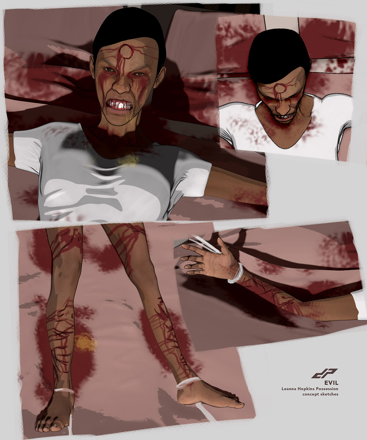
Worked on some concepts for Monster In My Closet FX studio for the tv show EVIL on CBS. Really quick stuff. Had only a couple of hours and 2 lines of info on the subject matter. Kinda fun to do tho.


