design a typeface 2009
- Started
- Last post
- 629 Responses
- juhls0
Due on Friday :)
- ********0

- Amicus has the 5?jimbojones
- I like it!dropdown
- ah sorry, saw it was missing on the previous page...********
- here's the lineup http://qbntype.blogs…jimbojones
- fwiw this could develop into a nice 5. you can still grab a letter, accented are still almost all freejimbojones
- If I don't come up with anything better use this... It's along the lines of something I was working on anyways.Amicus
- Loving this!Sandman_1982
- joseprieto0
quick start...
thoughts???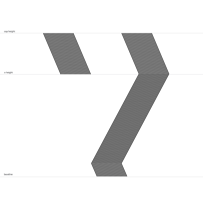
- Too literal.i_monk
- mmmmmjoseprieto
- i likedyspl
- #2 but needs more juicejimbojones
- I agree jimbojonesjoseprieto
- ********0

- Nice stuff...NotByHand
- see, that wasn't that hard, was it?jimbojones
- nicely done!jimzyk
- I dig it, the ball looks a bit small compared to the serifs [feet] imo..neue75_bold
- removing the counter would probably solve that..neue75_bold
- the counter stays!********
- It does feel a little off balance I agree but this is the best compromise I am willing to spend time on : D********
- jimzyk0

- Is it an F? I reckon bottom bar needs to be about a third thinner********
- yep — an F, must give that a try set, makes sense looking at it again.jimzyk
- nice one!neue75_bold
- looks goodFallowDeer
- i likefreitag
- I think its fine.Sandman_1982
- thanks sandman, and i think you're fine!jimzyk
- Is it an F? I reckon bottom bar needs to be about a third thinner
- neverblink0
nice ones!
- dyspl0
nice work everyone
-jimbojones, I will work on the letter between today and tomorow, You should get it on time-
- joseprieto0
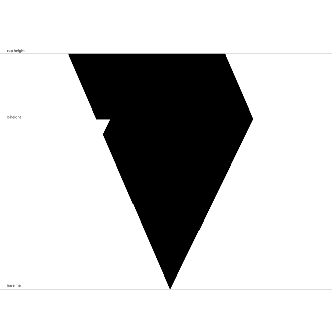
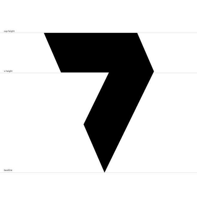
I think Im gonna go with this 7
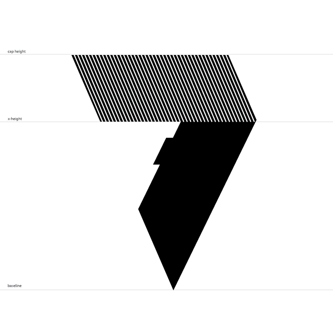
- 7point340
jimbo, i will try to send you a revised .ai file with all all my glyphs.
you can use which ever you prefer.
- no fucking way, you decide :p or let qbners decide, but not mejimbojones
- oh SUMBITCH, fine. i will send you the one i want tomorrow.7point34
- ItalianStallion0
Jimbo do you need the AI files?
- jimzyk0
some alternate f 's
one is nsfw
don't look at it.
- methinks the initial one is best, but what do q b n n e r s think?jimzyk
- not the 4th. then again the 4th is actually funny. 1st or 3rd. 2d is good but too wide.ESKEMA
- 1st, with the bottom shape a little thinner.Amicus
- f is for FAPP FAP FAPjimzyk
- 1st or 3rd.
I preferred the first version of the 1st...ItalianStallion - Fourth is raw and dirty, I love it!ali
- visual_infection0
Here are my attempts at the letter P. Let me know what you think. I wanted to make 3 concepts; literal, abstract, and simple.
(First time posting images on the forums, ohgodohgeez please let this work)


- hans_glib0
bump to remind the missing typographers...
- ItalianStallion0
Ok guys, it's up to you:
Version 1A:

Version 1B:

Version 2:
Version 3

Here's an iconic view:

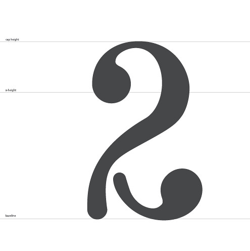
- version 2neverblink
- No. 2 with a little cleaning up of the curvesAmicus
- I like 2 as wellFallowDeer
- I like 3 but feels a bit off balance still********
- number 2 is good i likes itjimzyk
- 2 is really nice
7point34 - twoooi_monk
- tweefreitag
- Amicus0
this very nice 5 (by chris_himself)
- Amicus0
or one of these (be me, amicus)


- i_monk0
So the deadline is tomorrow, how many capital glyphs are you stll missing?
- typist0
missing glyphs
B: doesnotexist
H: Horp
I: version3
K: lukus_W
M: skt
N: MrDinky
O: elpaso
P: visual_infection
R: ESKEMA
V: utopian&: gramme
*: rayborn30003: neferiu
0: dyspl?: detritus
%: nerrdboy
@: OSFA
£: Autokern
#: MrT
¥: heathen
Å: NotByHand


