design a typeface 2009
- Started
- Last post
- 629 Responses
- ********0
1
- ********0
2
- ********0

- Was waiting for a significant post # to unleash the beast.********
- FUCK YES this is awesomesublocked
- prolly win the biggest file size of all when vectorizetypist
- thx sublocked btw. :D********
- this is so full of win :D
I prefer this one btwjimbojones - hahaa awesomejuhls
- Was waiting for a significant post # to unleash the beast.
- ********0

haha soo manyyyy pointtssss... 1.1MB...... fock..
- <- Minor revisions.********
- I'm sure you could at least halve the file size.Amicus
- How though? Just simplifying the paths? No time for pen tool madness....********
- Do you have overlapping paths? That could be a lot of the weight. remove the redundancy first and see how you are going.Amicus
- The whole thing is really clean actually... just complicated... see next post..********
- they're all about 1MB, no worriesjimbojones
- i love it********
- Your 3 has so much character it needs a name!ali
- <- Minor revisions.
- ********0
No overlapping paths really... The whole thing is really pretty clean.. just complicated.

- I suppose I could really get rid of the while 'holes' but it would take away from the 'sketchyness' let me know.********
- it's not much, but some of those holes are tiny... could you get rid of those without even noticing?Amicus
- word, i hear you, for sure. Just doubt ill have time tomorrow - its gonna be a busy day.********
- I suppose I could really get rid of the while 'holes' but it would take away from the 'sketchyness' let me know.
- MrT0
Here's a couple of inexplicably celtic # symbols.
Will you gusset-typists let me know which to go with please?
- MrT0
Cock!


- some lovely work mister tea.
both very nice – it's a draw!jimzyk - think i prefer the first one - but the second is great too. reminds me of scalextricjimzyk
- Both very nice.
Maybe the 1st, I like it clean.ItalianStallion - very nice, #2jimbojones
- some lovely work mister tea.
- MrT0
Why thank you.
If you don't mind old chap, I'll have another.
- torn between this one and the first you posted above.. lovely work sir..neue75_bold
- yep i agree - possibly one of the very bestest glyphs !jimzyk
- i like the one above better for this mark. but use this technique for another letter?scarabin
- typist0
missing glyphs update
B: doesnotexist
H: Horp
I: version3
K: lukus_W
M: skt
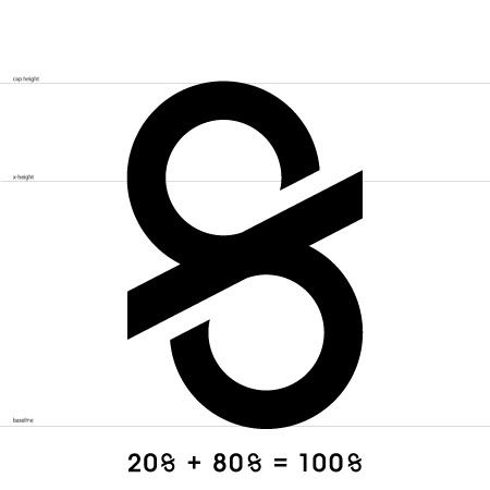
V: utopian&: gramme
*: rayborn30000: dyspl
?: detritus
%: nerrdboy
@: OSFA
£: Autokern
¥: heathen
- neverblink0
I'll take the % if nerrdboy pulls a no-show
- dyspl0
I'm on it, could someone send me the template?
- neverblink0
have sent you the template dyspl
- dyspl0
a bit rushed


- erotic!neue75_bold
- I wanna tongue that top one...neue75_bold
- top is most zero-esque - so my vote goes for that oneneverblink
- 1st one sentdyspl
- yummjuhls
- neverblink0
% (only if nerrdboy doesn't produce one before the end of day)
- ********0
I want V, if it doesnt come thourgh
- ********0
I want M or H
(utopian said he be done doing it now)
- typist0
@jimbo, pls update
- insane workload, really, will update asap, got some more AI's in the mailboxjimbojones
- crayz0
Ah bollex.