design a typeface 2009
- Started
- Last post
- 629 Responses
- ********0

- Calling shotgun is comparable.********
- Shotgun > Dibs********
- Over here, people only use "shotgun" for car rides. "Dibs" is more popular for other things.juhls
- Calling shotgun is comparable.
- ********0

- neverblink0
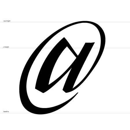
I'll do the @
- neverblink0
@ Jimbo, I'll send you the % and @ as AI right away
- typist0
¥
still available
- typist0
;
:
,
“ ”
‘ ’
( )
-
–
—
+
=
/
®
™
©
¥
still available
- ********0
The middle bottom part of the inside M was bugging me so I tweaked it a bit...

I'll send new files right away.
- ********0
reasonable price for the typeface? :p

- neverblink0
so where are all those people that said they wanted in, but were too late? There's about 16 more glyphs to do!
- neue75_bold0
.ai = sent

- freaky and brilliantkelpie
- on its own this kinda works although unoriginal, but as part of a typeface it fails miserably mate!********
- And your one of the good designers!********
- thanks for that...neue75_bold
- from my perspective any of the faces here that are 'proper' are by no means original... the ones that aren'tneue75_bold
- are just vain efforts to create something unique..neue75_bold
- further to that, this is not going to be an actual typeface, the letters will be featured in another way that I'mneue75_bold
- god... 'vain efforts to create something unique' - what a fucking bizarre view of graphic design********
- not sure jimbo has explained so I will not ruin the surprise..neue75_bold
- stop defending yourself. If I didn;t think you were one of the better designers I wouldnt be so harsh********
- dude get over yourself.. I'm not sure you know what you speak of..neue75_bold
- shut your puss set, wtf are you on about you arrogant twat?kelpie
- if you come at my like that I'll defend myself since you seem to need clarificationneue75_bold
- bunch of pussies. An opinion is an opinion. What do I need to be informed about?********
- context, usage?neue75_bold
- excuse me for misinterpreting the word TYPEFACE!********
- lets be honest this is the most vain submission there is, as it only works on its own! Im just being a cunt now but really********
- ok..neue75_bold
- i mean really, you call everyones submission either unoriginal or a vain attempt at originality...********
- you then say that there is a different intention for these designs but only you know about it********
- keep going..neue75_bold
- none of the things work in conjunction with the others, that's the frickin pointkelpie
- and call me arrogant? haha. No worries dude I shall keep my honest opinions to myself********
- hey kelpie fuck off son I'm talking to neue.********
- what a bunch of sensitive little dudes you are!********
- ok boss, you the mankelpie
- dude your grammar is terrible, you've never shown your work, your opinions are weak, why should we give you any credit?neue75_bold
- haha fuck my grammar mate this is a qbn note. Not asking for your credit just giving my opinion. I'll keep shtum from now on********
- the age old 'you havn't shown your work so your opinion is invalid' Grow up mate design is for people. ALL PEOPLE.********
- My opinion is valid whether I am wim crouwel or a bus driver.********
- I'm talking in general here, not this note.. you toss around the "nothing new nor original" comment all the time..neue75_bold
- those words in-itself have absolutely no meaning and show your ignorance..neue75_bold
- We can do this all day mate. My opinions are just that. If you want to tell yourself they are meaningless then fine.********
- yes, you are entitled and yes it is valid.. I'm done here.. again, thanks for your comments..neue75_bold
- http://www.qbn.com/t…jimbojones
- haha! get a room / thread chaps!
i joke, i joke.....
i like the C neue, and hadn't come across similar font before the guys pointed it outjimzyk - ....come across a similar font before the guys pointed it out eitherjimzyk
- 38!duckofrubber
- ********0
Not to sound like too much of a cunt but hey Jimbo Jones, what is this fundamental part of the brief that no one knows about apart from neue75?
- I tried to send you an email including formal apology and details but it didn't go throughneue75_bold
- <3********
- ItalianStallion0
We need dog-ear on comments here...
- jimbojones0
The brief was the same for everyone: design one glyph.
I told neue that I would like to make a dedicated website and maybe a poster series, where each glyph would get a special podium. But I don't have the intention anymore, time constrains on my side, and all in all there was too little discussion and process here to fill a website IMO. Not to say that I don't like the outcome, it just didn't work the way I expected it to.Anyway, people who still want to submit or resubmit, can send me the files until it's Thursday where you live. So the font will be available on Friday, I hope. Kidnappers around the world will be very pleased.
- jimbojones0
Can't help but reply to this, set: "on its own this kinda works although unoriginal, but as part of a typeface it fails miserably mate!"
Basically it should only work on its own, it wasn't the inention to make a usable typeface after all. So the decision to make a glyph traditional or totally experimental is not important at all here.
Doing something truly original in typedesign is wishful thinking. Neue's trick has been used for a commercial typeface, if that's where you're coming from, but I guess he didn't know.
The whole typeface fails miserably at being a typeface, I mean what did you expect if everyone does one single character without any general guidelines? That being said, since the design very close to Neue's has been successfully used as a typeface, I don't know why it couldn't.
- neue75_bold0
still, I shouldn't have lost it like that, clearly hit a never after a few people have pointed out that there is an existing typeface that's very similar, but honestly had no idea... as I have said though, in no way did I believe what I was doing had never been done before.. And as jimbo said differently, my opinion is that the vast majority of typefaces are mods of existing letterforms, so please don't take what I was saying in the notes as an offense [maybe hard not to] and finally jimbo, I apologise for even mentioning that there was suggestion of an alternate end purpose..
- personally I thought you had ripped the Soulwax stuff, never saw the typefacekelpie
- exactly! thank you..neue75_bold
- no problemjimbojones
- ItalianStallion0
I do not agree with Jimbo about the result...
Some things are really nice, some things are not, it's inevitable when working with a lot of different people with such open guidelines.
The core of the project is still good, maybe it needs to be more organized.
We must consider this a sketch phase, problems are inevitable.
Plus, personally I'm happy for my work, considering it was 2 years I didn't open Illustrator...- I know, my english sucks, hope you get the sense...ItalianStallion
- I said I liked the outcome, it just didn't work as expected to fill a website. Some things are nice, some not that great, that's perfectly okjimbojones
- neverblink0
jimbojones said:
there was too little discussion and process here to fill a website IMO
---------I think this might be partly due to the fact that we were asked to only design one glyph, not having to take the other characters in account gives you all the freedom to design the glyph how you want it to be. Not having to make adjustments for character combinations (kerning) or repeating design-elements in other glyphs.
I have a healthy interest in type-design and really liked this little project (as you might have guessed by the fact that I did 3 glyphs). Maybe the format needs to be changed just a little to give it the effect you were hoping for. (inspirational projects: http://www.dailytype.ru/ / http://www.flickr.com/groups/122… )
- I love dailytype too, but I hoped there would be more discussion and visible process. But it's ok, it's QBN, not typophile after alljimbojones
- yeah you're right jimbo, no real process or development here. people tend to post and just forget about it. i guess we're all too busy with work and fappping to think about design stage 2jimzyk
- ...too busy with work and fappping to think about further developmentjimzyk
- Sandman_19820
An interesting project that undertaken by my tutor whilst at University was to create a typeface based on Chinese Whispers. He commissioned one designer to create an A in whatever style he chose and then passed it on to the second designer who based his letter B on the design of the A and so on.
I think it could be interesting to try something similar to this and be able to see the progression of the typeface from A-Z, only posting the final typeface within the thread once each person has completed its character.
- nice idea sandman, kick it off, jimbo style!jimzyk
- I like thisESKEMA
- Yes, good idea...ItalianStallion
- yeh cos this one looks like its a fuckin shamblesWeLoveNoise
- This is a great Idea. I'd be down,********

