another quality rebrand
- Started
- Last post
- 50 Responses
- hellogoodbye0
1st one a bit like....
- tymeframe0
there is nothing frigid about that red
- dibec0
very nice. I do like it.
- sfeske0
that rebrand just killed the american dream... i thought that logo would never change
- Etype0
ya thats a shame... at least it had personality and character. now it just looks like everything
- formed0
Loved the old one. Most of their products are right inline with the old design - kinda a classic design but with a modern flare.
The new one looks like a joke to me (and until I see it in one of their print ads I'll think this is a joke)
- Milan0
omg, stop crying you pussies, it's a fuckin logo that was way overdue for a redesign. a retro-looking logo doesn't help sell new appliances. jesus christ
- monNom0
Welcome to Frigid IR, your investor relations profeshunals.
- hellojeehae0
failed
- hellojeehae0
Frigid and Ire.
- johndiggity0
who did this?
- version30
don't forget this...

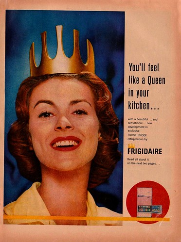
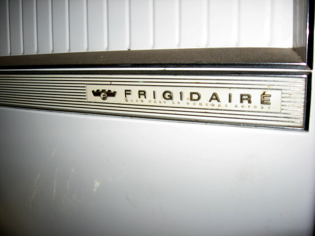
though, I always loved the crowned F on their commercial refrigerators- and...
http://www.a1vipserv…version3 - The crowned F rocks.Redmond
- and...
- version30
hmmm, go GM

- version30
nice hat

- version30
shame about the flash. nice crest

- version30

- That mark is truly badass...I love the negative spacemonospaced
- wow, i just now realized that it's supposed to be a face! :\
that's great.lvl_13
- version30
i guess they're still paying reparations for?