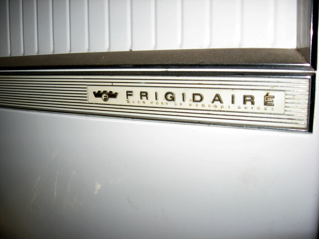
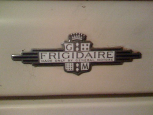
another quality rebrand
- Started
- Last post
- 50 Responses
- version30

- That mark is truly badass...I love the negative spacemonospaced
- wow, i just now realized that it's supposed to be a face! :\
that's great.lvl_13
- version30
i guess they're still paying reparations for?
- Milan0
omg, stop crying you pussies, it's a fuckin logo that was way overdue for a redesign. a retro-looking logo doesn't help sell new appliances. jesus christ
- miesvan0
modern women not frigid&ire...mmm
- version30
it seems the center cross bar of the "F" was pulled out, the "G" was raised, the "D" & "I" were moved slightly away from the invading triangle, & the center cross of the "E" was also pulled out.

- janne760
both F and E have changed from the original Gotham.. and by doing this they fucked up the balance.
- version30
if the red fill diamond was the goal, they should've maybe just stopped here

- ukit0
Putting aside the merits (of lack thereof) of this one, has there ever been a redesign of one of these "classic" logos that people liked? Seems like there is a built in aversion to changing them.
- monospaced0

- what the whore?version3
- Paul Rand. My point was that messing with heritage isn't always the answer, even if you're the master.monospaced
- johndiggity0
i like the idea of the new pepsi logo, i just don't think it was drawn very well.
- dbloc0
it's a rip..

- ninjasavant0
That F is horrible.
- dbloc0
That is F'n horrible.
- BonSeff0
trble
- utopian0
Someone shoot the designer in the head with a triangle!