Pentagram Sucks...
Pentagram Sucks...
- Started
- Last post
- 189 Responses
- i_monk0
- the before one is great!Krassy
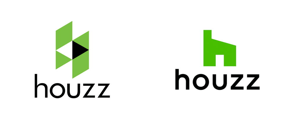
- FFS...it looks like a Squatty Potty!utopian
- lol utopGuyFawkes
- I bet there were bedates over visually centering the mark over the word, or the UGnash
- although, I do prefer the new oneGnash
- I know they've aligned the door of the house with the space in the U, but it being off centre like that feels wrong********
- ^ totallyGnash
- hah, sorry Gnash, I didn't even see your comment re: alignment********
- Definitely bedates over that********
- b's d's will de my unboingGnash
- Gnash has deen hitting the dong pipe harb again.detritus
- living the bream on qdn********
- QDN!********
- that will be $500,000. Thank you, we've been working hard! Soo very hard!********
- For a second, I assumed the After was on the right since it's so much better.CyBrainX
- looks religious with the crossdbloc
- houzz of prayerdbloc
- Gnash-1
- a factory?Krassy
- So that's what a square is. All this time...MrT
- I just vomited in my mouth.utopian
- Throw the designer in a wood chipperutopian
- that grid makes no senseinteliboy
- The entire logo makes no sense, just a lazy boring poor execution. Probably just a money grab.utopian
- FFS...a 16 degree roof pitch, with a open door frame that is not even in proportion with the rest of the house/toilet seat.utopian
- they only had planning permission for the 16 degrees unfort, they wanted 30 but council said no.fadein11
- Lol @ fademicrokorg
- afterthoughtdbloc
- doesnotexist-1
it's natasha jen's fault
- lvl_131
so much hate.
aside from that bullshit grid, the logo is actually a nice update from the original.
- Is it tho?scruffics
- A nice update? You are fucking
with with us right.utopian - it is far better, not to say it won't date as bad as the original.kingsteven
- it was ordinary before, it's ordinary now. so much ordinaryhans_glib
- it's more the illustration of the grid that's poor. '16 degrees' is obvs the result of a junior designer's pride in remembering pythagorus' therom.kingsteven
- ordinary 2008, ordinary 2018.kingsteven
- Never heard of this company so no baggage. I prefer the new one. Those BS grids people do are so stupid though LOL.Hayzilla
- SO. MUCH. HATE.
Don't dare voice a dissenting position... HATERS.detritus - why you hatin' detritus? PLEASE STOP THE HATE.lvl_13
- Well no, it's not a nice update.i_monk
- well, fuck you very much. I actually don't care. I'm just bored.lvl_13
- detritus-3
Zz
.
Why would anyone - who is not in the business of selling sleep - employ a double zz in their branding?
That's CRAZZY, motherfuckers.
- Domain********
- the only point of interest here is how such a 2nd tier .com can afford Pentagram. Investors money well spent when one of us could have banged it out?fadein11
- I do know what they do by the way, I have to integrate their fakkin' reviews into numerous architect client websites.fadein11
- they're valued at around $4 billion.Gnash
- yes, it's abundantly clear the domain was the limiting factor here, that's obvious. What's not obvious is the lack of any further thought on the subject.detritus
- Asks obvious question. Gets obvious answer. Says obvious answer is obvious. lol********
- @gnash, Uber is valued at [insert inflated meaningless price here] but they are still an utterly shit company not worth anything near.
And Jesus, I was joking.fadein11 - Sorry, set - shall i dig out my badge machine and make you a congratulatory badge for your profound insight here? What's your address again?detritus
- LOL.detritus
- "one of us could have banged it out" was the clue to the seriousness of my comment.fadein11
- 72 go fuck yourself avenue********
- hahafadein11
- [engage QBN escalation routine]
no pls don't, let's all just be nice to each other, like jaded bitter dog wee stained snowflakes.fadein11 - Meh. Said with a smile on my face********
- meh is prob the most appropriate response to my comment(s) and without a smile on your face. I've done it again :(fadein11
- What's your address, fadein? I've got a badge for you too, it's sparkly and has a flop-wristed snowflake on it... .detritus
- Just in case you're sat there weeping, I wasn't being entirely serious, fadein.
Not EVERYONE on QBN loathes you.
Well, almost.detritus - Even I don't loathe fadein. I don't really loathe anyone. Well, apart from mono, but that's unavoidable.********
- lolmonospaced
- Only joking. Obviously.********
- What sort of a micro-penised halfwit would bother downvoting this fantastic post?detritus
- Not this one********
- haha!detritus
- this thread gave me a micro-penis, I like it.fadein11
- Domain
- i_monk0
- I think it's excellent********
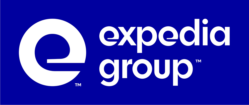
- hah, the E is shit on the own, penta did it... then they dumped it on MCKL to make the rest of the font (which actually makes sense of the e) FFSkingsteven
- https://www.undercon…kingsteven
- ^ that works exquisitely. What's the problem?********
- Utterly abhorrent. Yeesh.Hayzilla
- it's a weird one. I initially really liked it but if you keep looking at it, the bottom of the e starts to deform. or maybe I need some food.Fax_Benson
- where the straight meets the curve is horrible if you focus on itFax_Benson
- Yes, it's an improvement over the old logo but the "e" does look weird on its own, and doesn't look like it belongs to the rest of the alphabet.Maaku
- http://cdn0.wideopen…face_melter
- the e has a very weird "weight" distribution. it's off balance for me.renderedred
- I'm not ashamed to say I think it's utter shit.Continuity
- Its crap, both from a typographic and conceptual standpoint.cannonball1978
- Detritus digs™detritus
- is expedia™ a Kids toy or kids TV show? dafuq?!Krassy
- Paula is probably a multi millionaire and she's laughing all the way to the bank as we here bitch about their work. lol********
- ^ Sadly, this.Continuity
- hahah I love this, it looks like someone's cock got caught in a wringer washer.fate
- No, i agree set ... MCKL is a genius, the e is that bad and still he pulled it off.kingsteven
- Do companies hire Pentagram and approve their work just because of their past reputation? Is it all on autopilot at this point?chukkaphob
- https://media.giphy.…chukkaphob
- I think the 'e' is great********
- I just vomited in set's mouthutopian
- i prefer the work of set
seriously set you make way better work than this shitty logo.Bennn - At a glance...probably one of the worst identities that I have seen come out of Pentagram. Is Trump running that firm as well?utopian
- ASSnudes
- I actually like it. Distinct and very 60s. Cool to see them taking a risk.mandomafioso
- I think it looks like shit, there's my professional opinionpinkfloyd
- Wish I could illustrate these comments, lolMaaku
- How do they convince corporate that this is a good idea...Used car salesmenFawnDog
- Those of you who like it, do you think your opinion was at least a lil influenced by the fact that it's Pentagram work? be honest.chukkaphob
- Not at all********
- I think it's excellent
- kgvs72-2
- i_monk3
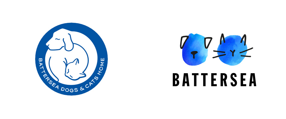
- better than before but lacks consistency... guess they couldnt decide on a single animal to represent their business.trooperbill
- Poor cats and dogs at Battersea.. They have had their eye gouged out!shapesalad
- before.. they were sleeping. well they're awake now, the poor mutt and kitty.. Pentagram have shown no mercy in removing their eyes!shapesalad
- the dog ears are filled solid and the cats aren't. that inconsistency is distracting so, fail.MHDC
- Also BATTERSEA sounds like a delicious chippyMHDC
- The dog's ears are folded forward, the cat's aren't.detritus
- It was better before... I would have just taken the type out and moved it underneathnbq
- i like it.utopian
- This font, man********
- Great work! Love the new one and its applications.Krassy
- Great. Love it. I walk past this place a few times a week. Most people just call it battersea dogs home so I guess they wanted emphasise the dog AND cat aspect********
- Works for me********
- love itinteliboy
- I like it.Hayzilla
- A friend who recently acquired an old mooch from Battersea responded "neutered testicles?" when I showed him thisdetritus
- MHDC7
- betterseacapn_ron
- Battering Sea ~ the most horrific wave of violence seagulls have known.shapesalad
- shapesalad0
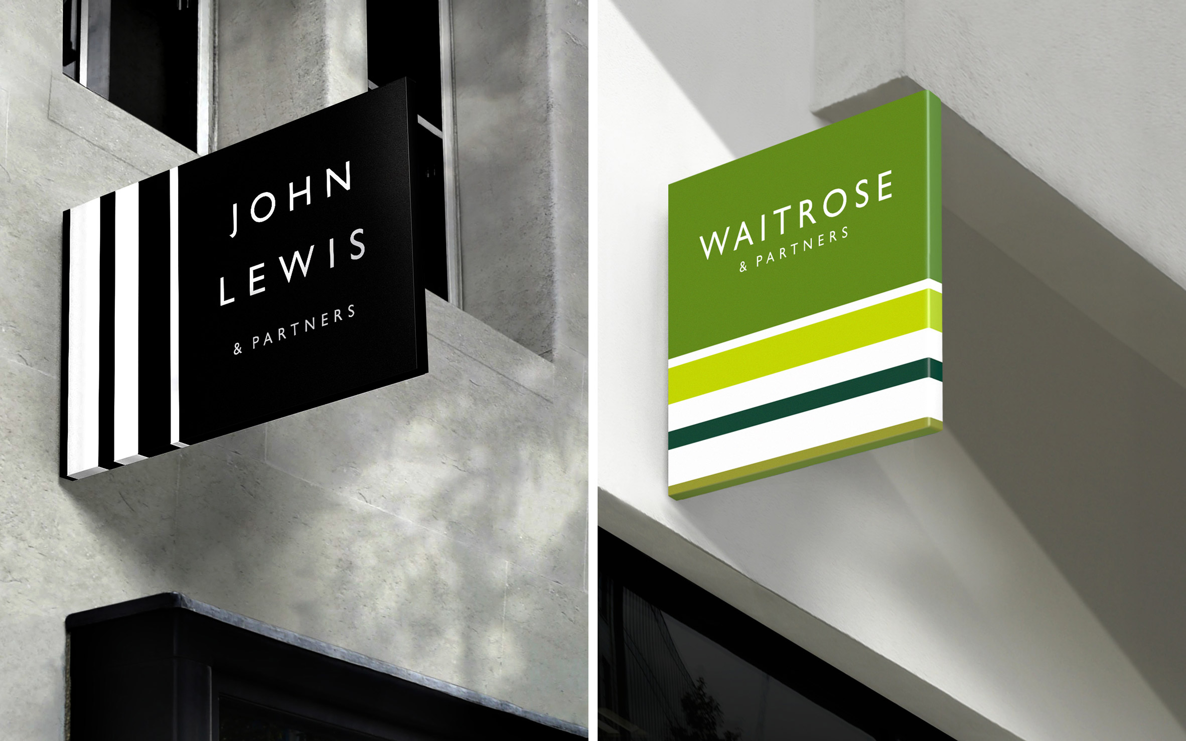
- isn't it trying to be an upmarket home deco shop?Fax_Benson
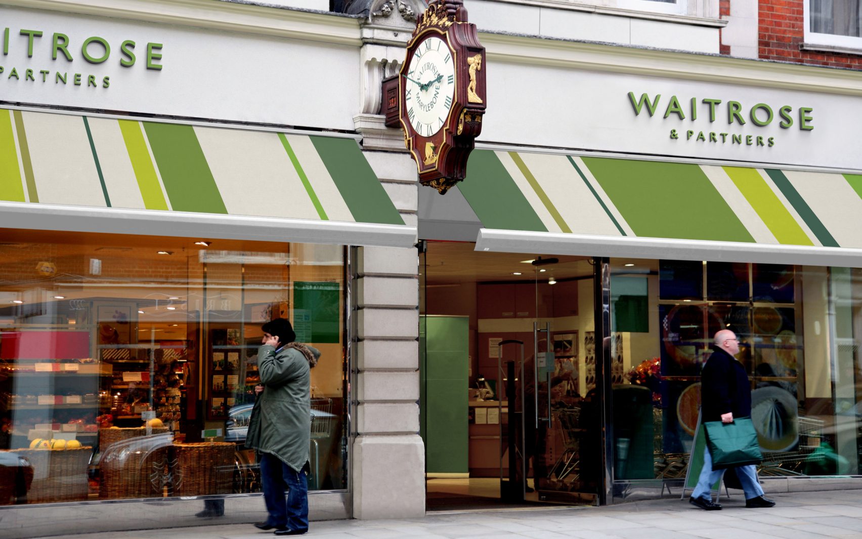
- I like the JL one. Waitrose greens seem a bit tired.Fax_Benson
- lol, fax :)Gnash
- nice.Nairn
- https://www.pentagra…Hayzilla
- So if I make some cool animations, truck templates and fake 3D, I can also add a few zeros to my fees?? Awesome.formed
- ^ grumpy old meninteliboy
- I'm left completely indifferent to this.
Which is just about the best review Pentagram could ever hope for from me.Continuity - It's fine********
- what do they do? flowers?mekk
- ^
John Lewis is like a Macys
Waitrose is like a Whole Foods
Upmarket stuff.Hayzilla - @Continuity - exactly what I thoughtformed
- It's all for nothing, post Brexit Waitrose & Lewis won't be able to stock their stores, when they do, they won't have any customers as we'll all be unemployed.shapesalad
- Could they not have waited for there to be no people outside the Marylebone High St Waitrose store? The scruffy guy on a call doesn't look a typical customer.shapesalad
- Clip Art Heaven®utopian
- this reminds me of military ribbons
https://pentagram-pr…dbloc - It's a bit M&S meets Sephora...see_thru
- Not every rebrand is a client-free b3hance project. Confirms the common heritage, fits the brief, job done. I'm the sort of wanker they sell to.MrT
- reminds me paul smithshapesalad
- the thick / thin stripes - I don't know why but feels.. off. like it's awkward for my eye to flow over them.shapesalad
- I'm usually the first to post here, but I gotta say I dig this rebrand.i_monk
- youngdesigner0
They are killing it....the fact that they make you question if it's good proves that it's good.
- Not for me. For me it’s the fact that they make all the $$$ that makes me question it.monospaced
- they're not the company they were, that's for sure. or else clients are getting duller and duller.hans_glib
- Dull is the new exciting...youngdesigner
- “the fact that they make you question if it's good proves that it's good.”
What kind of garbage logic is this?cannonball1978 - Kinda like the “they’re just jealous” one for explaining mean kids.monospaced
- i_monk2
- This one's not easy to look at...it's hard on the eyeballsMondoMorphic
- it worksGnash
- it worksKrassy
- "the boss wants to know if you can make the logo about 200% bigger. Other than that, we're are all okay to sign-off"monNom
- it workschukkaphob
- Pentagram rules...sorry.see_thru
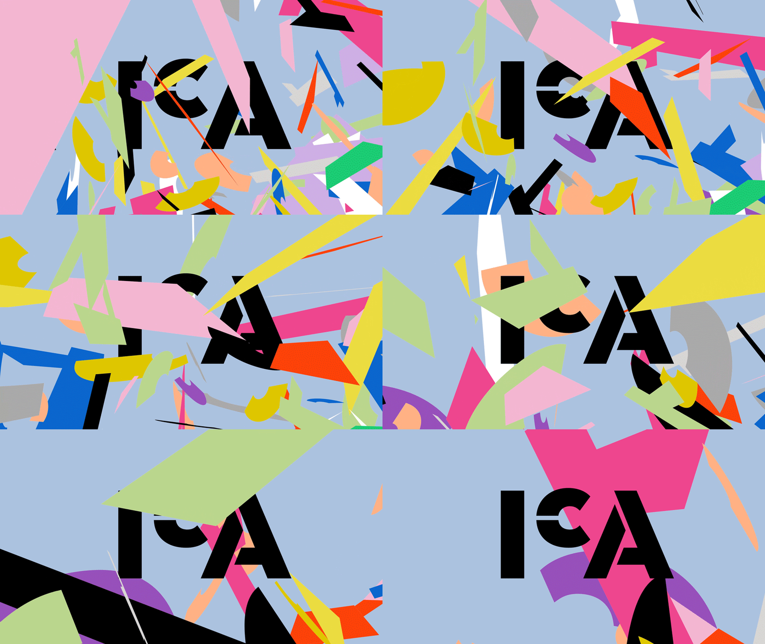
- Animation bit is cool.PhanLo
- I don't like the confetti gif but I love the logo. It works.CyBrainX
- Podunkutopian
- mg332
- https://www.itsnicet…mg33
- That's great!Krassy
- love itchukkaphob
- Step 0: Build a brand so widely known that two colored discs and some red tones are enough to recognize itmekk
- Interbank is my favorite version.NBQ00
- @mekk touchéKrassy
- although it's a logical progression, nothing more than that i wonder how much it cost them ;)renderedred
- wow, just wow.utopian
- this is such bullshit. you could do the same thing with most fortune 500s due to mass media ad buys and general social recognitioncolin_s
- self-congratulatory "mount olympus" bullshit beirut is such a fucking twat he's a bigger disaster than lebanon in 89colin_s
- 250,000$ please, txBennn
- May be he was testing the limit of the system and the limit hasnt been crossed and he made 250000$ for this? He's a rebel actuallyBennn
- worth every penny
the (genius) idea is what costs, nothing elsechukkaphob - Interbank looks like interscope's logo.shellie
- In the next Pentagram iteration the get rid of the TMNutter
- Nike did exactly the same with the tick...so what?see_thru
- ^ and same with so many others
It works!chukkaphob
- fate8
This is my favorite thread on QBN
- RumperChunk3
I'm gonna say it. I like Pentagram. Don't always like what they turn out... but mostly thumbs up. I also like Michael Bieruts essays and books. Humble and intelligent.
- i dunno i was re-reading looking closer 4 yesterday (specifically 'cause of this) and beirut just seems spinelesscolin_s
- That’s cool.. I just like the fact that he is not in your face like a lot of other well known designers..RumperChunk
