Stranger Things @ Netflix
- Started
- Last post
- 193 Responses
- Poochie0
If you were an eighties kid, this will seem really familiar.
- Familiar how? I haven't watched it yet.monospaced
- Very Spielberg influenced. In a very good way.Poochie
- I love that.monospaced
- sounds goodmoldero
- Wolfboy3
Half way through it and enjoying it very much.
Like Poochie said, it's rooted in 80s nostalgia and I'd be interested in hearing what people who didn't grow up with Speilberg's 80's work think of it. It's got ET, The Goonies and all those kids-having-an-adventure flicks running right through it's DNA.
I did grow up loving those films and it certainly hits the right notes for me so far. As I say, I'm 4 episodes in and I'll obviously reserve final judgement till I've seen how they stick the landing.
And how about this for a bit of artwork that could have come directly from the 80s:
- Ya, that looks like an Indiana Jones posterMilan
- hasn't anybody ever heard of Drew Struzan?LameKidsClub
- microkorg2
YEAH! This is brilliant!
Watched 4 episodes last night.Lots of bits will feel familiar to any 80s kids - there's lots of familiar moments 'borrowed' from the likes of E.T and The Goonies. Even down to the likes of the floating toys, introducing the dinosaurs etc and especially the little blonde girl who is totally Drew Barrymore in ET!
It's like a mashup between ET, The Goonies and Poltergeist.
Loving this so much!
The artwork and title sequences are great and the music is a lot of 80s classics and some awesome synth stuff for atmospherics too.
Much kudos to the guys behind this series.
Looks like all us oldies appreciate it but wonder what the younger generations think of it.- Ok I'm in********
- they mention Poltergeist by name in Episode 1, i believesarahfailin
- Ok I'm in
- Wolfboy1
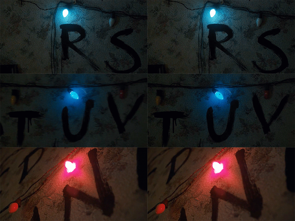
I love the opening titles. They're really simple but the music is John Carpenteresque, the typography is period perfect and it looks like they've even added little bits of, for want of a better phrase, 'film speckles'.
- "grain" might be the word you're looking forsublocked
- No not grain, I mean when specks of dust get on a projected film.Wolfboy
- I see the speckles tooprophetone
- sea_sea0
Binge watched 3 in a row so far. Those kids are great and the soundtrack is pretty sweet. Some of those scenes are definitely an homage to 80's Spielberg. it's getting weirrrrd. :)
- ********0
- prophetone1
Soooooo good. Long live the 80s.
- prophetone1
Watched all 8 episodes back to back, which I don't do usually. It's so spot on with the story, evenly paced, great acting, the soundtrack is 80s perfect. A+
- pango1
It's like ET...
I dig it.
- PonyBoy1
Binged 1-4... Good stuff... Klepto Ryder and Modine are making me feel old.
Aging is lame.
- Haha yeah middle-aged mom ryder made me feel real old too.microkorg
- Pilgrims!pango
- hahaha at klepto
#neverforget !sea_sea - *Kleptona Ryder
(sorry for the misspell)PonyBoy - Lol took me a minute i forgot she was klepto! Bwahaha Bloomingdale's or some shit right?HijoDMaite
- Ruined her career for a long while.pango
- "klepto" cmon, let it go man. lolsofakingback
- fadein110
Yep enjoying it - 3 in.
Love the title sequence but need more of those touches throughout - although it is good.
Like a kiddy version of It Follows or The Conjuring in terms of VHS/Betamax nostalgia.
Interested to see how it pans out.
Winona is a really bad so far but not sure if she is meant to be... prob so.
Really like the copy chewing pills at any opportunity.
It's a like a QBN wet dream really isn't it ha!?- Winona is*
Cop chewing pills*
phone screen and no glasses lol.fadein11
- Winona is*
- elahon2
Loving it so far. I don't know if you can see in on YouTube, but on my TV when watching in the dark, the opening credits have little grains and specs, especially noticeable near the end of the credits.
And the title type face reminds me of Stephen King novels from the 80's, as a similar typeface was used on his books from that era.
- Yeah... Totally spotted that King book font treatment... Thought it was a nice touchPonyBoy
- Completely different fonts.monospaced
- no shit, mono... it paid homage... yes totally different fonts... but the S and R placement etc...
again... a nice touchPonyBoy - pretty standard 70's/80's horror film fonts.fadein11
- The 'grains' and 'specs' treatment...been seeing that a lot the last few years. Mostly just people being retro / trendy—but here it's lovely / purposeful. <3 itPonyBoy
- This has so much going for it, I'm sad there are only 8 episodes. Firing up episode 3 now!elahon
- not exactly official... but it looks like Modine let it slip that there will be a second season, elahon: http://screencrush.c…PonyBoy
- PonyBoy chill, no need to lash out at me with curse words just because the fonts look nothing alike. Same time period is the "no shit" here.monospaced
- Your consistent 'corrective tone' needs to fucking "chill", mono... that and your 'captain obvious' comments are damn near as annoying as yuri at times. smhPonyBoy
- @elahon i love watching this in the dark as well. :)sea_sea
- Im a type nerd on a design site. The fonts are different. That's what I said. You got bent out of shape like a child.monospaced
- And you're delusional if you think I'm corrective in nature. Must be thinking of someone else. I don't go around like a cunt correcting spelling like some jerksmonospaced
- Nobody said it was the exact font but paying homage to the era... your statement was obvious an unnecessary... and corrective. Never Change, mono. :)PonyBoy
- Sorry you felt that way, but I feel the same about your response to me. I didn't see my comment as anything but a discussion on what typeface it was.monospaced
- lots of feelings going on here...
... up for a hug, young fella? c'mon... bring it in.... briiiiiing it in. <3 sorr sorr, mono <3PonyBoy - I didn't notice any corrective tone - he just knew what the font was... jesus of all the shit that goes down on here to get annoyed about that ha.fadein11
- Fade... Did you need captain 'no shit' to explain those fonts weren't the same?PonyBoy
- Why do you keep calling me captain 'no shit?' I don't have a habit of going around making corrections and stating the obvious. Relax.monospaced
- wow, dude, I respect a lot this intro, have to see the show nowfeel
- monospaced1
- The Stephen King one is a different flavor altogether.monospaced
- yep. I think they were going for that flavour but there were many 70's/80's horror films that used v.similar fonts to the title sequence.fadein11
- Yeah. Understood. But this typeface is extremely unique and recognizable. Not many like it.monospaced
- I never liked this font. I had it in 1994 at my first design job. It seemed very 70s and dated even then.CyBrainX
- Same here. First job in 1998 and it was part of the identity where I worked in college. Know it too well.monospaced
- PonyBoy1
- Like the reverse soviet russia version of bmx getaway scene in E.T... car flies over youprophetone
- Ya ETpango
- ********0
- Maaku1
Watched the whole thing yesterday. 5 stars
- Maaku0
SPOILER (maybe?) I was a little bummed at the end, thinking it was just going to be one season but the last episode shows what looks like a posible continuation. I hope they do.
- autoflavour1
just started last night.. yep, so good.. sometimes cheesy, but then it comes in with the goods and it totally balances it..
but yep, Garth Marenghi written all over it.. said it like 3 times last night..


